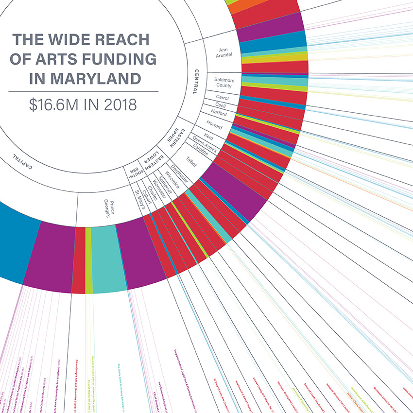
Wide Reach of Arts Funding in Maryland
DATA VISUALIZATION | INSTALLATION
This was a student project using data from the Maryland Council of the Arts, showing where arts funding ended up across the state. This is designed to be a 15 foot wide installation piece, displayed at the annual Maryland Arts Day gathering, where lawmakers, artists, and citizens meet and discuss their priorities for state arts funding.
Click on the image below to make full screen. Click again to zoom, and click and drag to pan around.

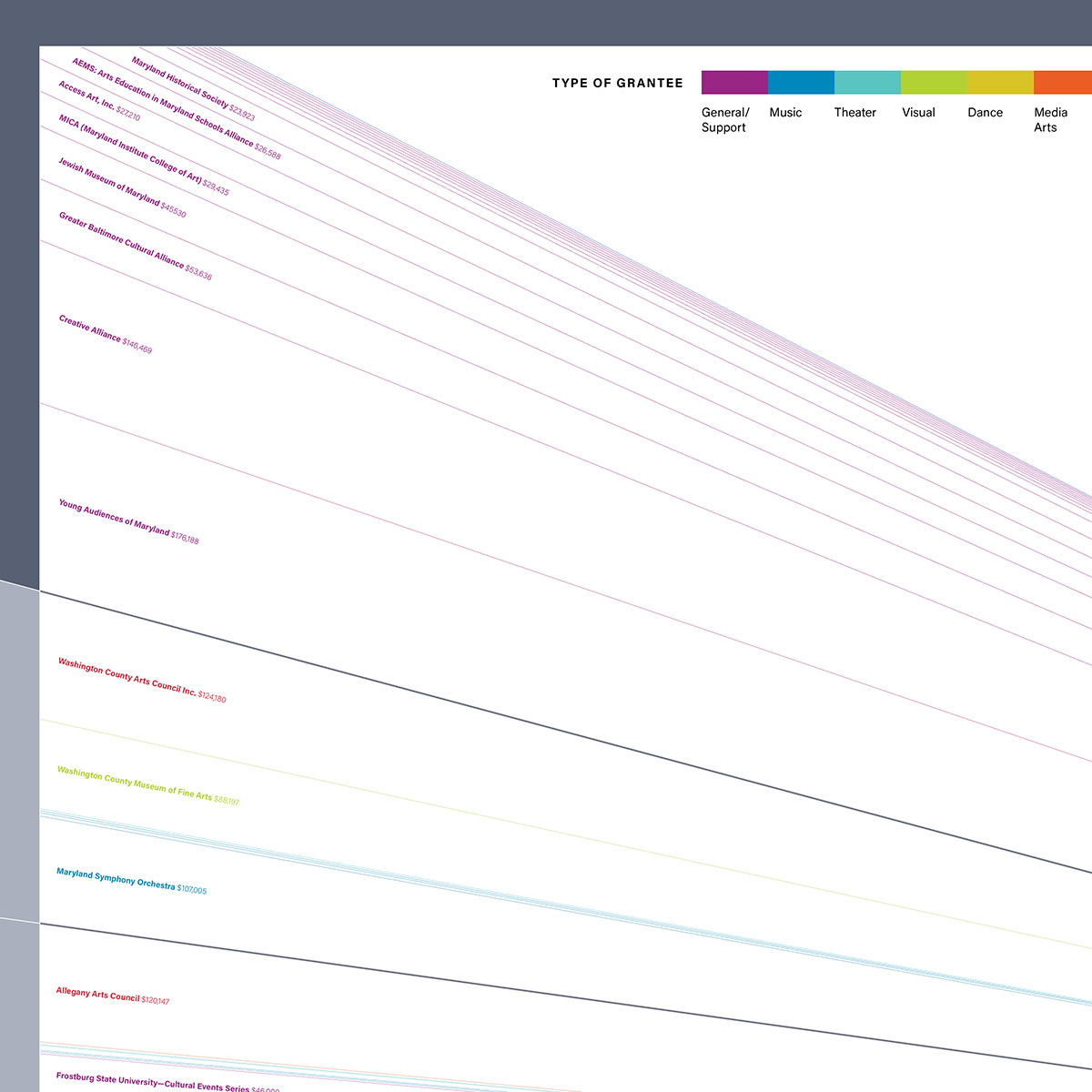
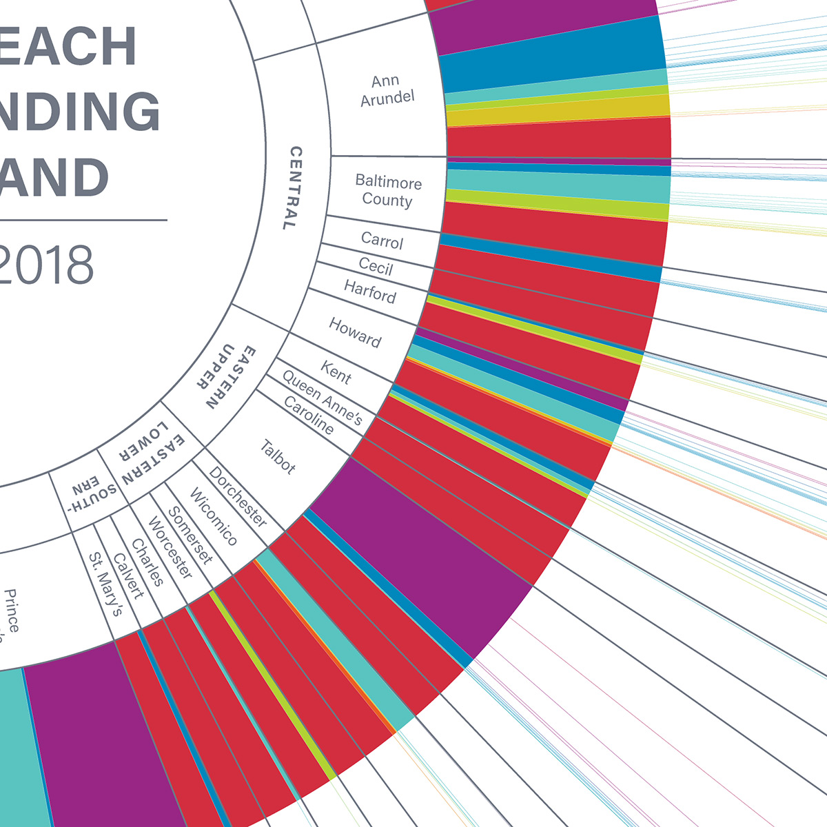
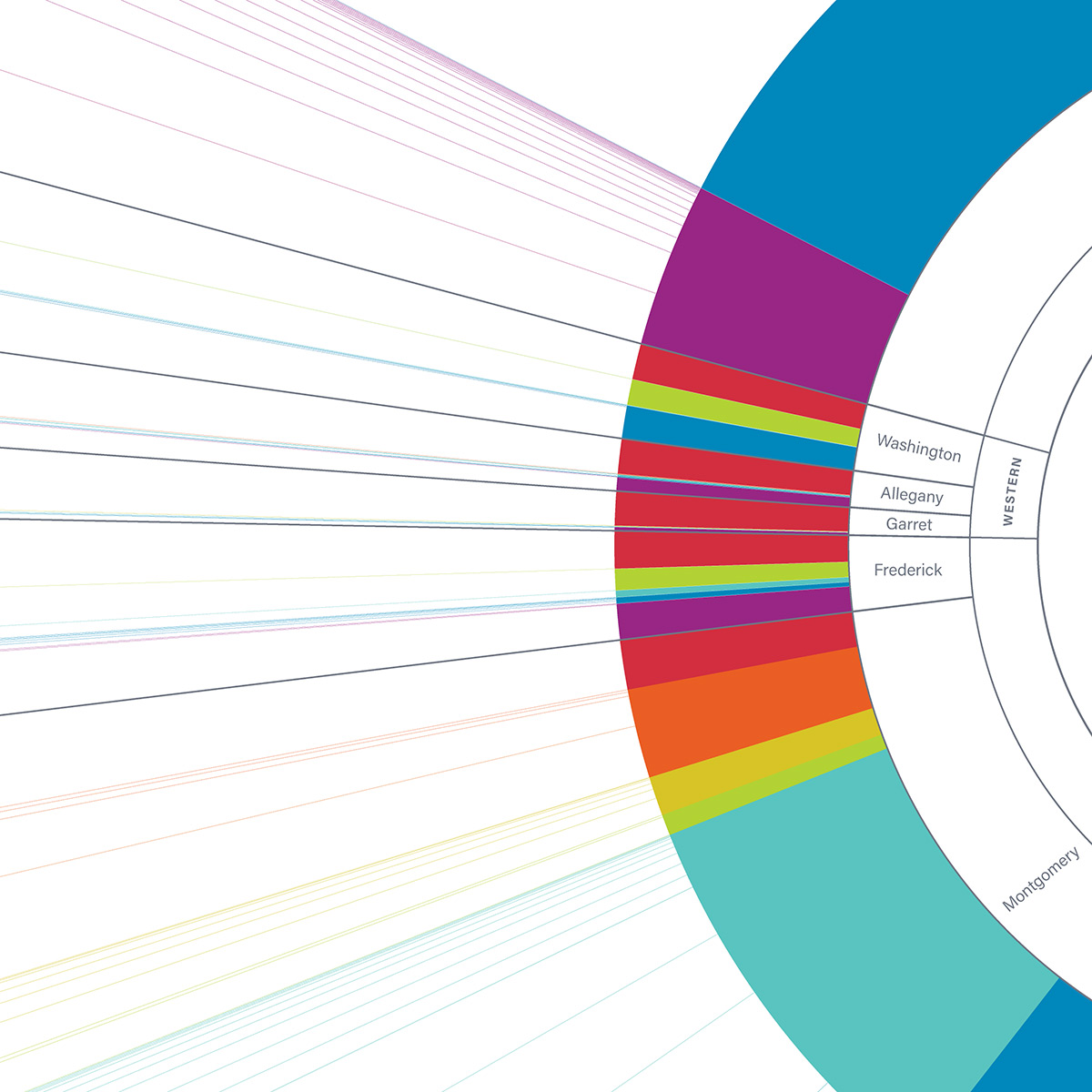
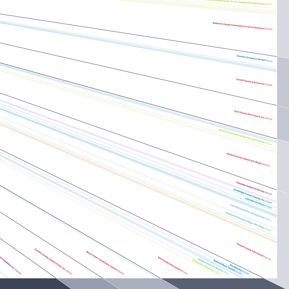
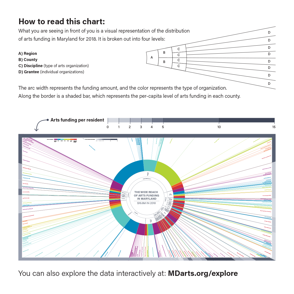
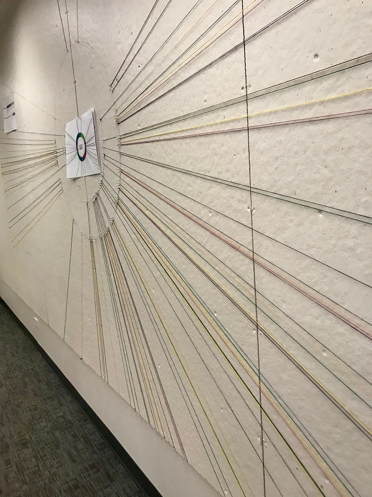
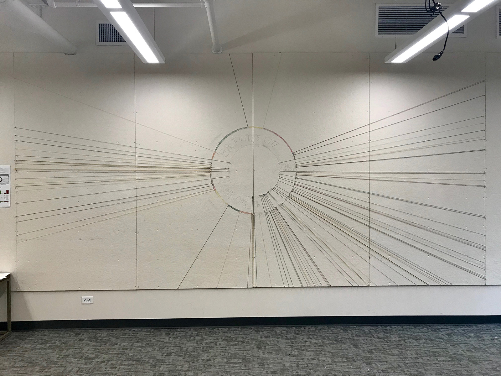
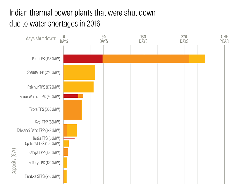
The infographic is structured around a sunburst chart, a type of radial hierarchical treemap (or it can be thought of as a bunch of nested pie charts). The central core shows the total arts funding for the year. The innermost ring divides that amount into the main regions of the state, breaking Baltimore City into it's own group, as it recieves the lions share of funding. Outward form there, it subdivides into counties. And then the next ring is a thicker, and color coded by arts discipline (music, dance, theater, etc.). Then each line radiated out to the edge of the canvas delineates grant recipients. The width of the arc encodes the grant amount. The edge of the canvas has an additional measure, showing the per capita arts funding amount for the county. As it's designed to be printed 15 feet across, it can be tough to read on the screen, so here are some detail shots:
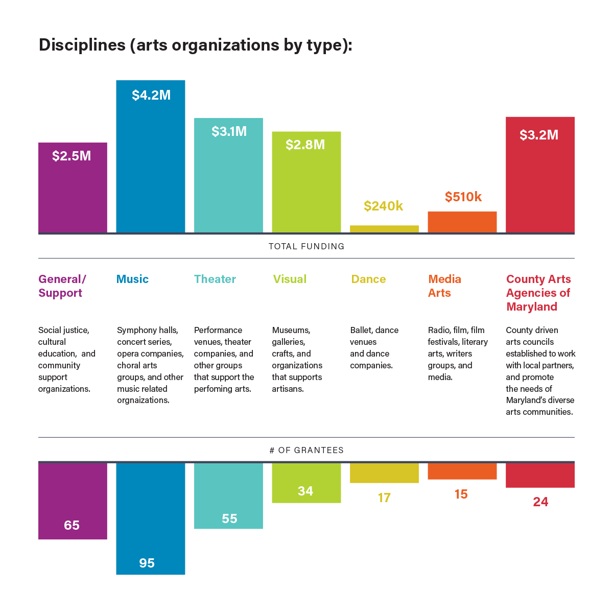
I also designed a postcard, which would be displayed on a small table in front of the infographic. The postcard walks the viewer through how to read the infographic, and includes some summary statistics on the backside:
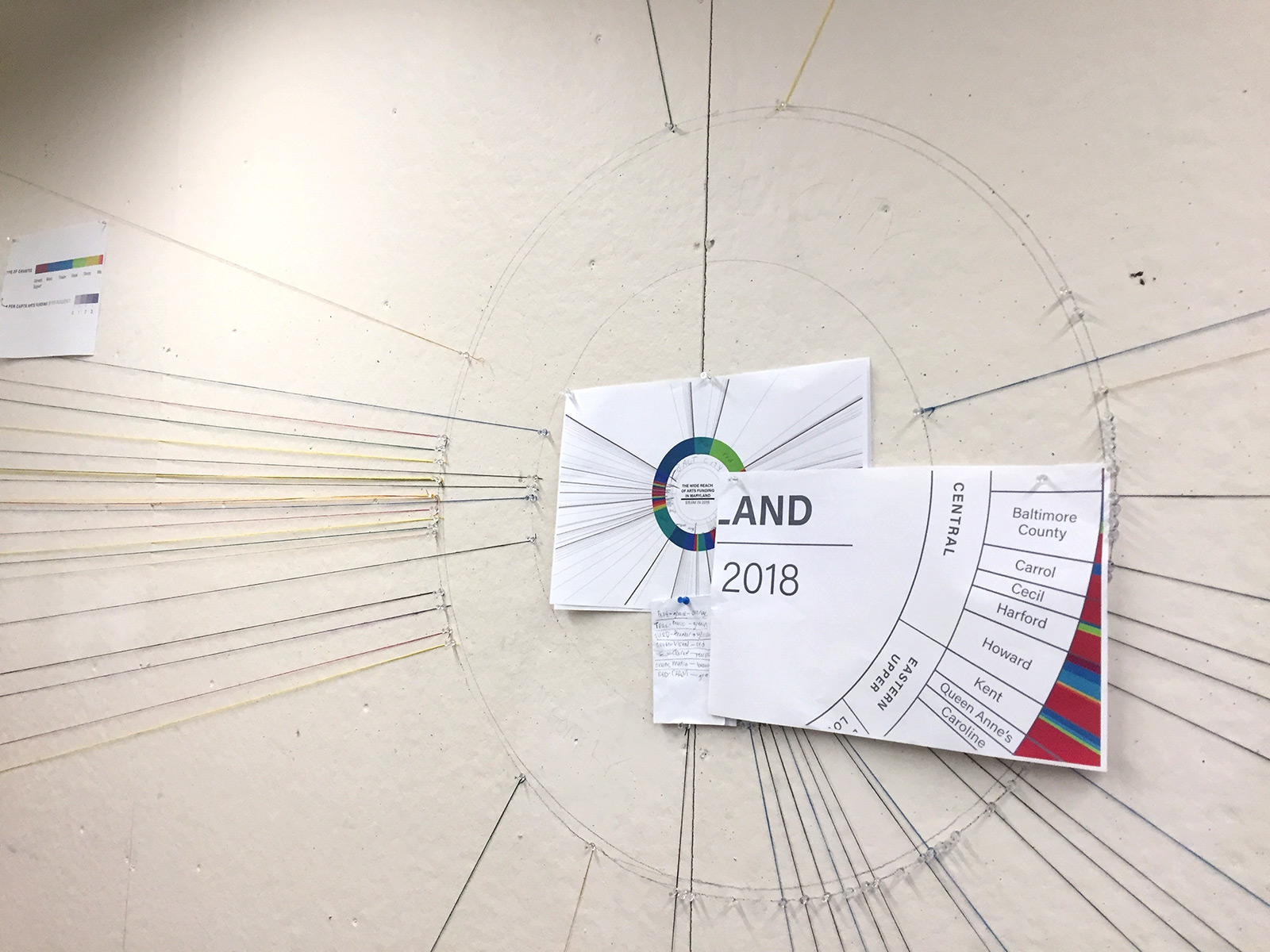
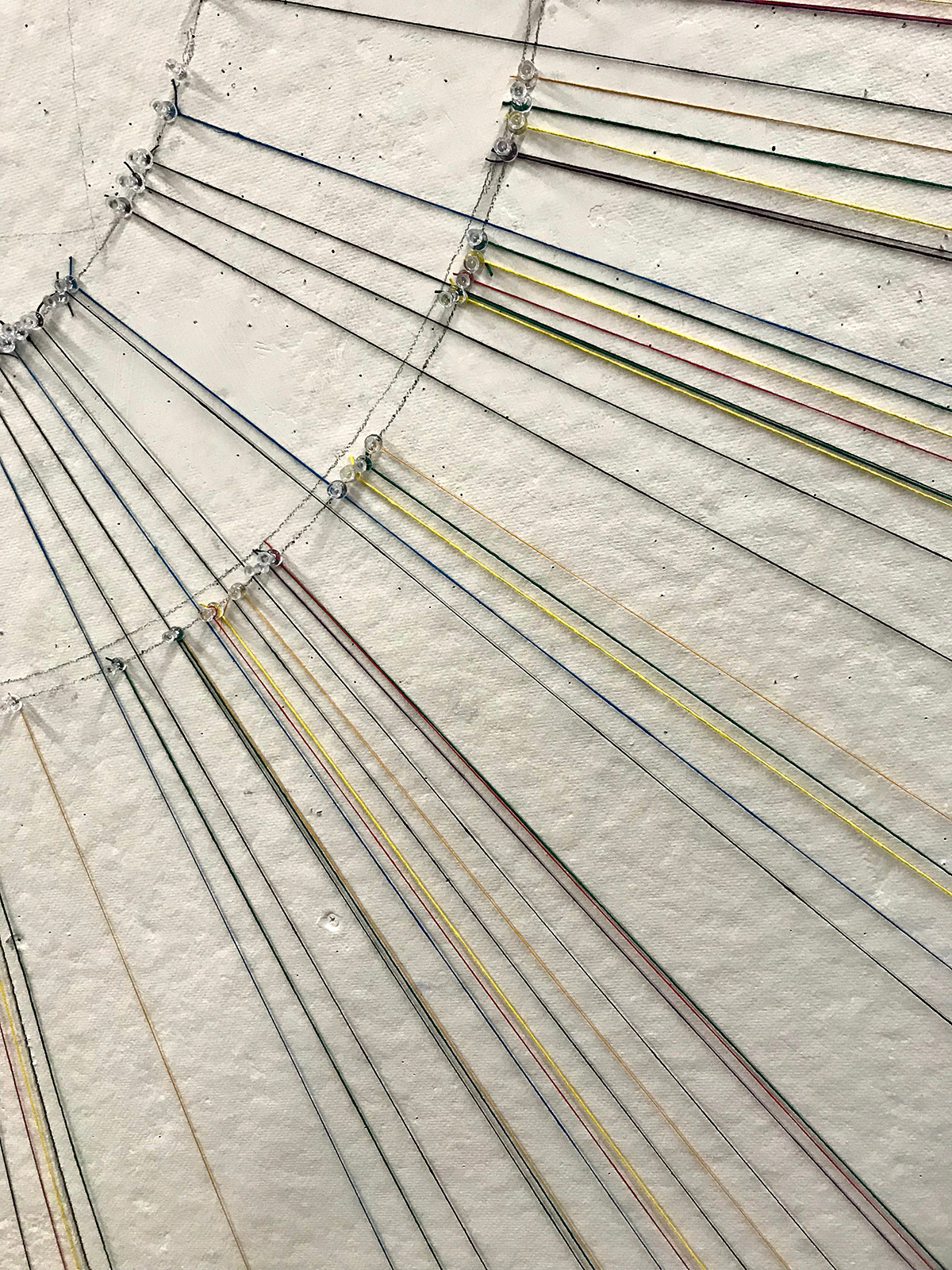
In addition to the digital version, we prototyped a life sized physical mock-up, using pushpins and string:
Other Projects:
Visualizing the History of FugaziData Visualization
COVID-19 Testing Trends TrackerData Visualization
Timeline of COVID Policies in the U.S.Data Visualization
VIEW-hub website designUI/UX Design & Data Visualization
Transforming Food Systems Under Climate ChangeData Visualization & Report Design
Towards a More Equal CityData Visualization
Wide Reach of Arts Funding in MarylandData Visualization
Creating a Sustainable Food FutureData Visualization & Report Design
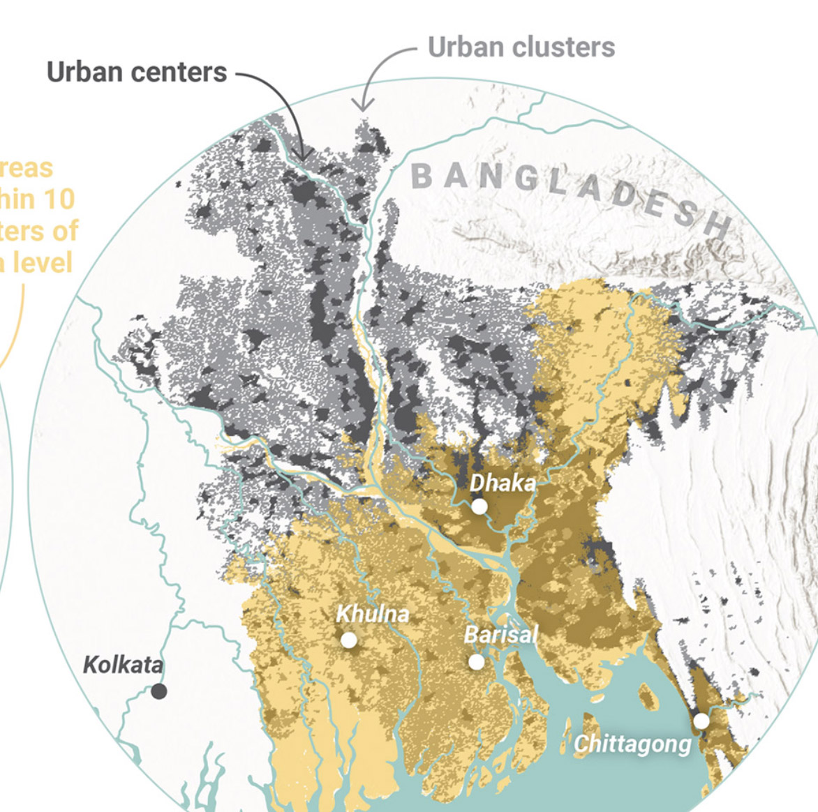
Global Commission on AdaptationMap & Infographic Design
Logo & Branding projectsLogo design
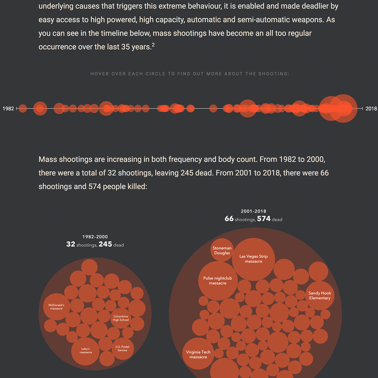
Sensible Gun Laws NowInteractive
Stories to WatchPresentation Design
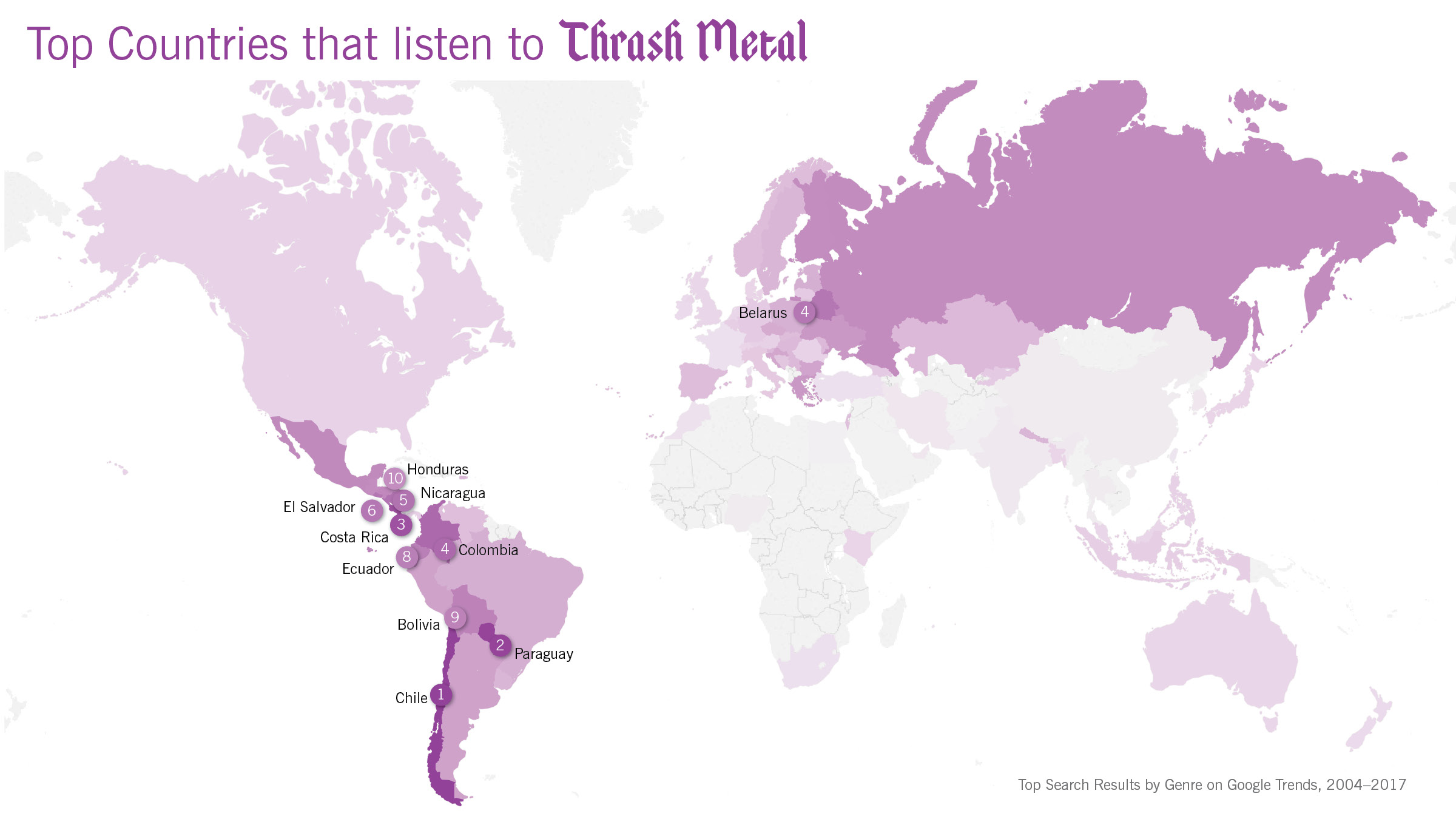
Globetrotting History of MetalData Visualization
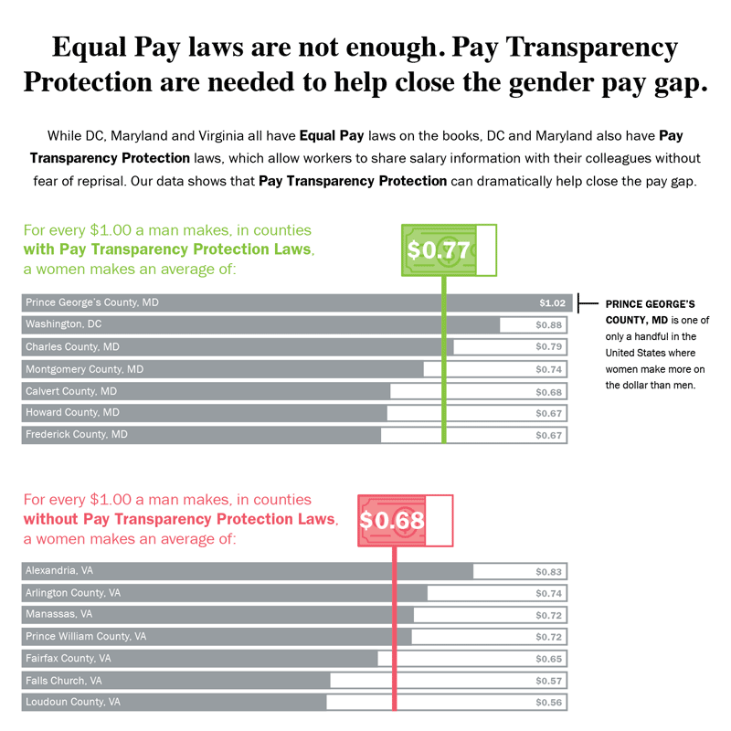
Equal Pay Laws are Not EnoughData Visualization

How to Record Your BandInfographic
WRI Blog graphicsCharts & graphs
The Slow Recovery from the Great RecessionInteractive
The Race to the MoonInfographic
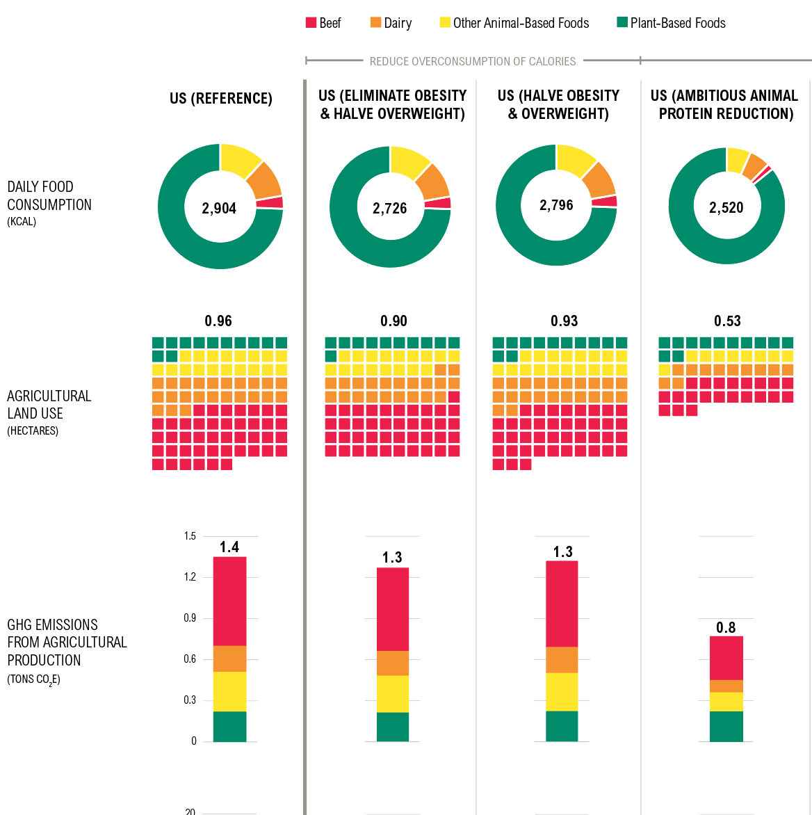
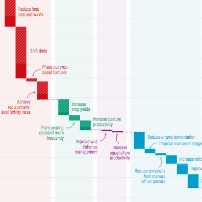
Shifting DietsData visualization
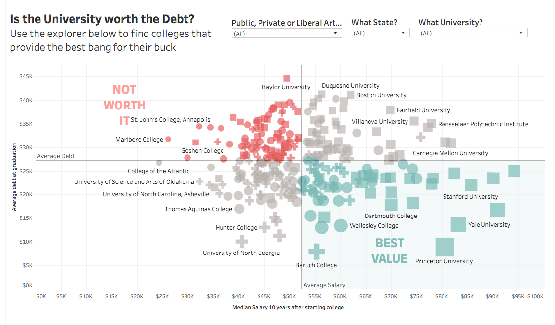
Is the University Worth the Debt?Interactive
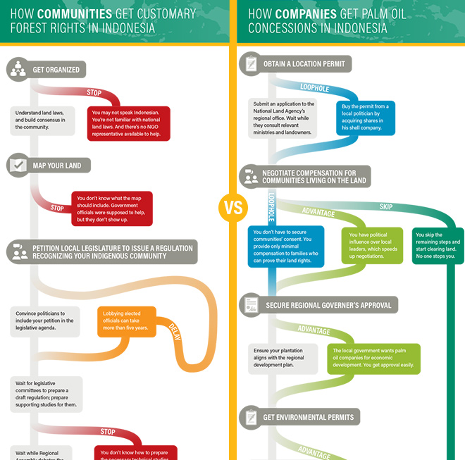
Scramble for Land RightsInfographic
Show FlyersConcert posters
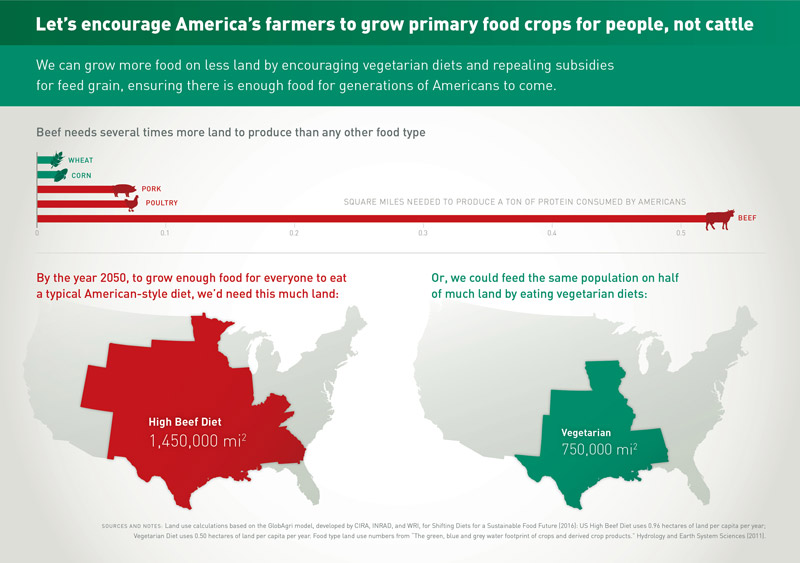
Land for Plants, not CattleInfographic
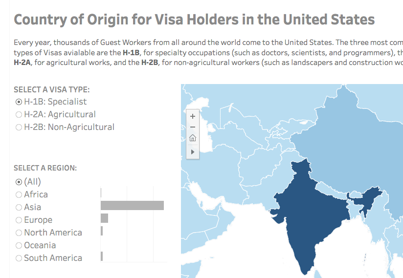
Visa Holders DashboardsInteractive
Positive Youth FestConcert Poster
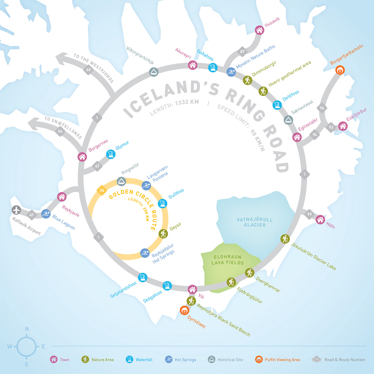
Iceland Ring Road MapInfographic
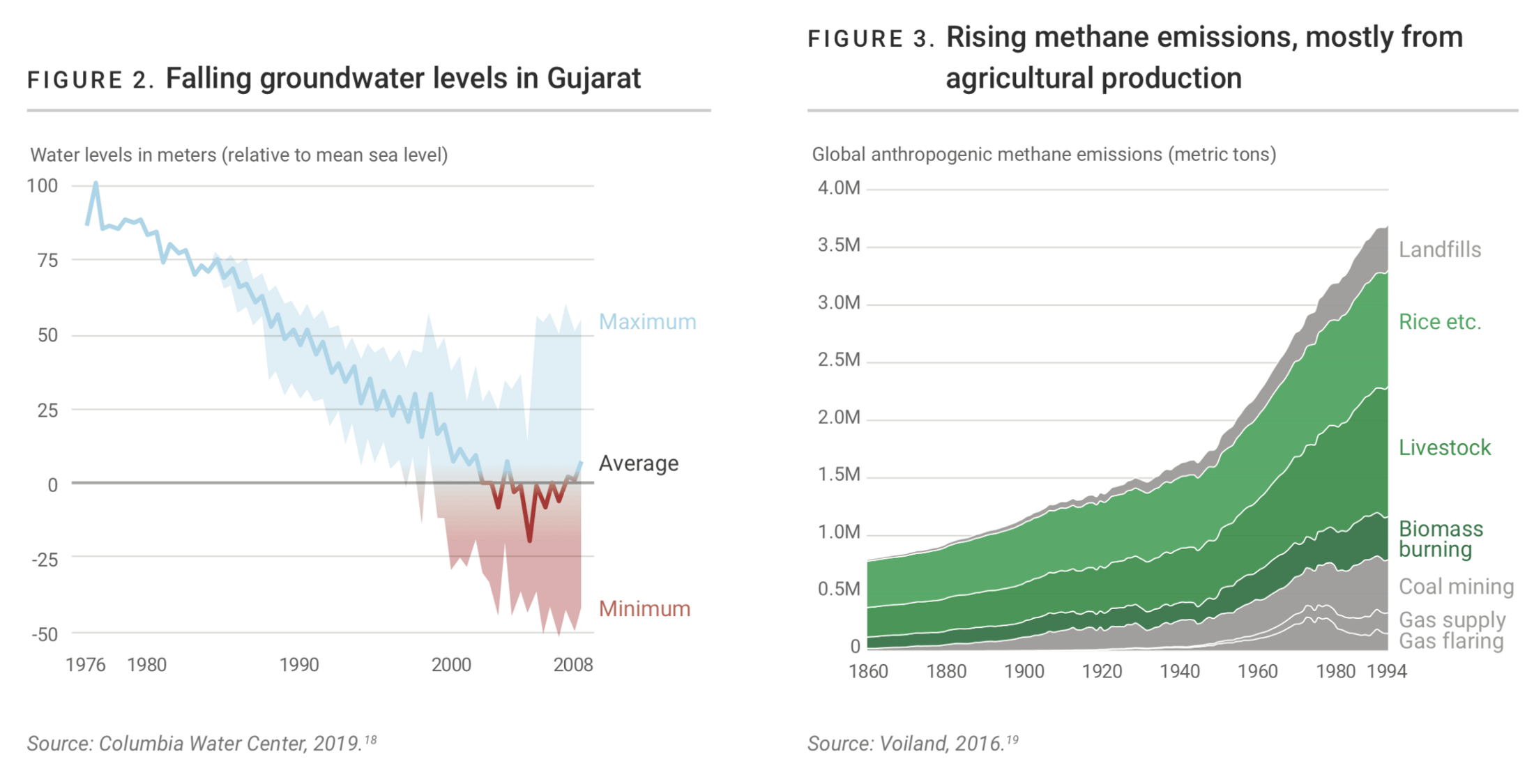
Droughts & BlackoutsData Visualization
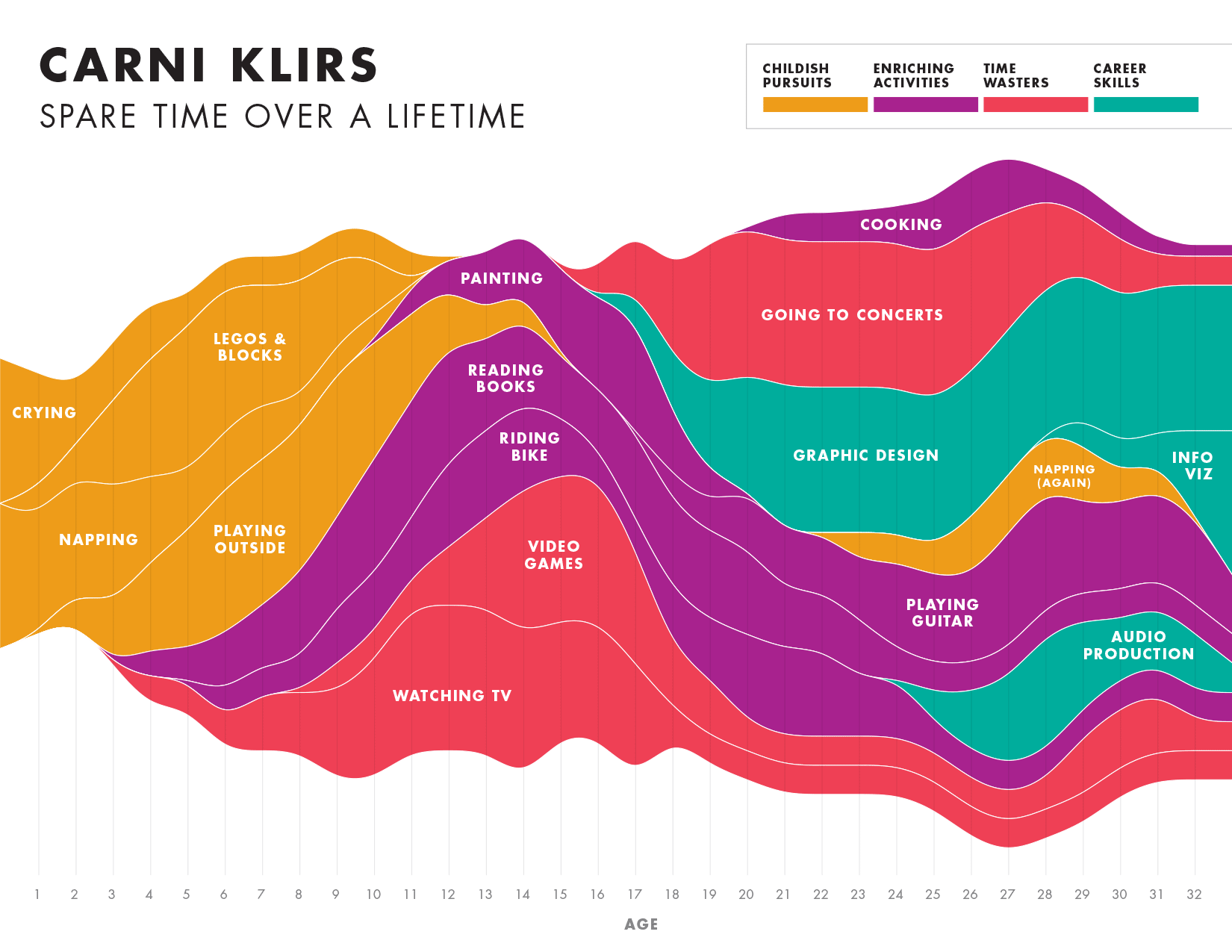
Spare Time over a LifetimeInfographic
Pinkwash posterConcert Poster
Please be in touch: carni.klirs@gmail.com. Follow me on instagram or twitter.