VIEW-hub Data Visualization Platform
WEBSITE DESIGN / DATA VISUALIZATION
As part of the team at Graphicacy, I was the lead designer on a total revamp of the VIEW-hub data visualization platform for the International Vaccine Access Center (IVAC) at the Johns Hopkins Bloomberg School of Public Health. The VIEW-hub platform visualizes over 100 data sets related to vaccine access, coverage, introduction, and use, as well as compiling relevant academic studies on vaccines. I focused on making the site more engaging, intuitive and innovative, while our engineers worked on a brand new data pipeline to allow the IVAC team to easily update and expand the site themselves.
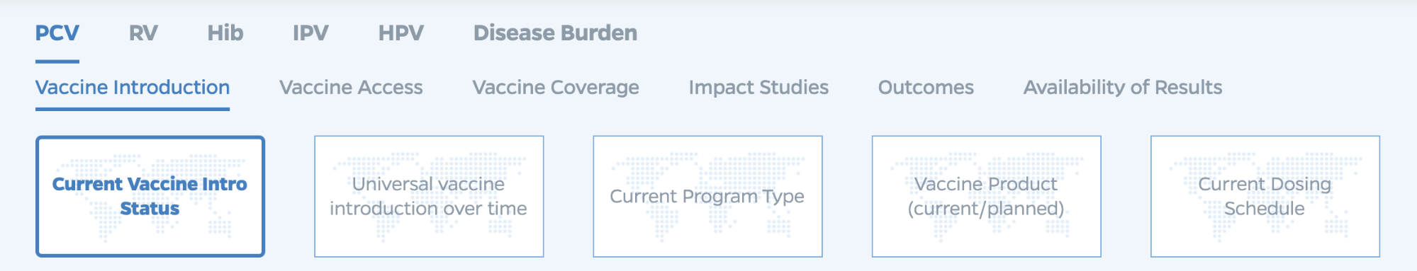
Bringing new life to an interactive map
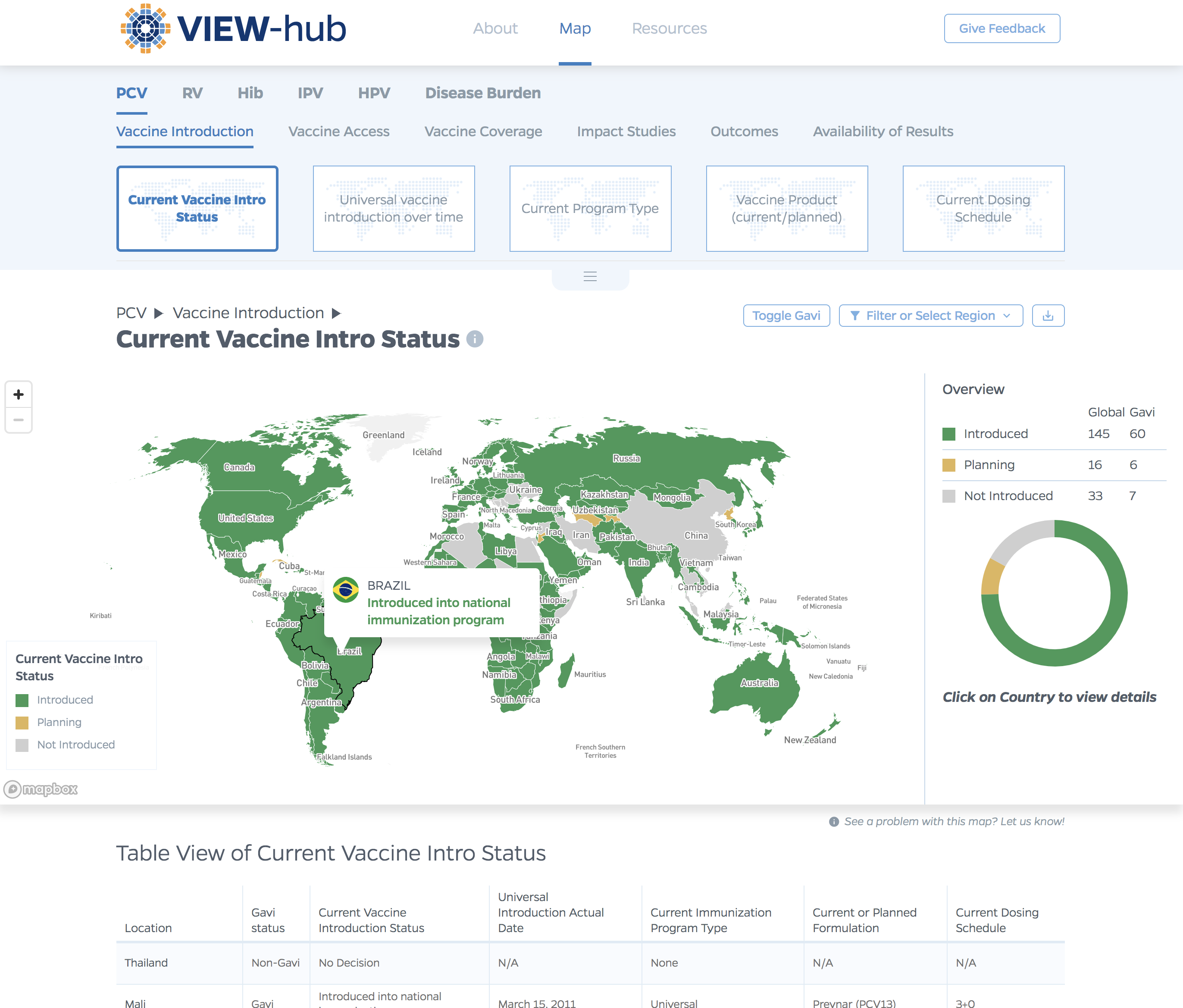
The core of the VIEW-hub website is an interactive map, which displays country-level vaccine data. The old site structured the map page like a desktop application: lots of panels, small icon-only buttons with no little context for the users what those buttons do, and a sidebar accordion menu to navigate between map layers. The IVAC team conducted a robust set of user interviews, to learn the pain points of their current site. From these interviews, we learned that the map page had a number of features that were often unused, and unnecessary for the majority of users. Furthermore, the core features that the IVAC team wanted were hard for users to find.
Informed by the user interviews, our design approach on the map page was to eliminate unused and unnecessary features, make the most important features easier to find and access, and create a more intuitive and lighter user interface. The interface elements needed to be easy to locate, but not overly cluttered, and couldn’t overwhelm the map. I also completely reworked the color scales for all the map layers, to create a unified palette that was color-blind safe, and robust enough to handle categorical, sequential, and diverging palettes.
Diving into details on Country pages
From the map page, the user can click on a country, and navigate to a dedicated Country page. The old Country pages were only available as modal windows on top of the map, with important content buried behind multiple tabs. So we created proper pages for each Country, un-tabbed and stacked the content, so it was more discoverable by scrolling, which is a more natural user behavior. The various modules on the Country pages each had a pass of UX design and data visualization design improvements, to bring consistency and clarity throughout the new site.
Making the site easy to update and maintain
One of the biggest challenges the IVAC team faced with their old site, was a lack of ability to update the data themselves. They would maintain the data in offline spreadsheets, and communicate data updates to the developers, who would make changes manually. This process was time consuming, and error-prone. We wanted to introduce a new system, which replicated the experience of working with traditional spreadsheets, but in a cloud-based platform with an API, so our new site can pull data directly from the data that IVAC maintains. Airtable provided the right solution for these needs.
In addition to setting up Airtable to house the raw data, we also used it allow control over some presentation elements on the VIEW-hub platform itself: a “Map Color” column ties directly to a CSS file designating map colors, and a table was set up to power the map layer navigation:
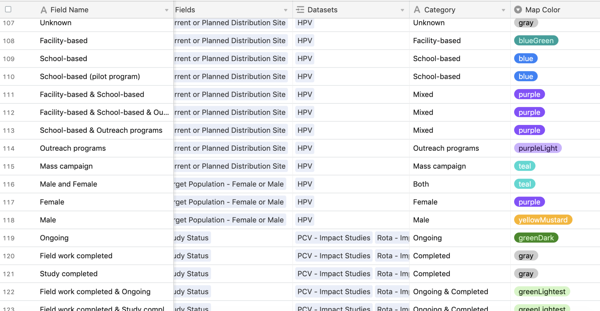
Layers can be “published” or “unpublished” directly from Airtable, giving IVAC control over what they want to show. New map layers can be added easily by the IVAC team by adding new data into Airtable, designated colors and category names for the map legend, and adding it to the Menu table.
The overall site is built on top of Drupal, which manages the Homepage, a Resources library, as well as a repository of academic studies on the impacts of vaccines in various countries. The map page is an Angular application, which provides a seamless, “single page app” style experience, while routing the current state of the map to the URL. The URL also reflects any filtering the user applied. So a map of the number of children with PCV vaccinations, filtered by Low and Middle income countries, can be shared with a direct link. This routing also allows analytics to track which maps are being visited most, and what filtering options users are applying.
Other Projects:
Visualizing the History of FugaziData Visualization
COVID-19 Testing Trends TrackerData Visualization
Timeline of COVID Policies in the U.S.Data Visualization
VIEW-hub website designUI/UX Design & Data Visualization
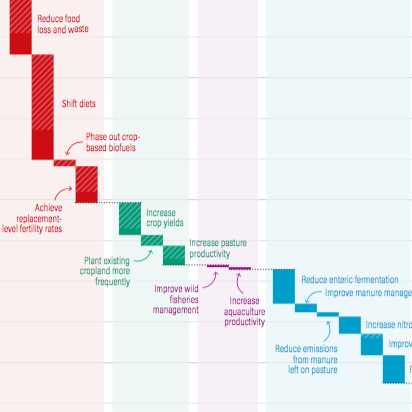
Transforming Food Systems Under Climate ChangeData Visualization & Report Design
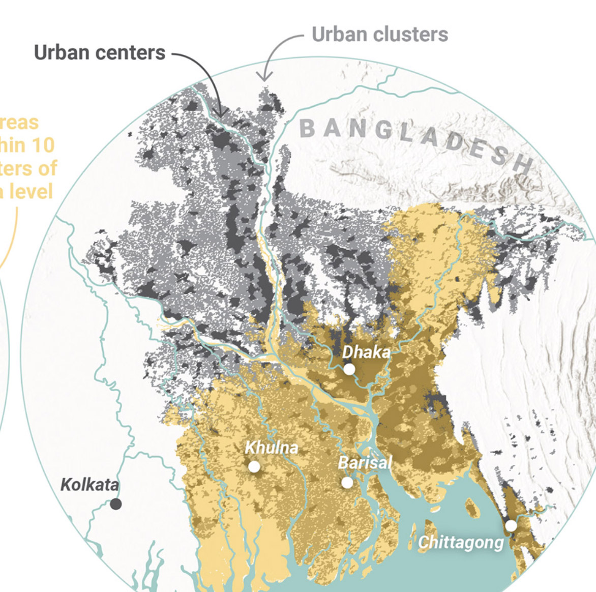
Towards a More Equal CityData Visualization
Wide Reach of Arts Funding in MarylandData Visualization
Creating a Sustainable Food FutureData Visualization & Report Design
Global Commission on AdaptationMap & Infographic Design
Logo & Branding projectsLogo design
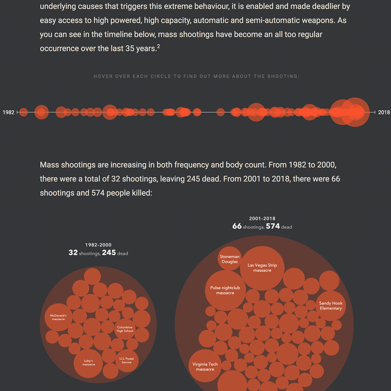
Sensible Gun Laws NowInteractive
Stories to WatchPresentation Design
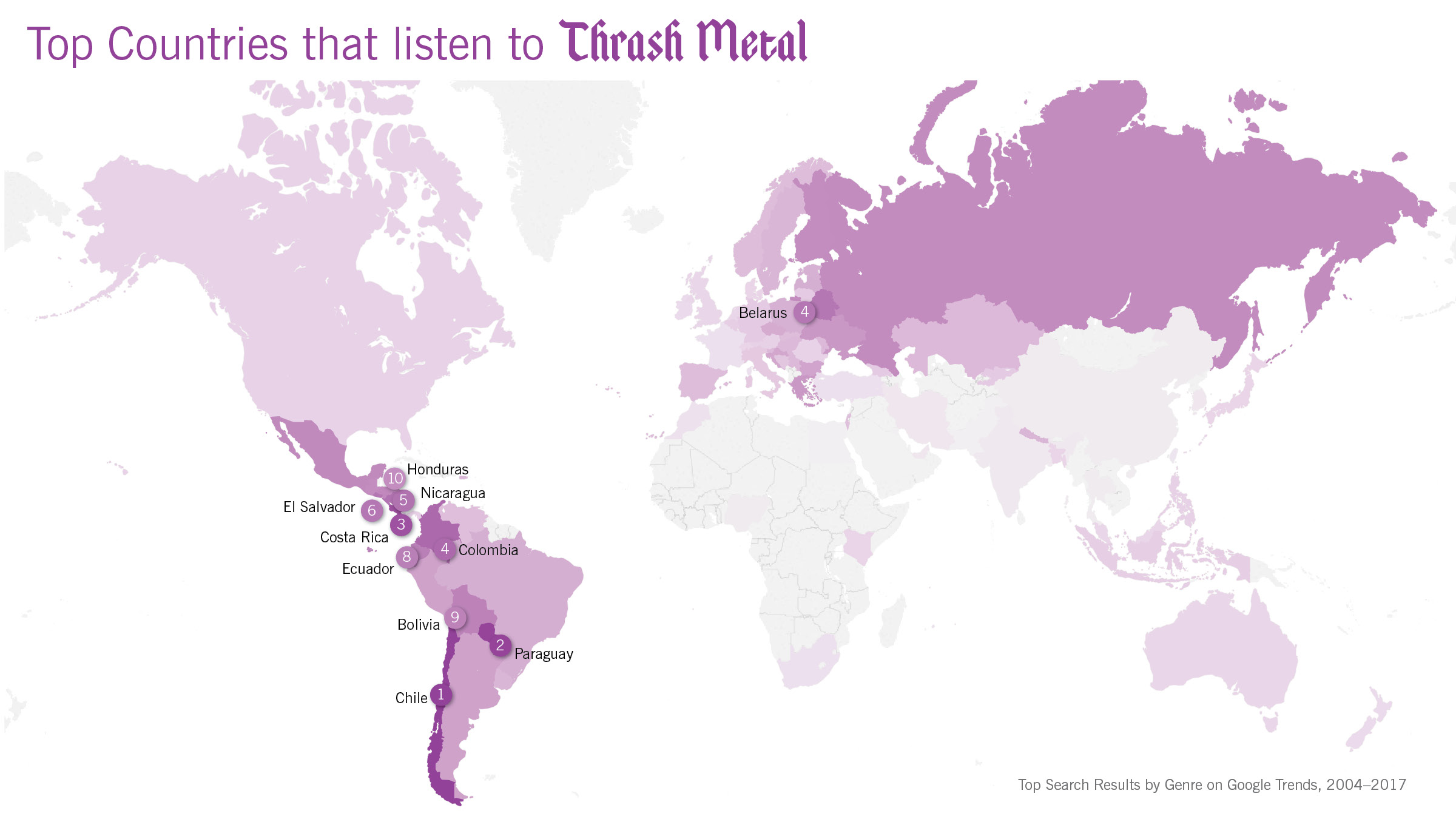
Globetrotting History of MetalData Visualization
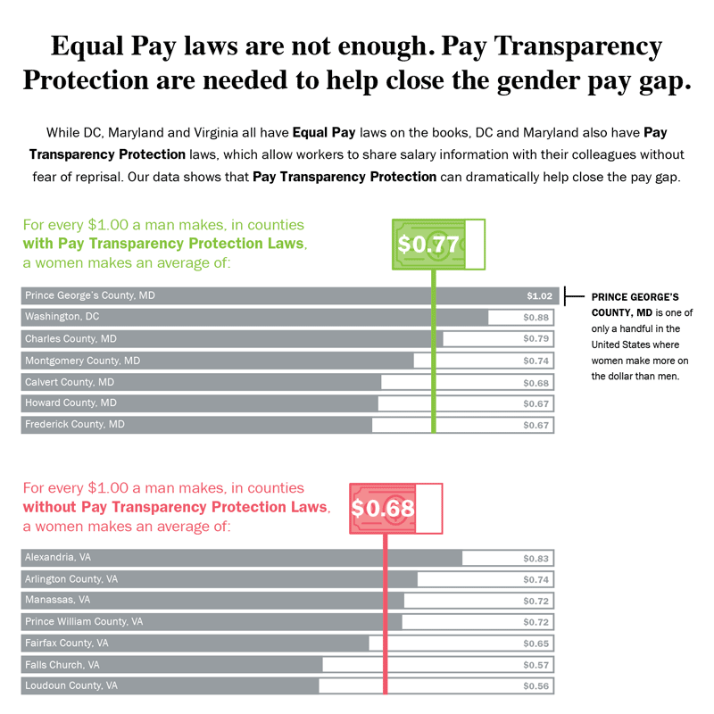
Equal Pay Laws are Not EnoughData Visualization

How to Record Your BandInfographic
WRI Blog graphicsCharts & graphs
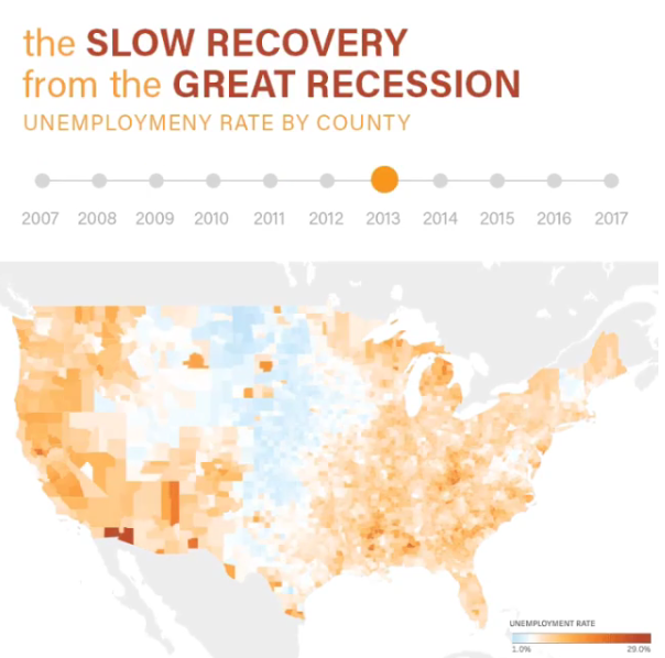
The Slow Recovery from the Great RecessionInteractive
The Race to the MoonInfographic
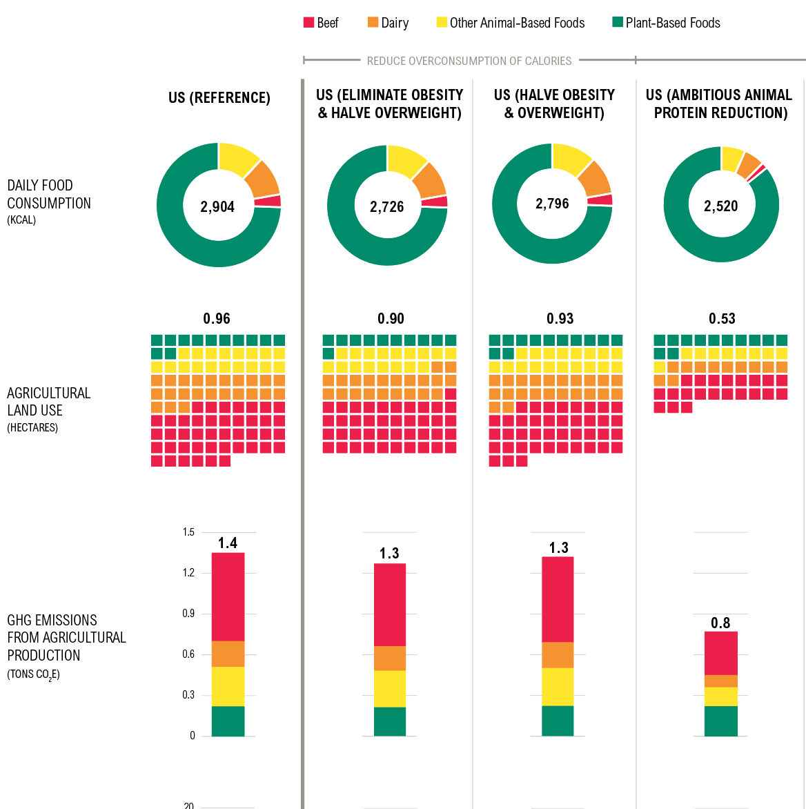
Shifting DietsData visualization
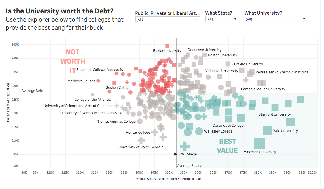
Is the University Worth the Debt?Interactive
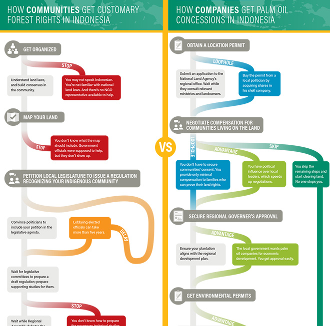
Scramble for Land RightsInfographic

Show FlyersConcert posters
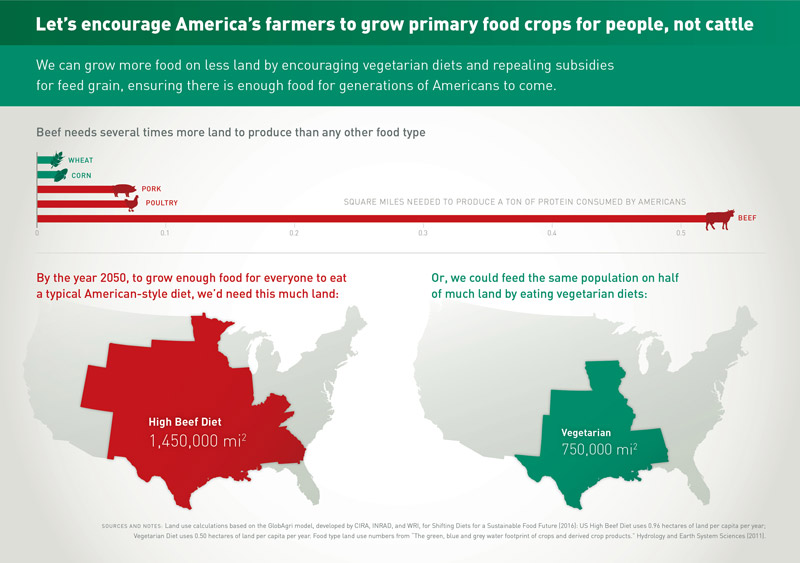
Land for Plants, not CattleInfographic
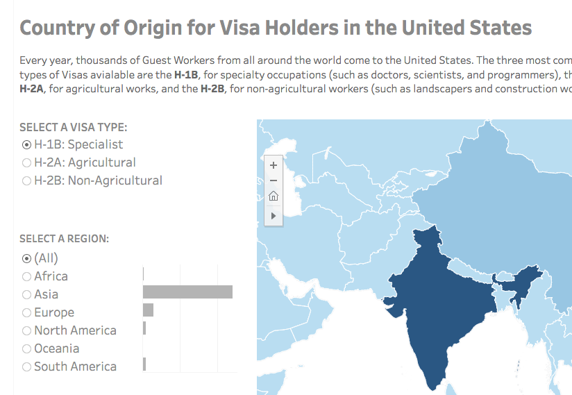
Visa Holders DashboardsInteractive

Positive Youth FestConcert Poster
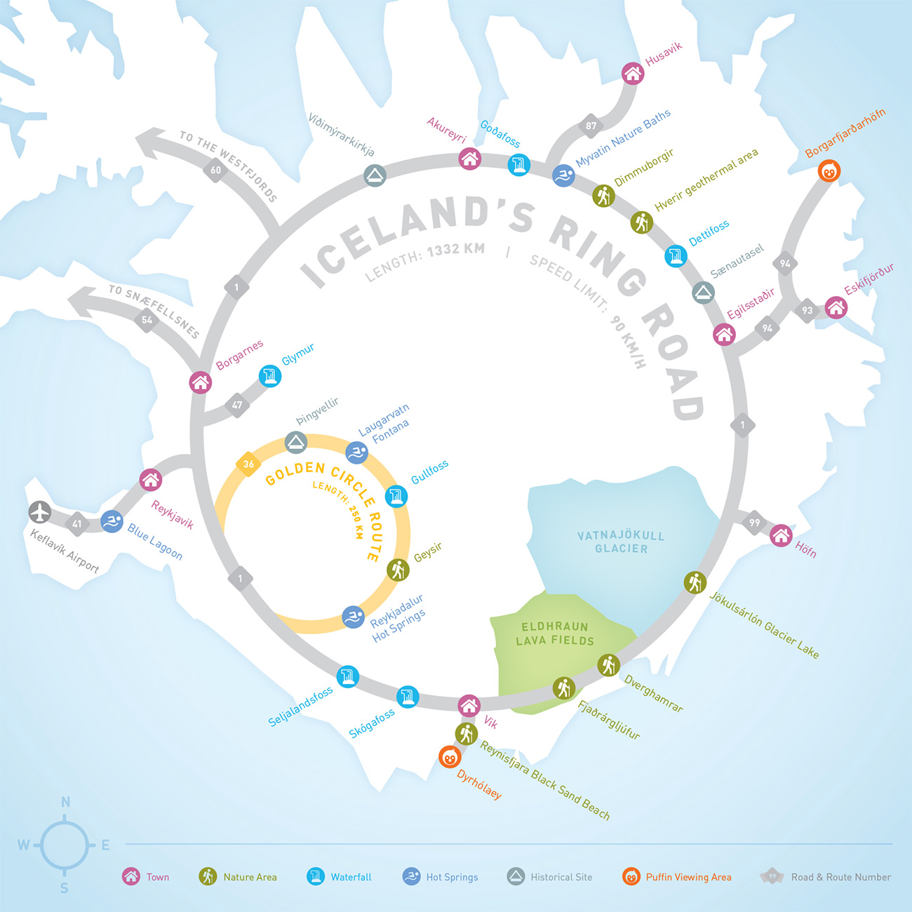
Iceland Ring Road MapInfographic
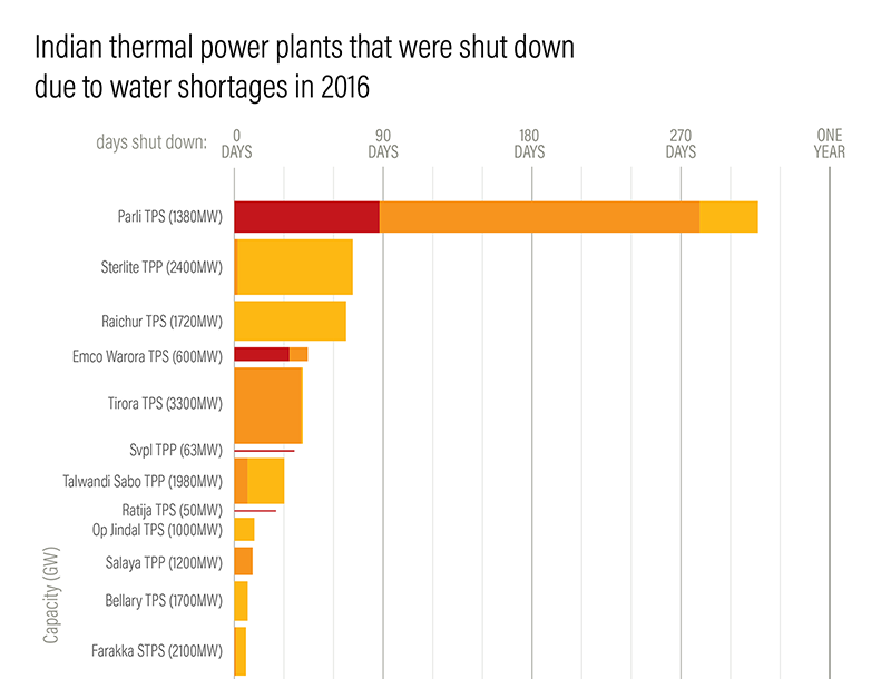
Droughts & BlackoutsData Visualization
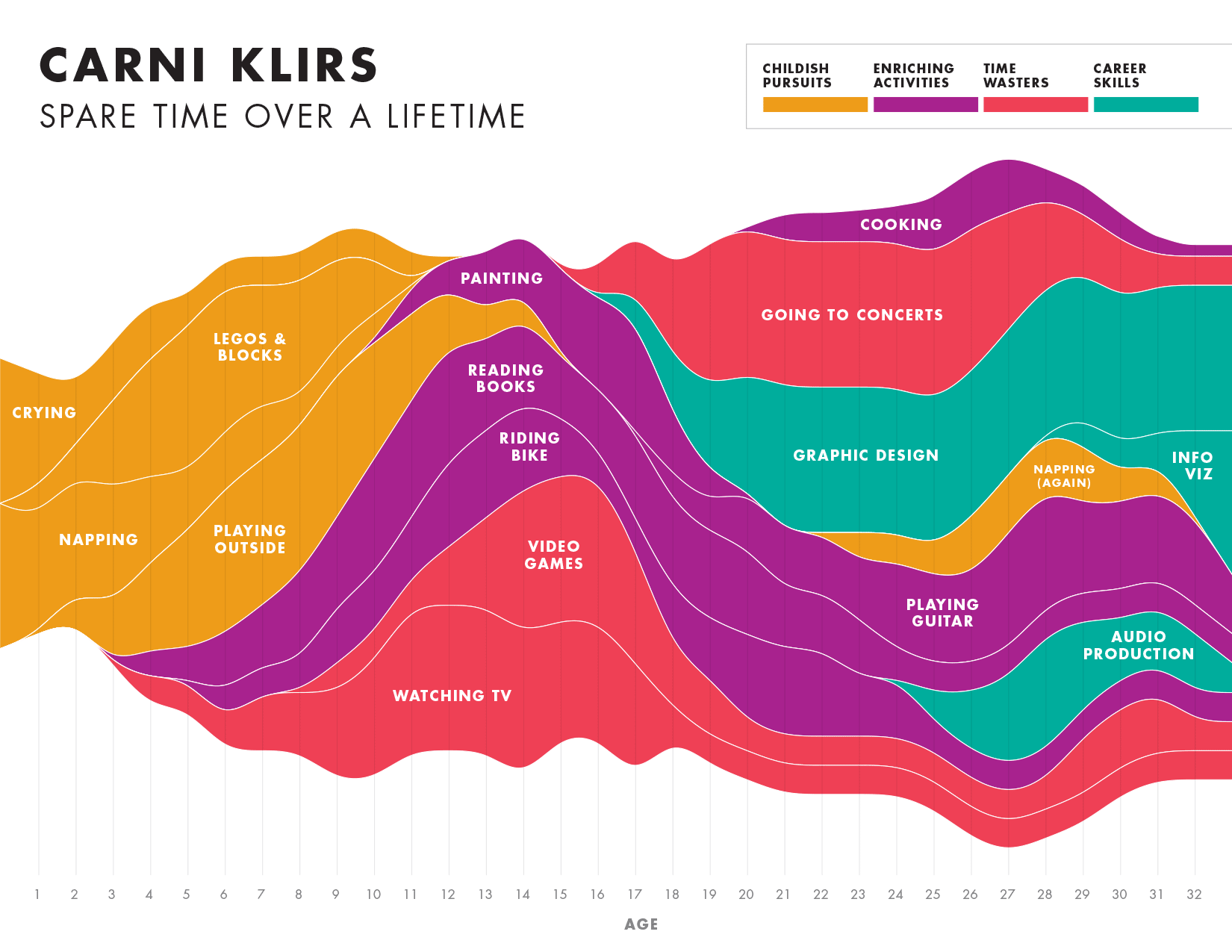
Spare Time over a LifetimeInfographic

Pinkwash posterConcert Poster
Please be in touch: carni.klirs@gmail.com. Follow me on instagram or twitter.