The Slow Recovery from the Great Recession
INTERACTIVE | DATA VISUALIZATION
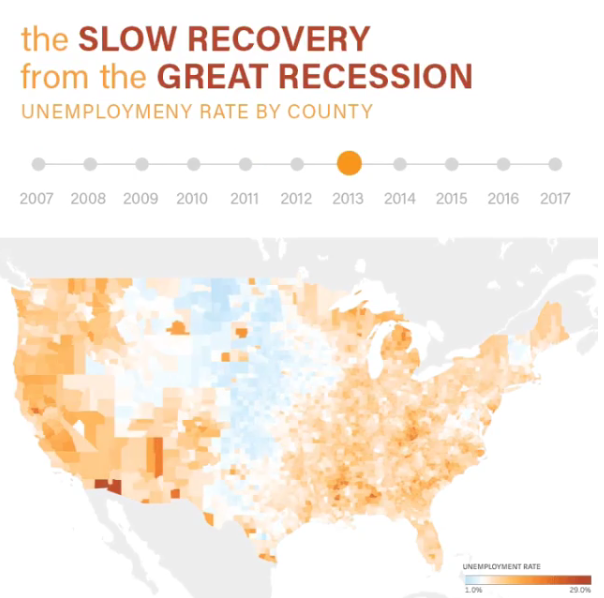
For this student project, I decided to build visualization about the recovery from the Great Recession, using county level unemployment data. While there are many ways of measuring the recession (such as jobless rate), and it’s impacts (such as percentage of families living below the poverty line), the most direct is the unemployment rate. It’s a commonly cited statistic in the media, so most audiences will be familiar with it.
I decided to dedicate the majority of the dashboard to the map. The primary interaction method is using the slider above the map to progress from year to year. I manually set the color range from 1% to 29%, and set the mid-point to 5% (what most economists consider "full employment"). So this custom color ramp pushes any counties that are doing great into the blue, and any above 5% into the orange.
I provided a bar chart of State level data as a secondary way to navigate through the map. The users can click on a state name, and the map will adjust its zoom level to only show that state. Similarly, the user can click on multiple state bars, or click and drag directly on the map to select a group of counties. I decided to rank the state bars in descending order. This reinforces the central story: as the user progress across the years, they can see the distribution of color across the bars shift dramatically towards orange, then fade back to blue. This does make it a bit more difficult to find a particular state (alphabetical order would have been easier to do that), but I felt that was an OK sacrifice for the visual reinforcement of the central story.
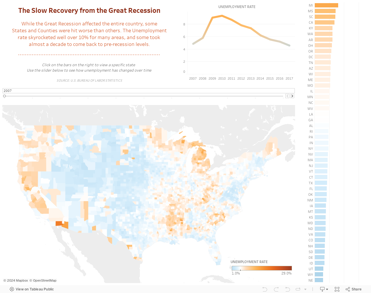
The color scale is persistent across all years. I did this to enable the viewer to compare one year to another by clicking across the timeline slider. I experimented with small multiples, but I found the effect to be more powerful and more convincing with a single map. As the user progresses through the years, they see the map become overwhelmed by dark orange, then slowly fade back to blue. The change over time is easy to see when I turned this into an animation for Instagram:
Other Projects:
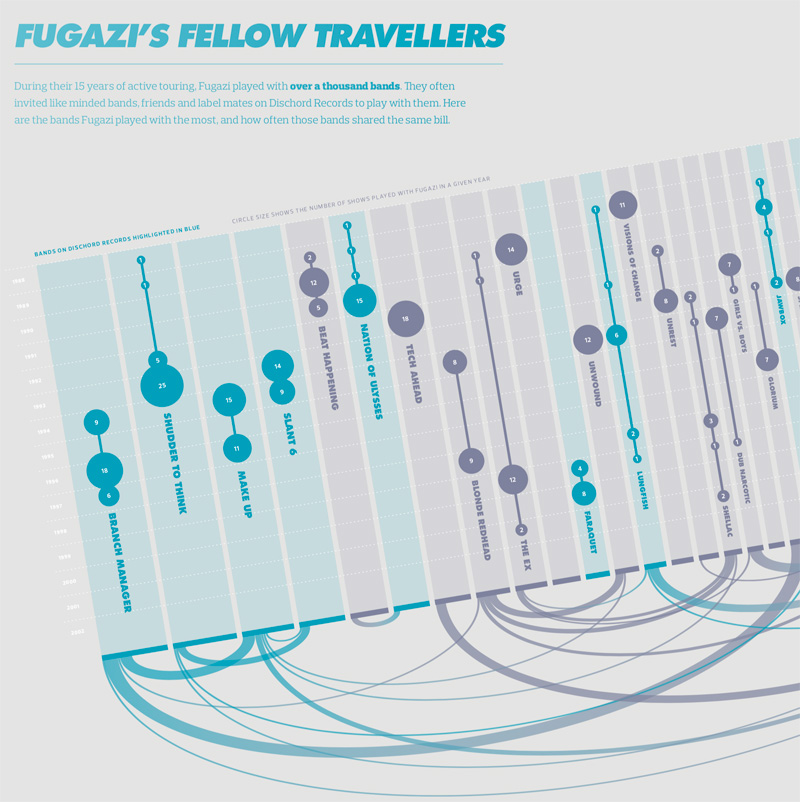
Visualizing the History of FugaziData Visualization
COVID-19 Testing Trends TrackerData Visualization
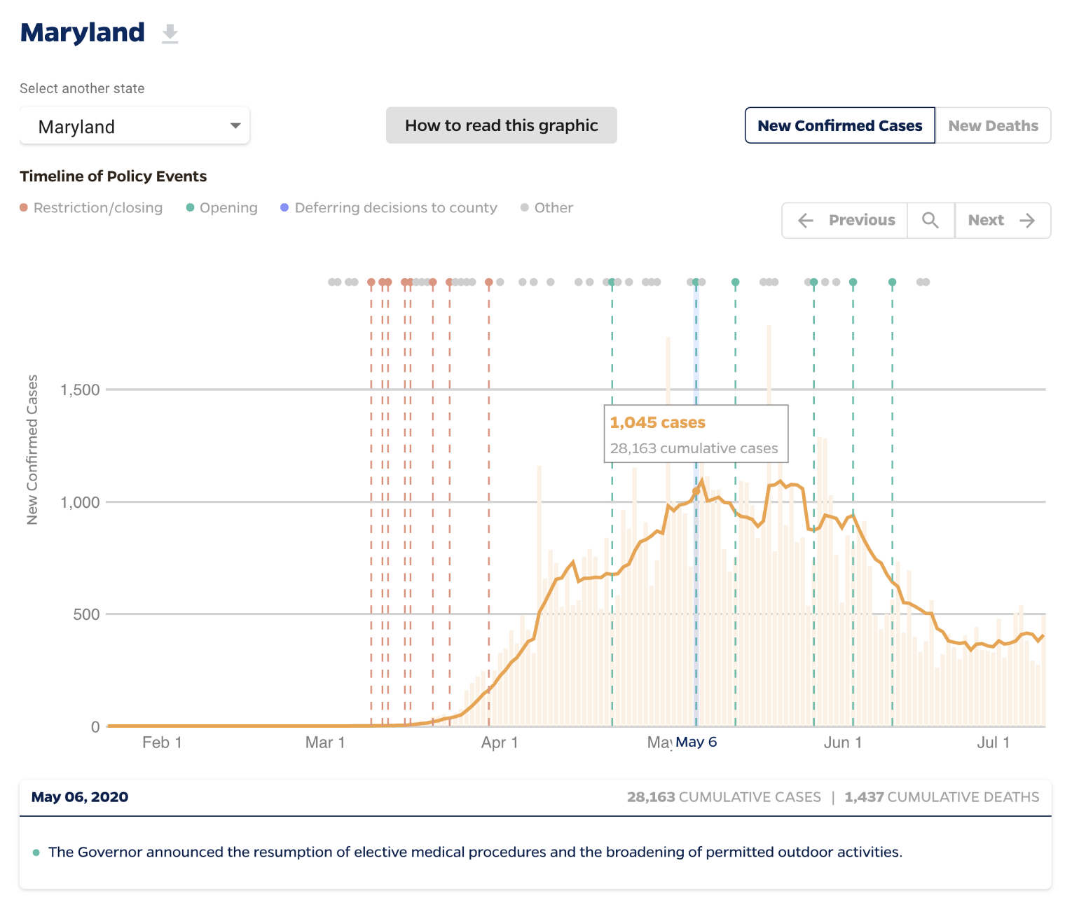
Timeline of COVID Policies in the U.S.Data Visualization
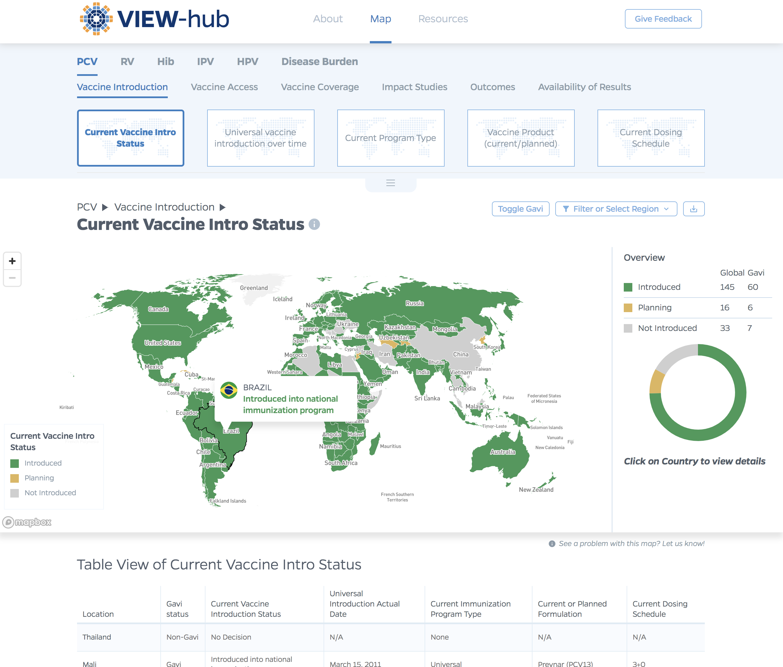
VIEW-hub website designUI/UX Design & Data Visualization
Transforming Food Systems Under Climate ChangeData Visualization & Report Design
Towards a More Equal CityData Visualization
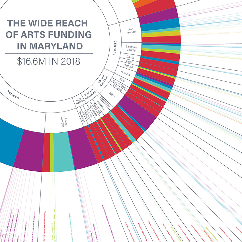
Wide Reach of Arts Funding in MarylandData Visualization
Creating a Sustainable Food FutureData Visualization & Report Design
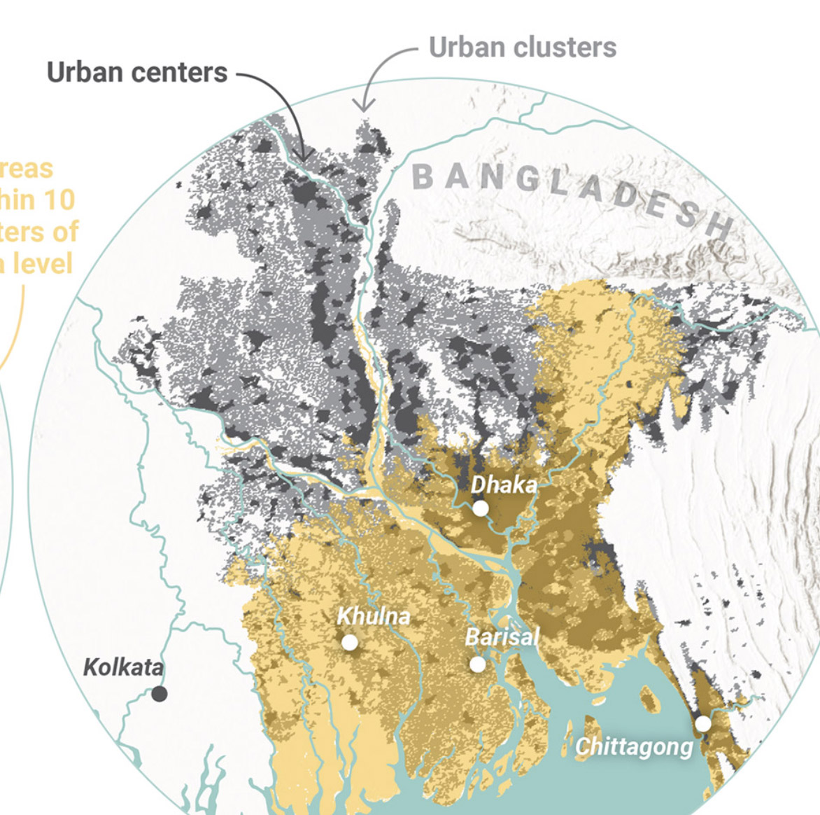
Global Commission on AdaptationMap & Infographic Design
Logo & Branding projectsLogo design
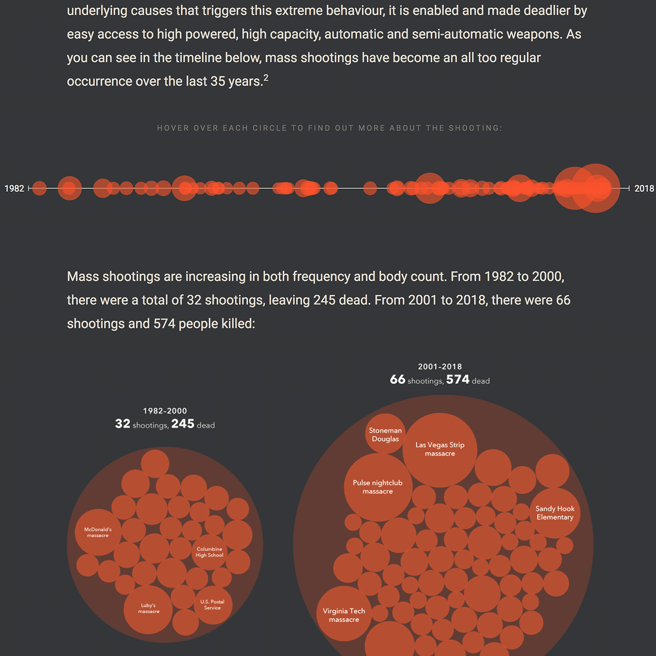
Sensible Gun Laws NowInteractive
Stories to WatchPresentation Design
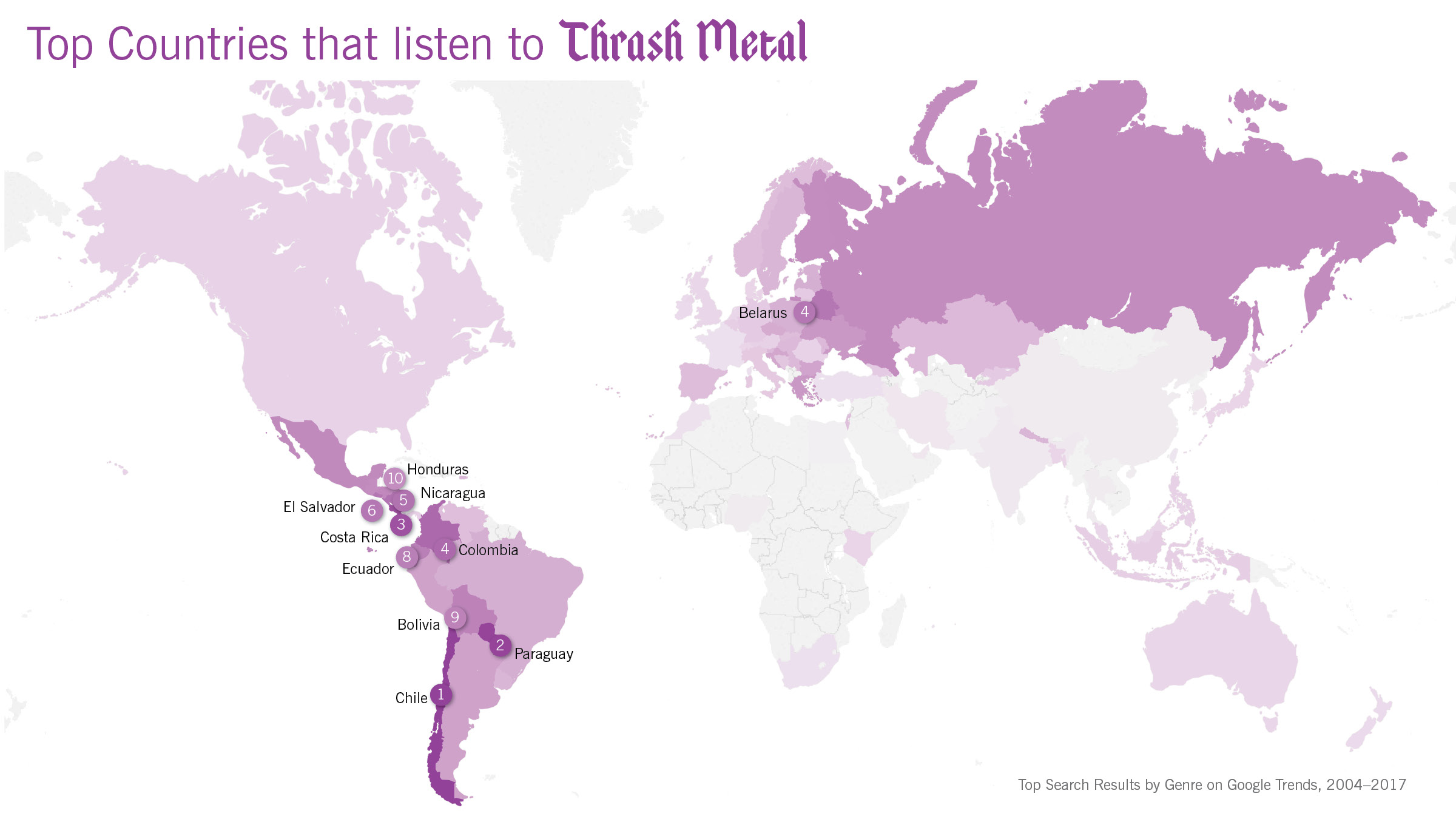
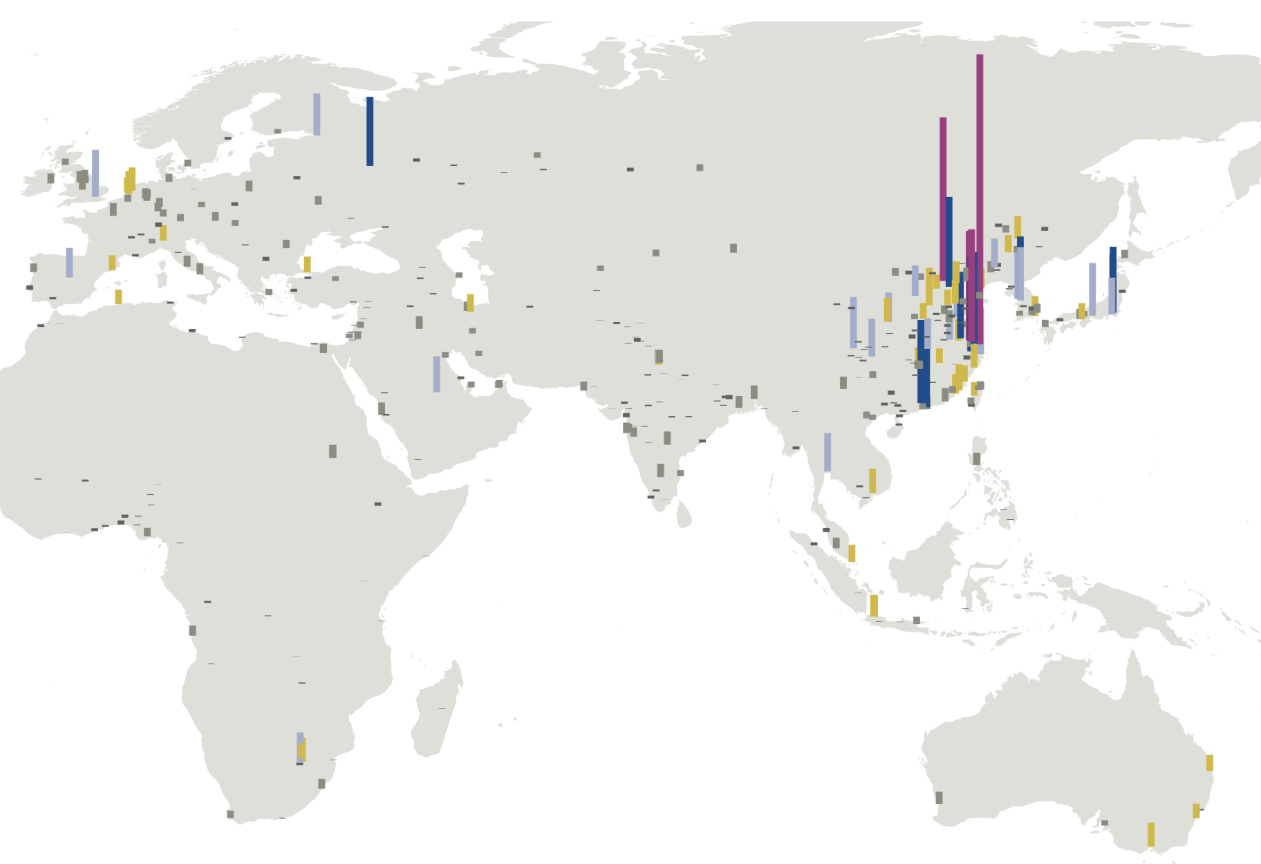
Globetrotting History of MetalData Visualization
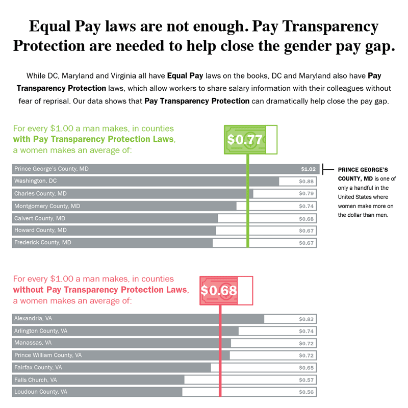
Equal Pay Laws are Not EnoughData Visualization
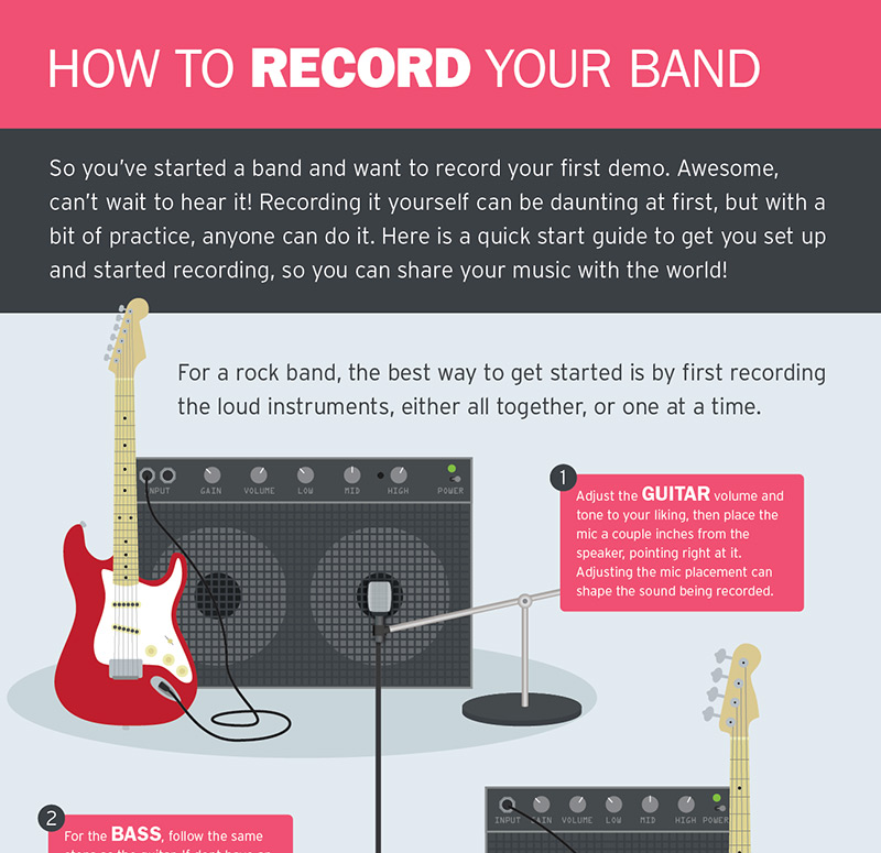
How to Record Your BandInfographic
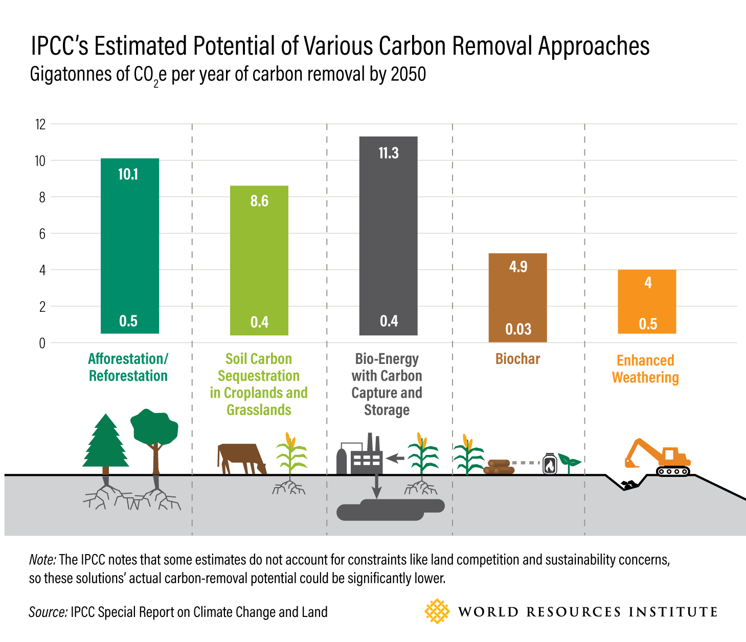
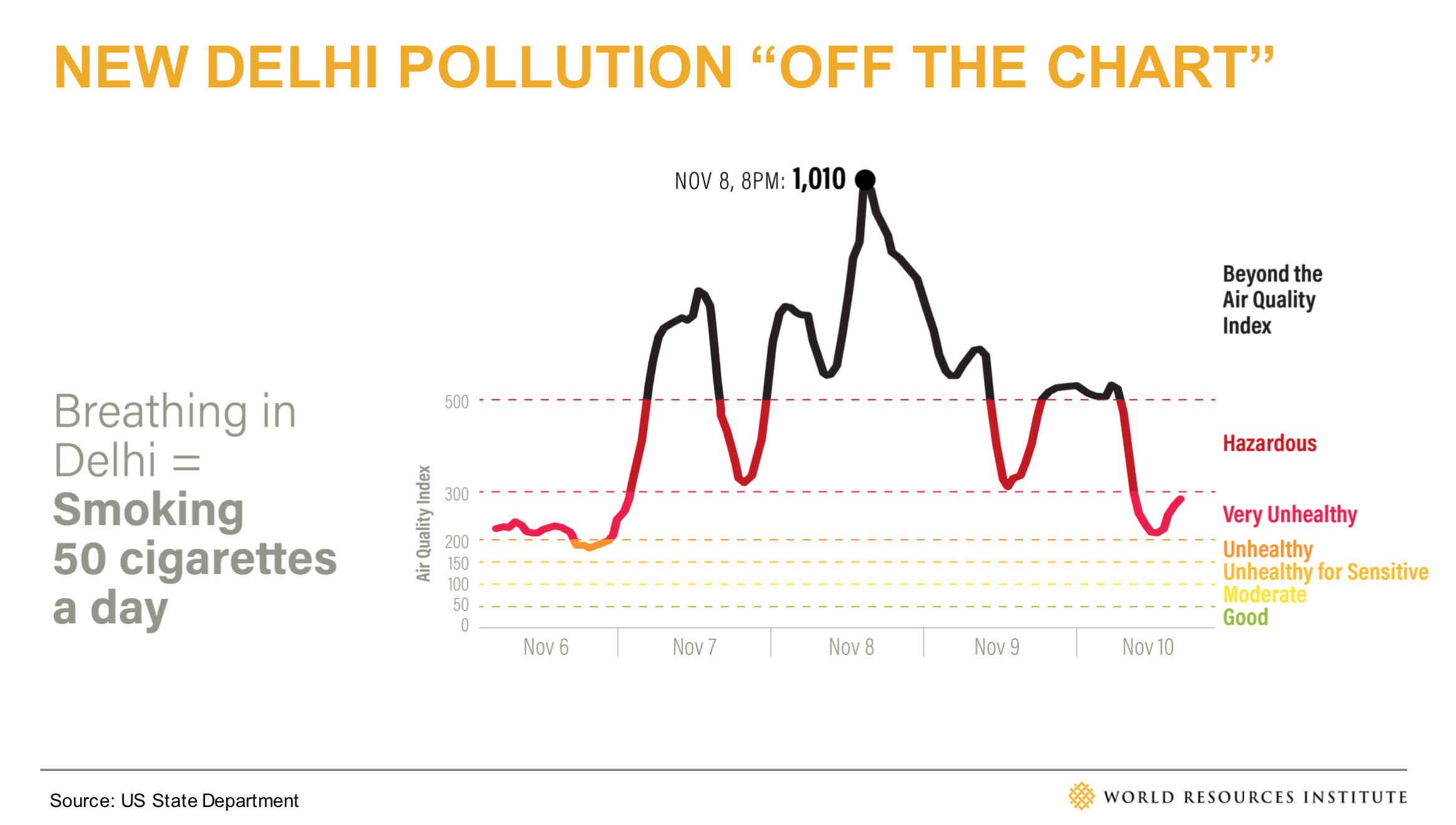
WRI Blog graphicsCharts & graphs
The Slow Recovery from the Great RecessionInteractive
The Race to the MoonInfographic
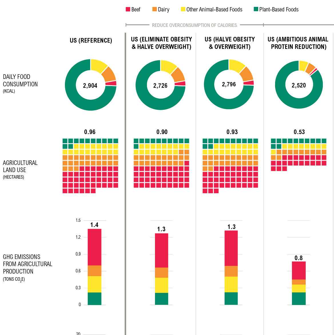
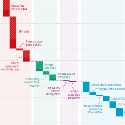
Shifting DietsData visualization
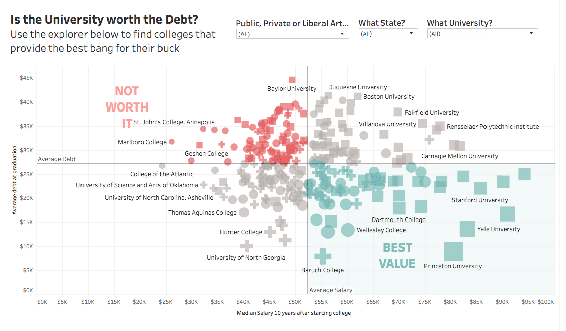
Is the University Worth the Debt?Interactive
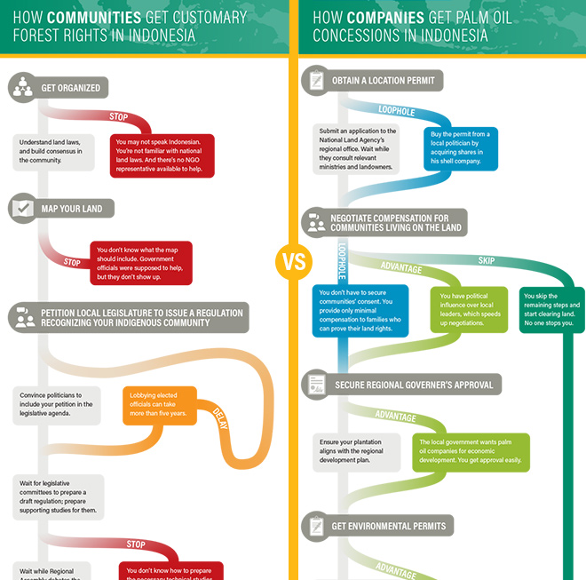
Scramble for Land RightsInfographic

Show FlyersConcert posters
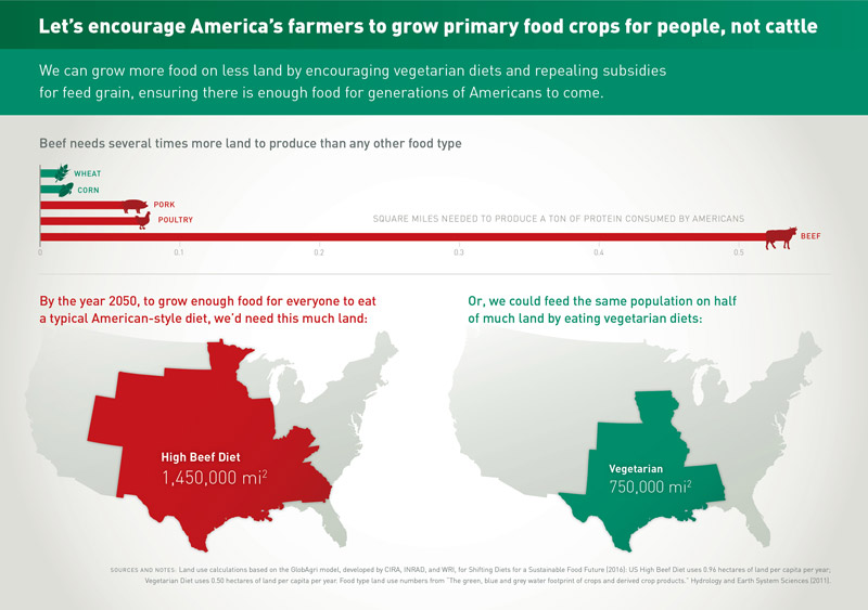
Land for Plants, not CattleInfographic
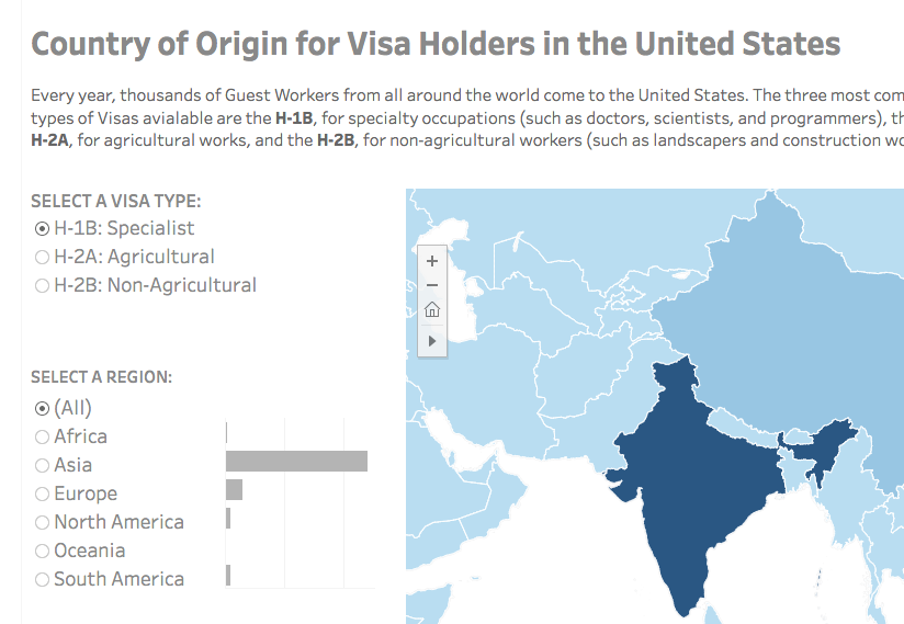
Visa Holders DashboardsInteractive
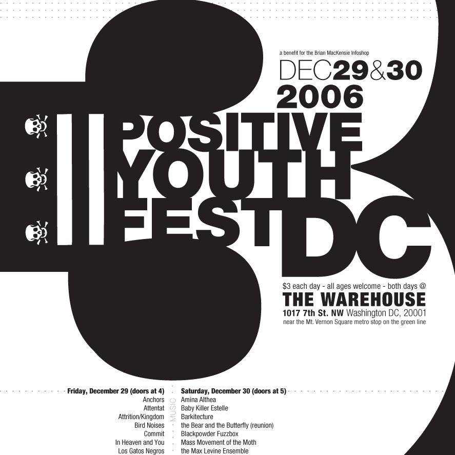
Positive Youth FestConcert Poster
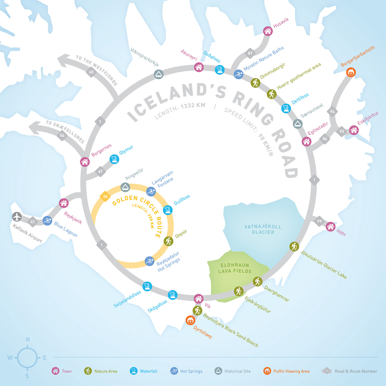
Iceland Ring Road MapInfographic
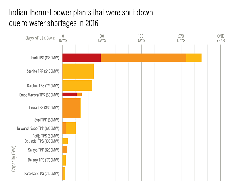
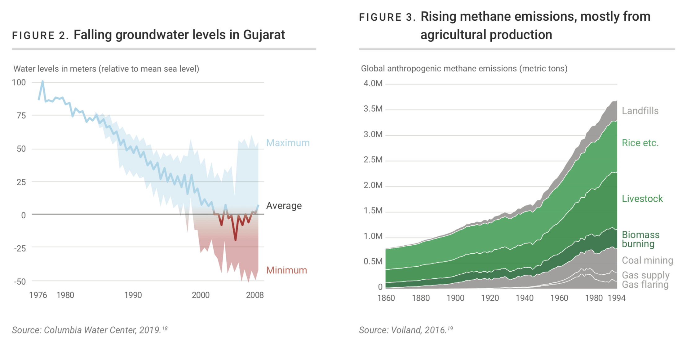
Droughts & BlackoutsData Visualization
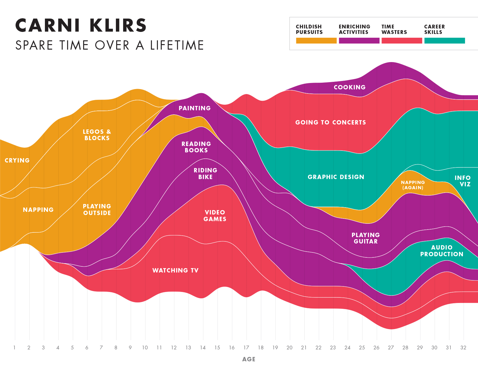
Spare Time over a LifetimeInfographic
Pinkwash posterConcert Poster
Please be in touch: carni.klirs@gmail.com. Follow me on instagram or twitter.