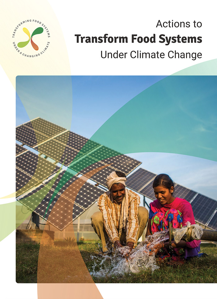
Actions to Transform Food Systems Under Climate Change
PUBLICATION DESIGN / DATA VISUALIZATION
At Graphicacy, I designed the publication and accompanying infographics and visualizations for a CGIAR Research Program on Climate Change, Agriculture and Food Security (CCAFS) report on how to transform food systems to avert a food and climate crisis.
Through the report, CCAFS and a panel of global experts in food security, food systems, agriculture and climate change identify high-priority actions to create sustainable, inclusive, healthy and climate-resilient food systems by 2030.
I started working with CCAFS when the report was in the drafting stage. At that time, the graphics in the report were a mix of new diagrams concepted by the authors and charts or maps cited from other sources. All had to be recreated to bring them in line with the visual style and color palette we established for this new report.
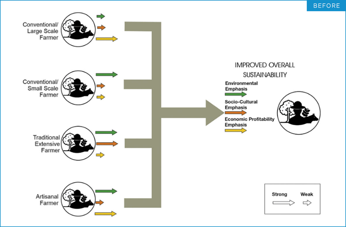
For the new diagrams and flowcharts concepted by the authors, I worked collaboratively to offer improvements on visual structure, language, and design to ensure the core narrative came through clearly.
For example, one of the report’s central concepts is “Different pathways for different types of farmers.” In other words, the path to a more sustainable, climate friendly farm looks different depending on the characteristics of the farm in question; environmental, socio-cultural, and economic considerations must be taken into account. I redesigned this diagram to make sure that narrative came through clearly:

I also redesigned charts and graphs that were cited from previously published sources. For these charts, I tried to maintain the structure of the original chart forms, while making design improvements for the sake of clarity. For example, the authors wanted to pair these two charts to show the environmental impact of food production on both freshwater use and greenhouse gas emissions.

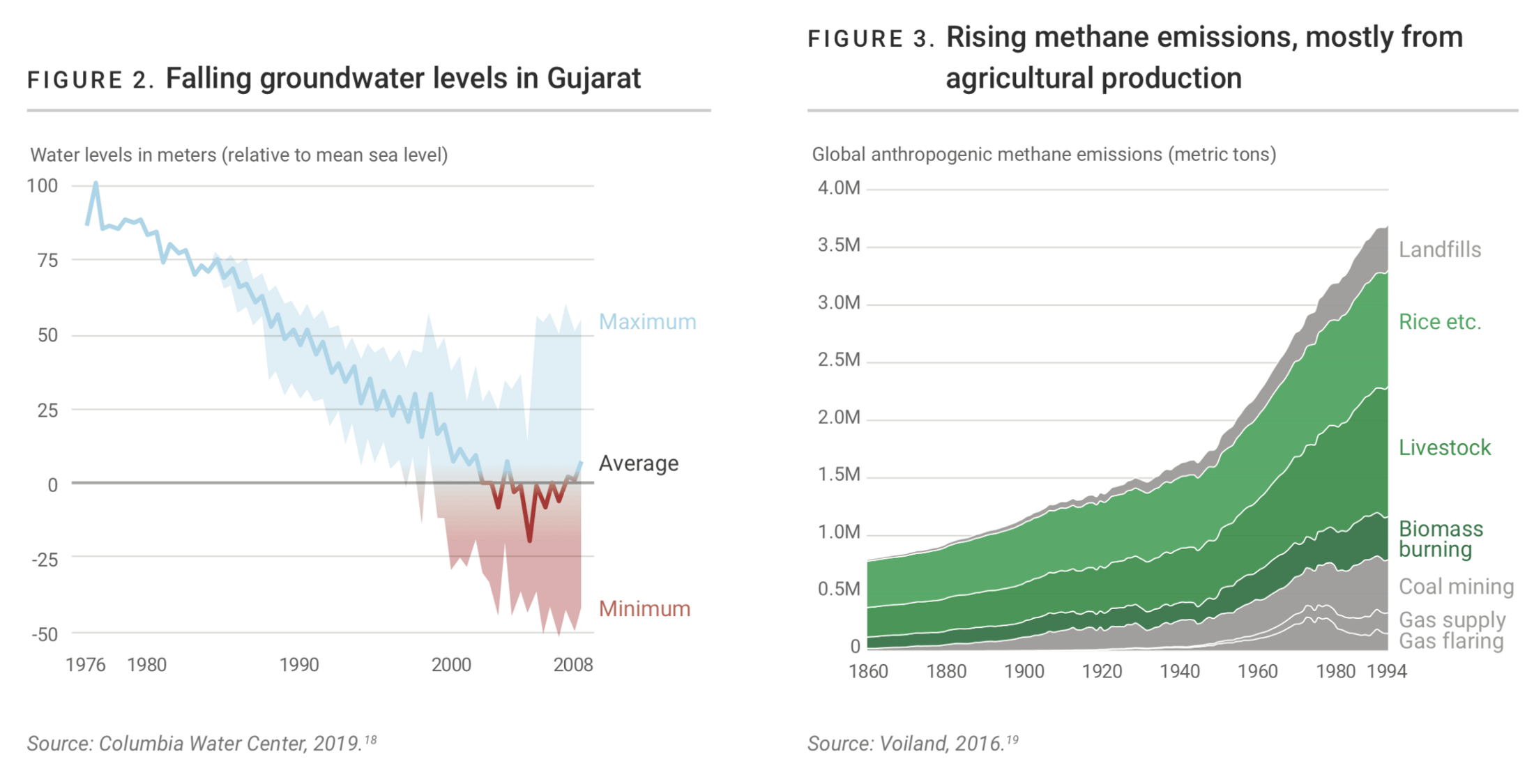
For the first chart, which shows falling groundwater levels in Gujarat, India, I offered a number of improvements. First I kept the Average line as a line, then converted the Minimum and Maximum to an area chart, so the chart reads more easily as displaying a single data set, with uncertainty, rather than three different data sets. I then changed the use of color to emphasize the zero line on the Y axis, and reinforce the story that groundwater has fallen to critical levels in recent years.
The clarity of the second chart was also improved, by moving the labels to the right side of the chart, and coloring in just the areas related to agricultural production. This creates a stronger connection between the chart title and the chart content; they mutually reinforce each other.
Other Projects:
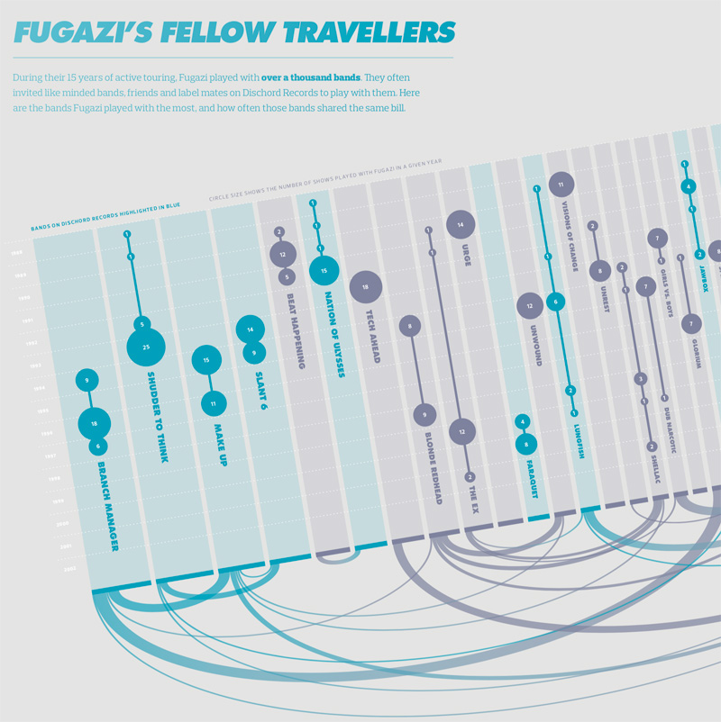
Visualizing the History of FugaziData Visualization
COVID-19 Testing Trends TrackerData Visualization
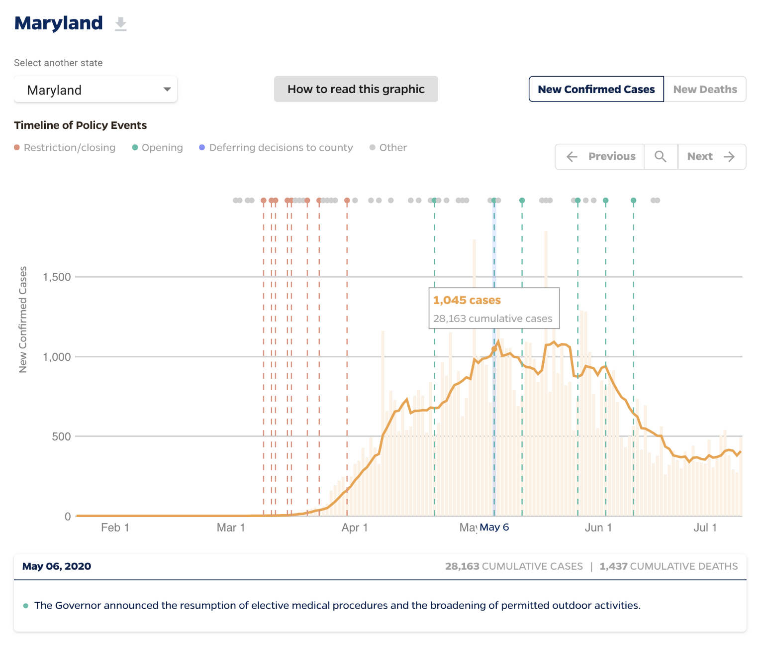
Timeline of COVID Policies in the U.S.Data Visualization
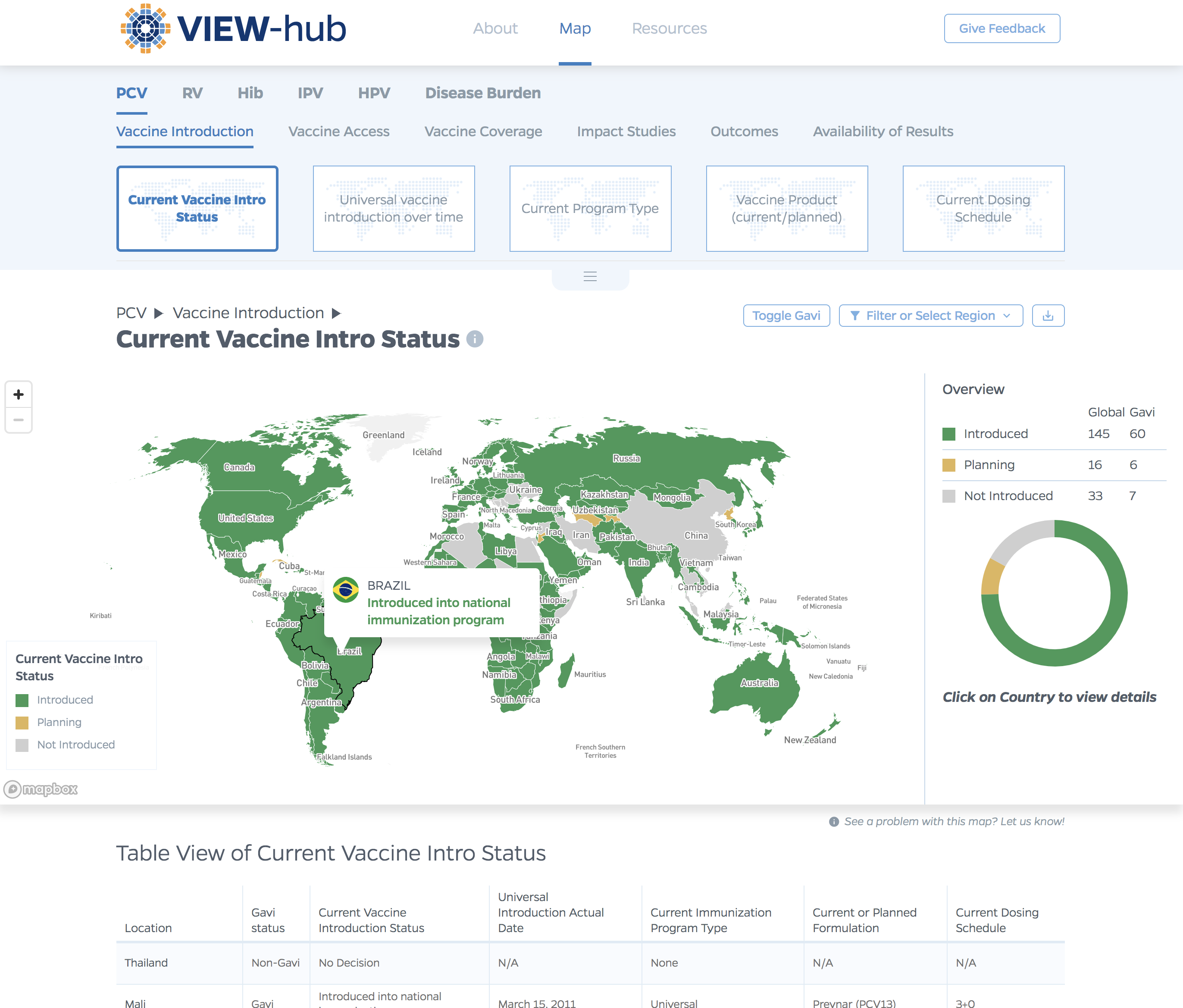
VIEW-hub website designUI/UX Design & Data Visualization

Transforming Food Systems Under Climate ChangeData Visualization & Report Design
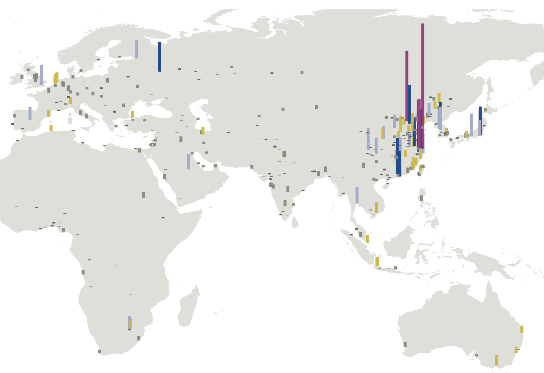
Towards a More Equal CityData Visualization
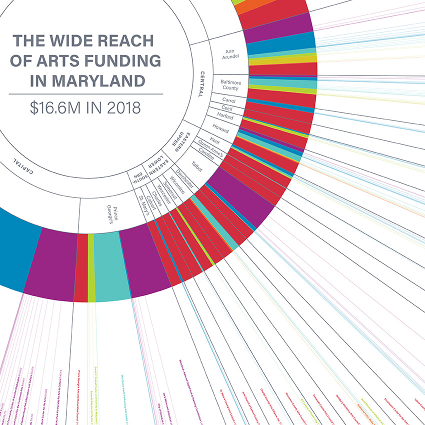
Wide Reach of Arts Funding in MarylandData Visualization
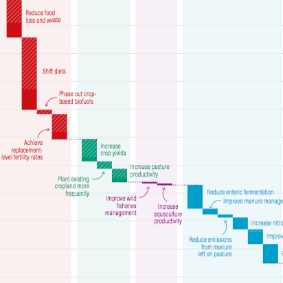
Creating a Sustainable Food FutureData Visualization & Report Design
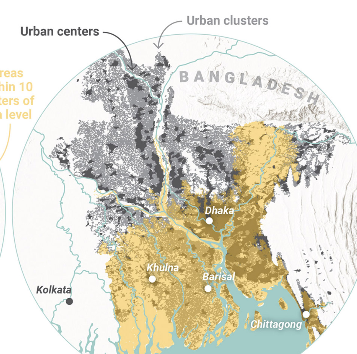
Global Commission on AdaptationMap & Infographic Design
Logo & Branding projectsLogo design
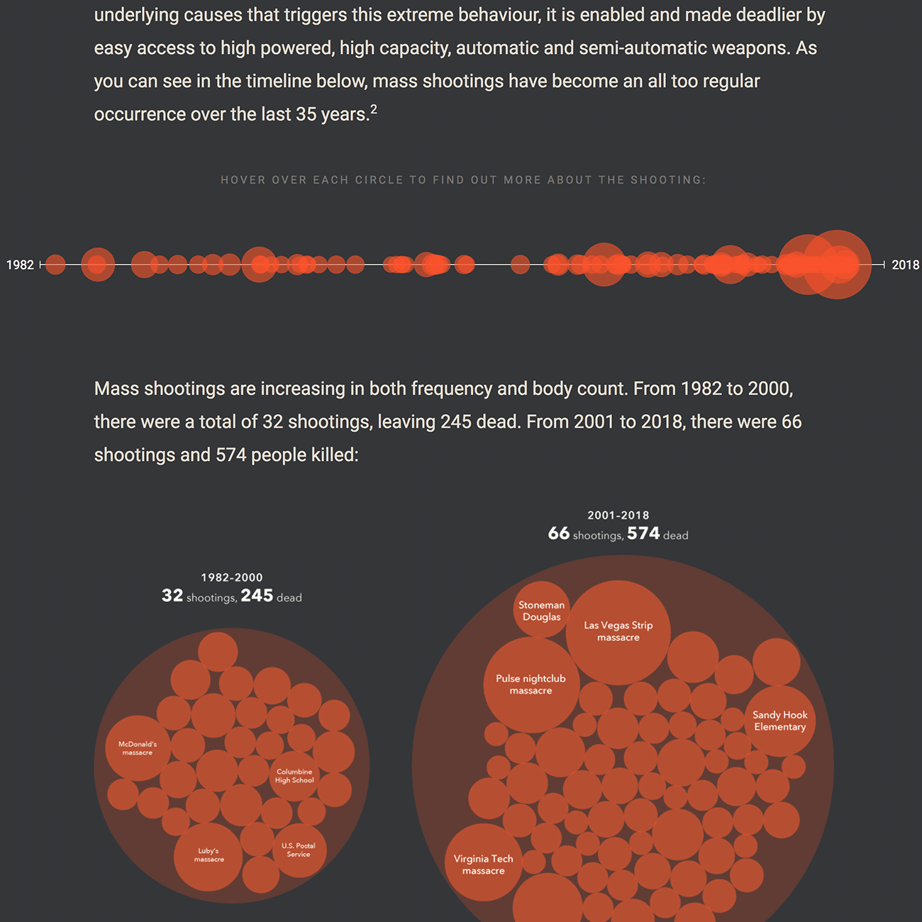
Sensible Gun Laws NowInteractive
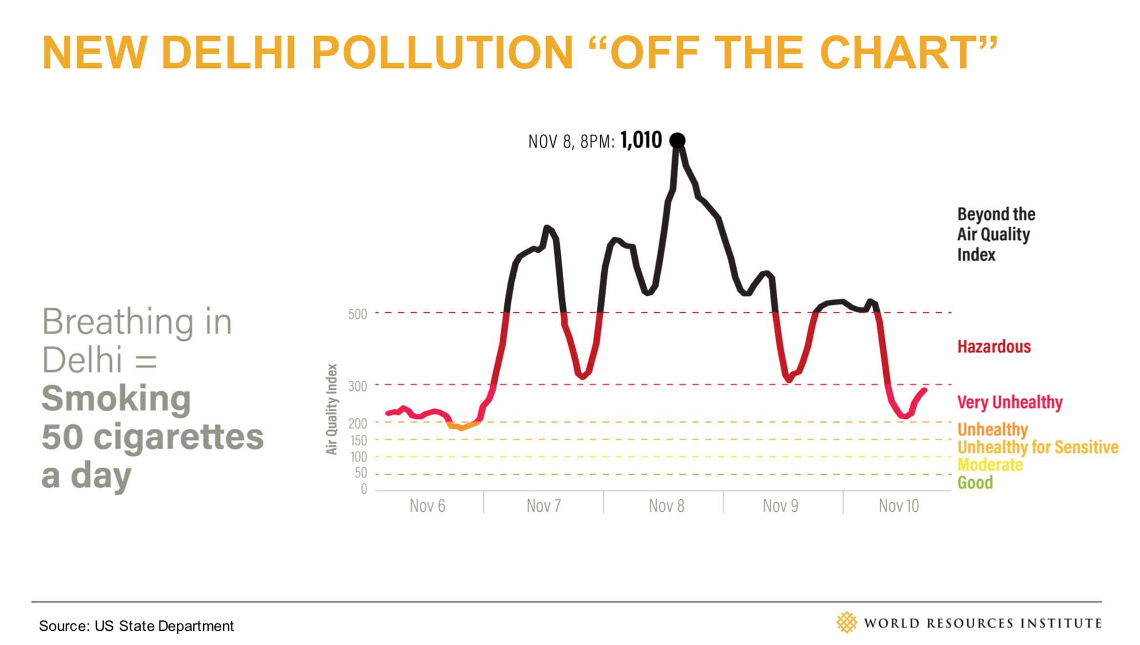
Stories to WatchPresentation Design
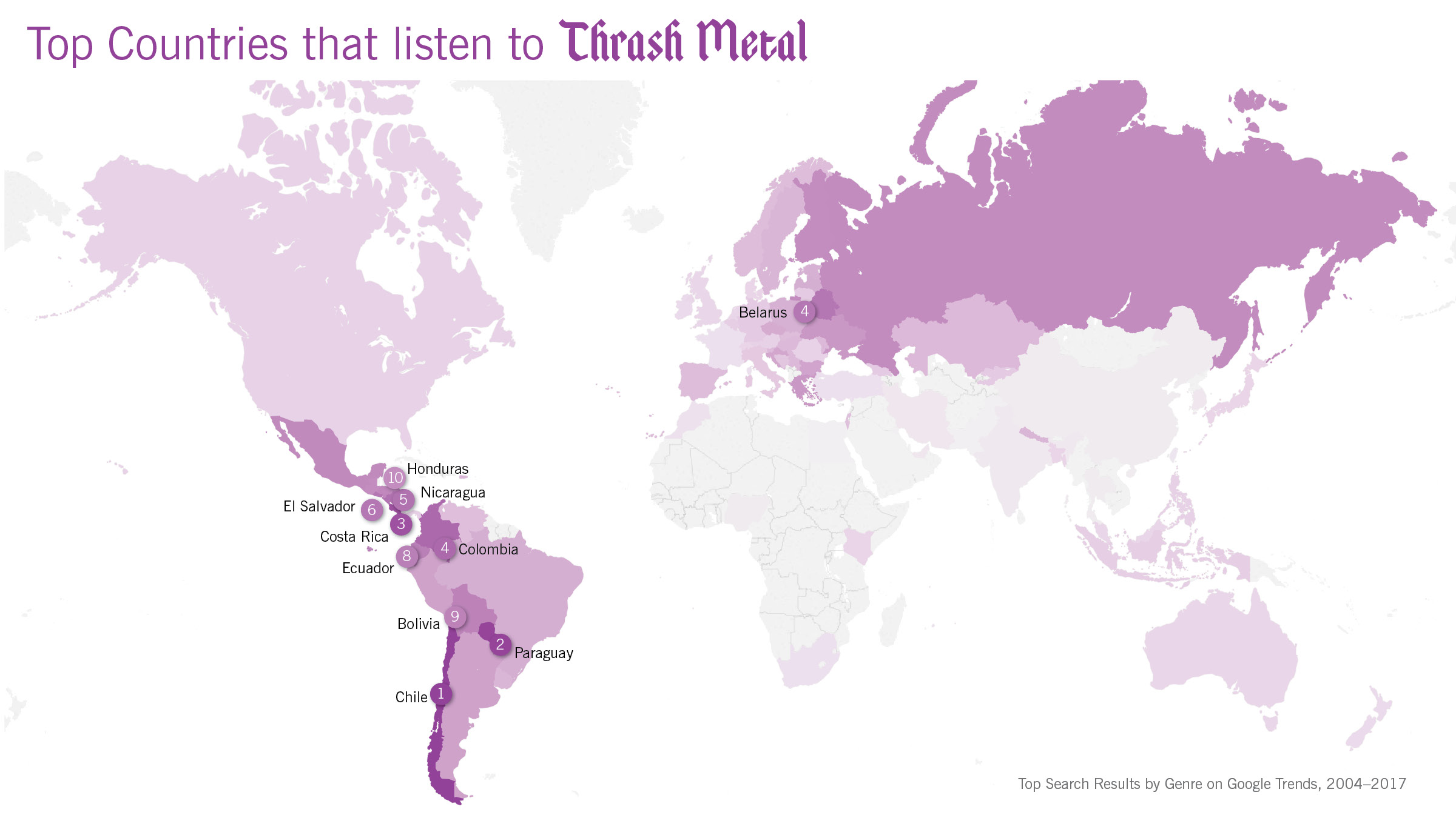
Globetrotting History of MetalData Visualization
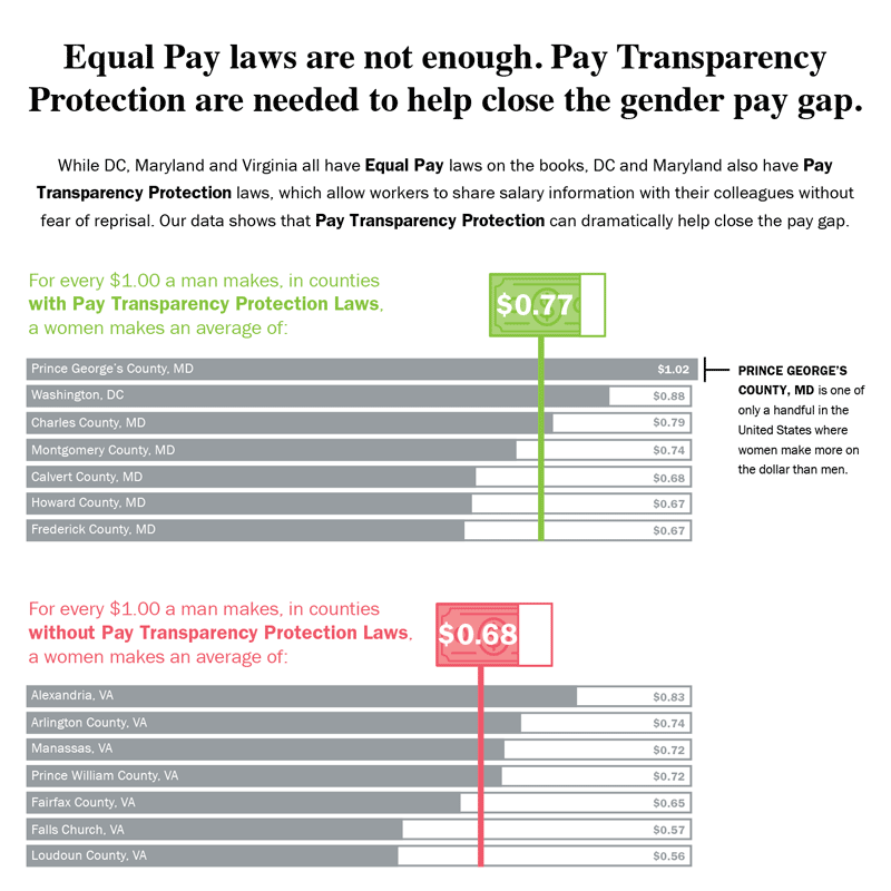
Equal Pay Laws are Not EnoughData Visualization

How to Record Your BandInfographic
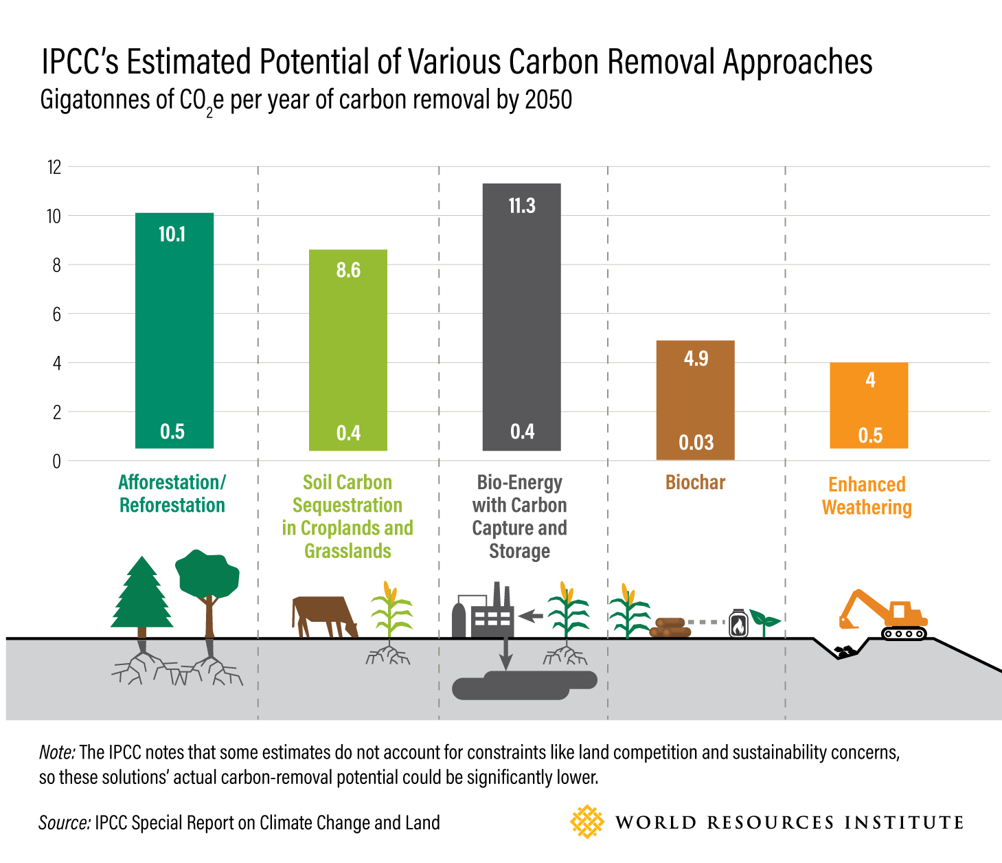
WRI Blog graphicsCharts & graphs
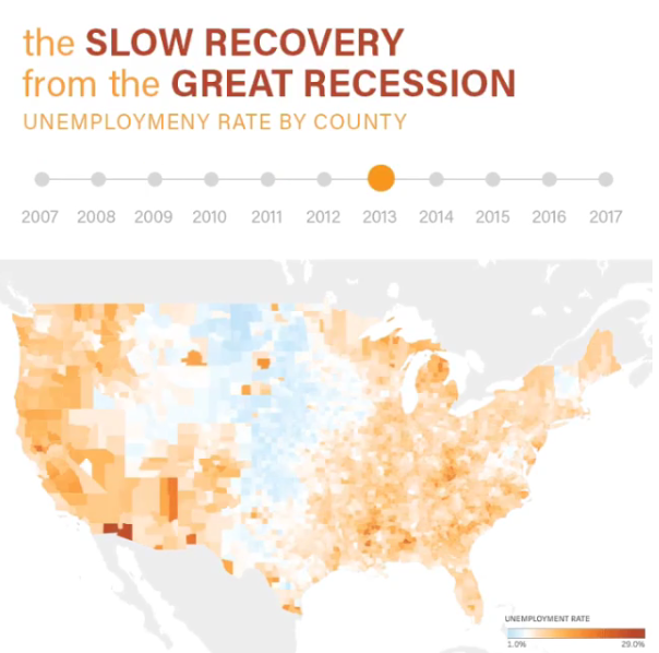
The Slow Recovery from the Great RecessionInteractive
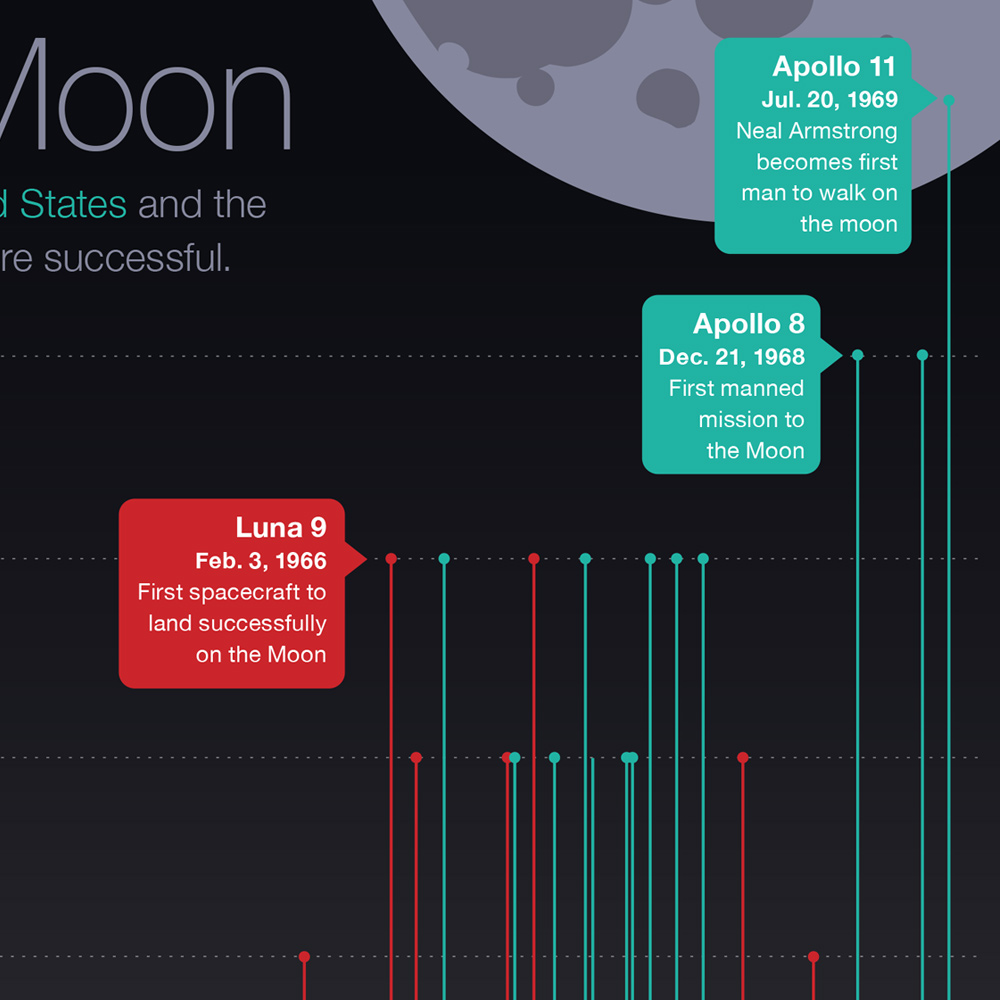
The Race to the MoonInfographic
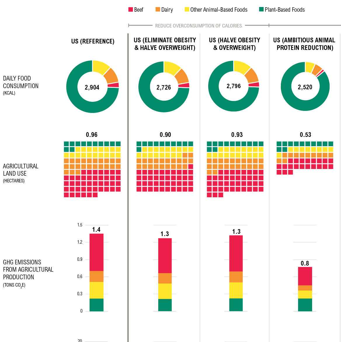
Shifting DietsData visualization
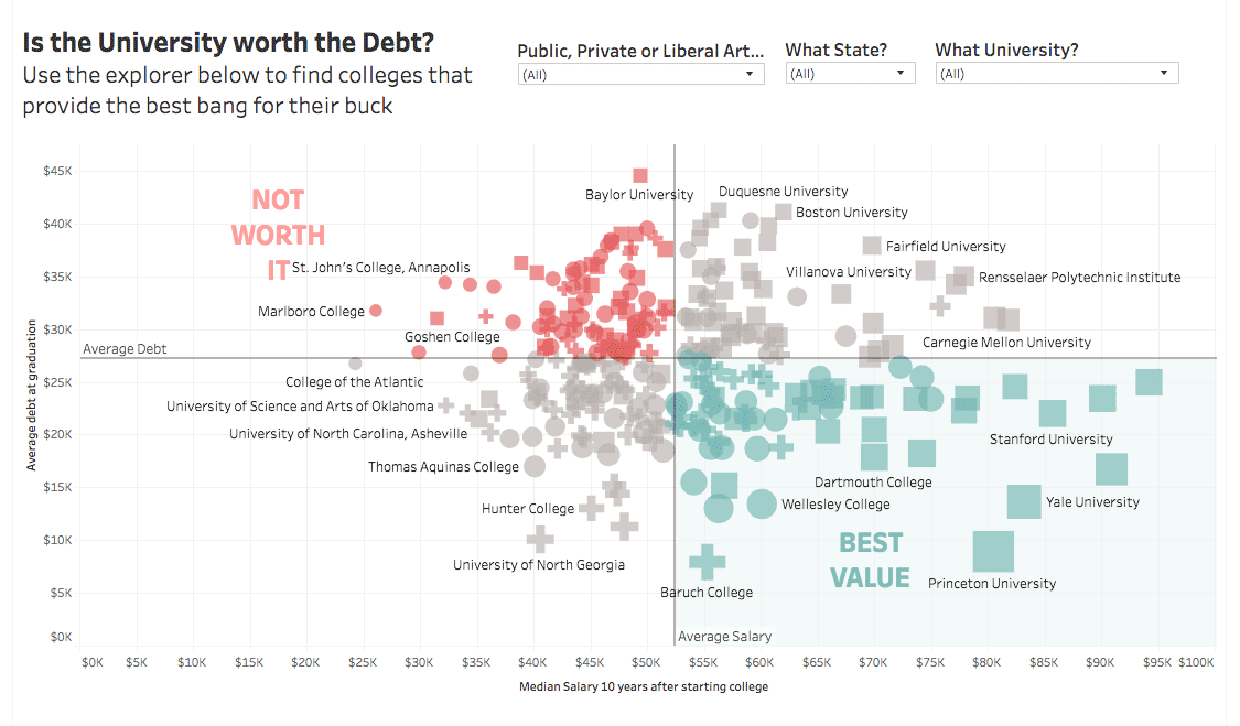
Is the University Worth the Debt?Interactive
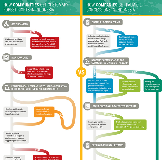
Scramble for Land RightsInfographic

Show FlyersConcert posters
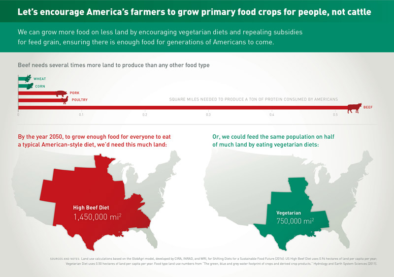
Land for Plants, not CattleInfographic
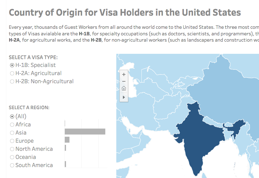
Visa Holders DashboardsInteractive
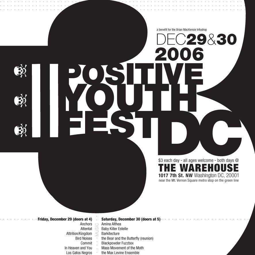
Positive Youth FestConcert Poster
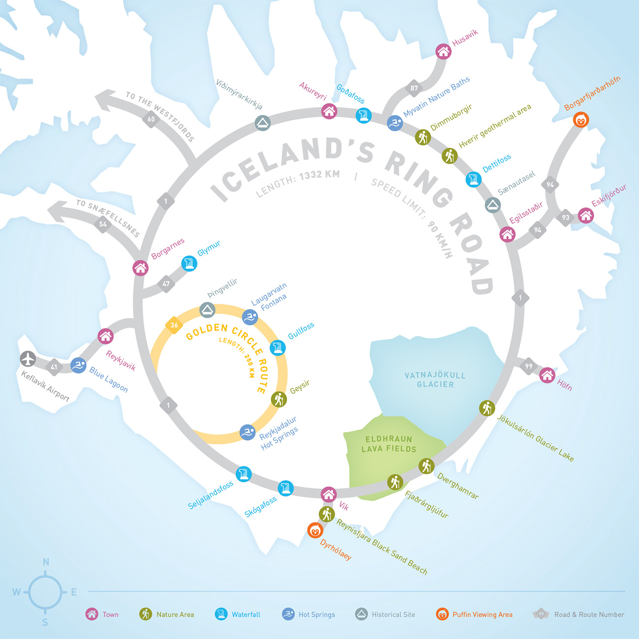
Iceland Ring Road MapInfographic
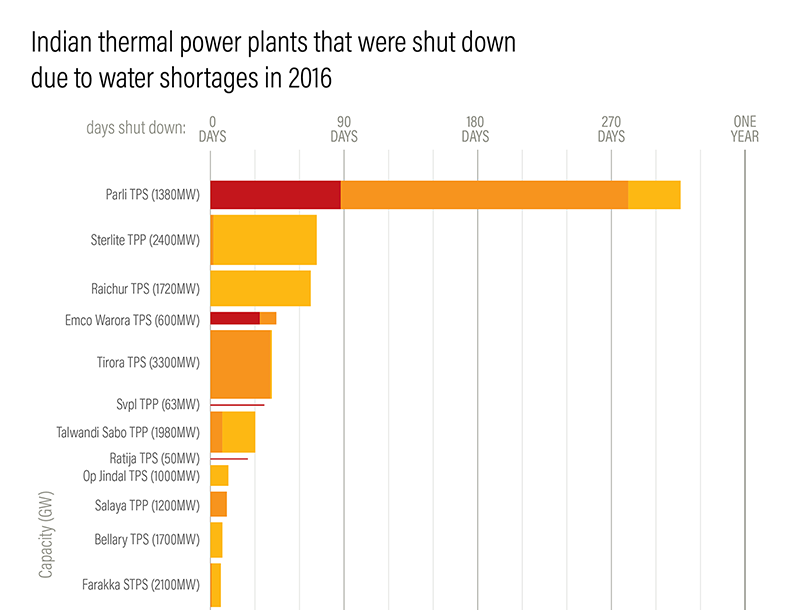
Droughts & BlackoutsData Visualization
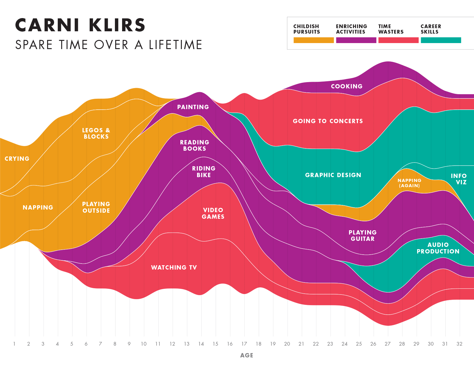
Spare Time over a LifetimeInfographic

Pinkwash posterConcert Poster
Please be in touch: carni.klirs@gmail.com. Follow me on instagram or twitter.