Droughts & Blackouts
DATA VISUALIZATION
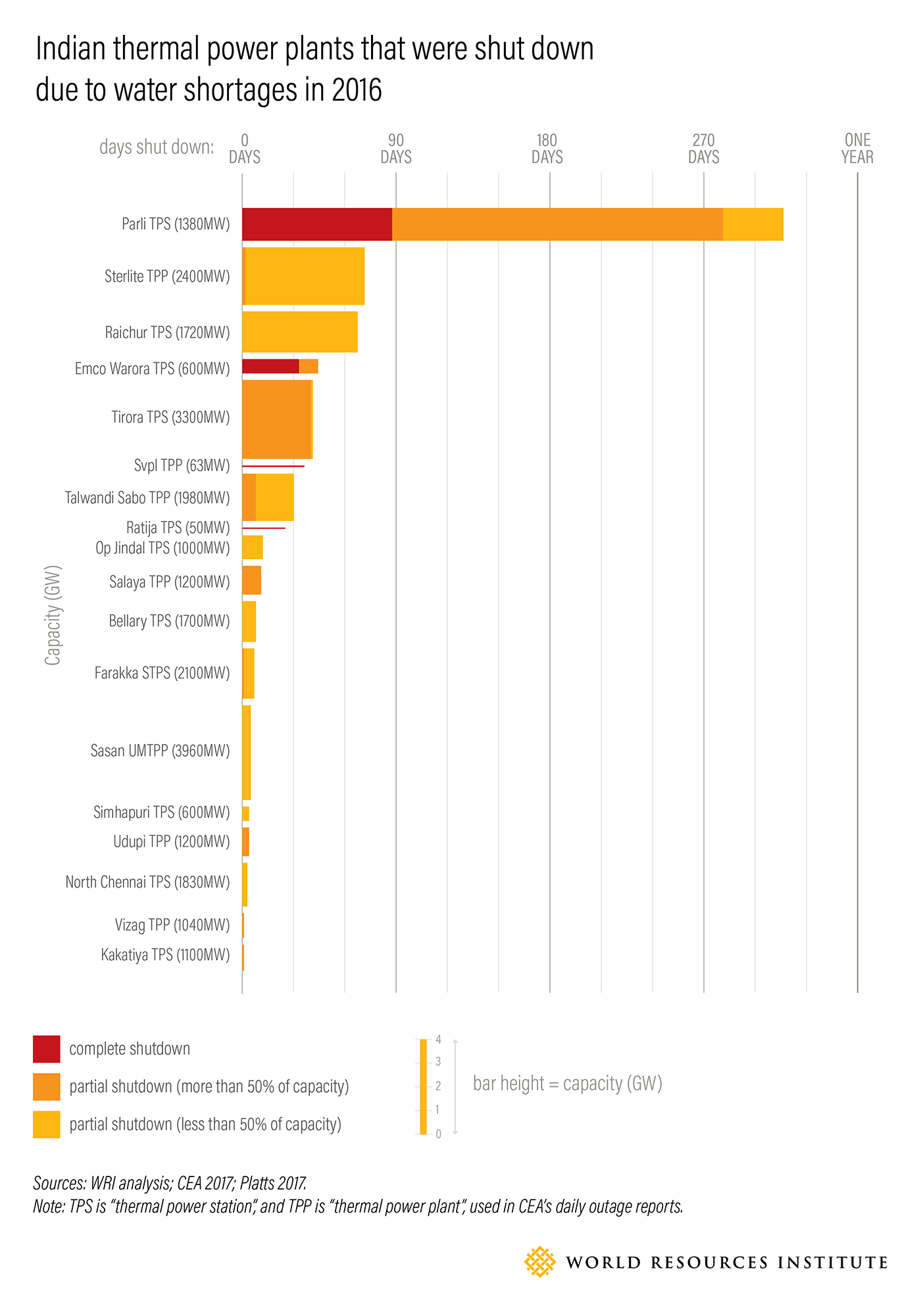
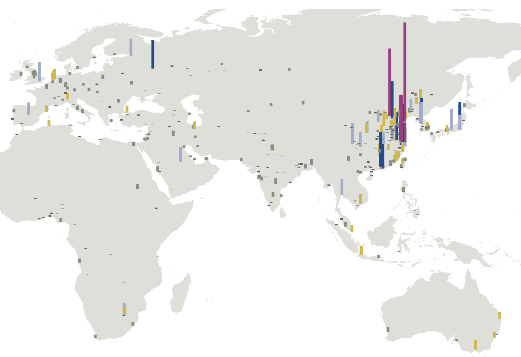
Working closely with research staff at World Resources Institute, I designed the graphics to accompy a blog post about the intersection of power and water use in India. Because the majority of power plants in India are very water intensive, they cannot run when there is a water shortage. Looking at water as a cause of blackouts is a new story, and these explainer graphics helped to make the case visually. This first graphic shows the number of days each power plant was shut down, along the X axis, and scaled vertically by generation capacity:
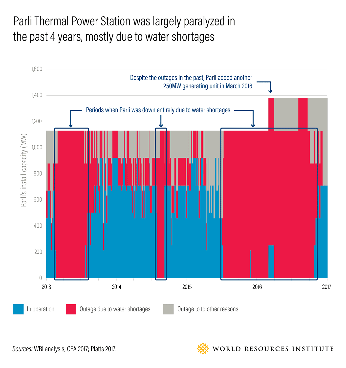
This heatmap of outages makes it the overall trends clear, when the plant was shut down for long periods entirely because of water shortages:
Other Projects:
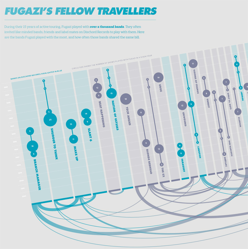
Visualizing the History of FugaziData Visualization
COVID-19 Testing Trends TrackerData Visualization
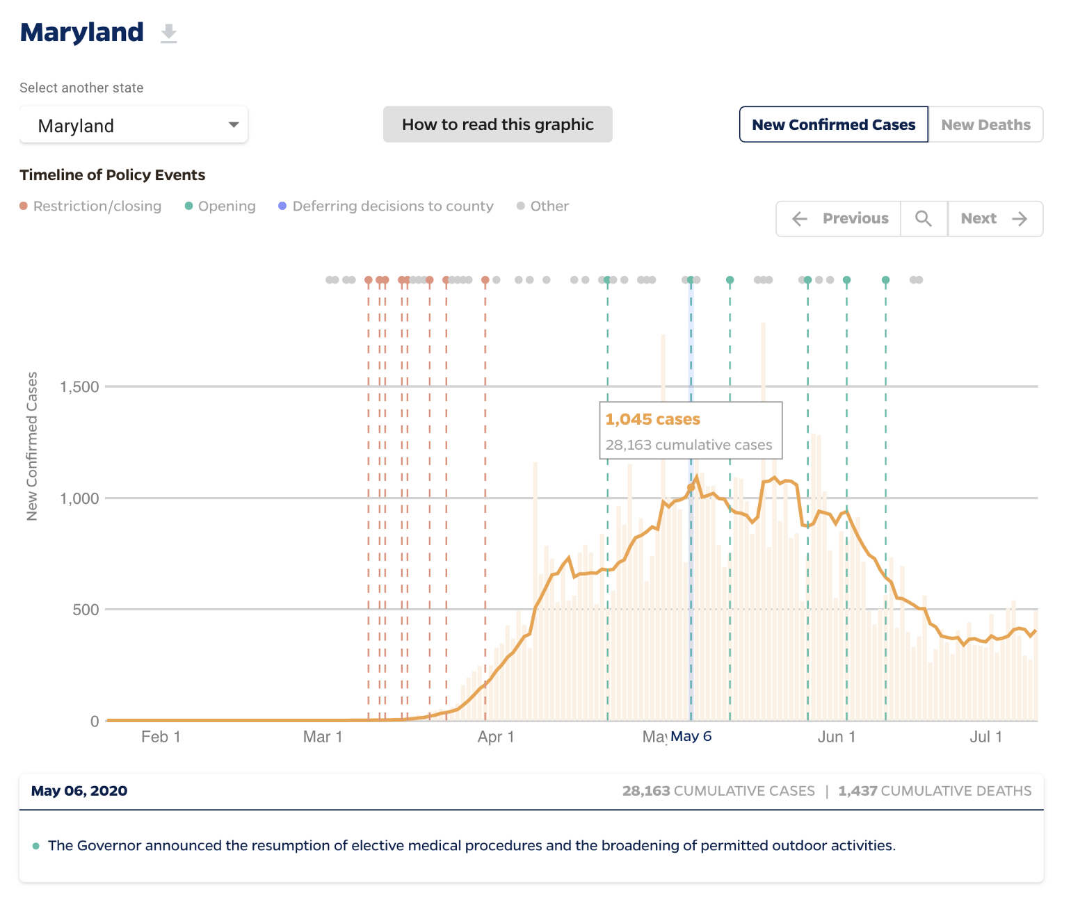
Timeline of COVID Policies in the U.S.Data Visualization
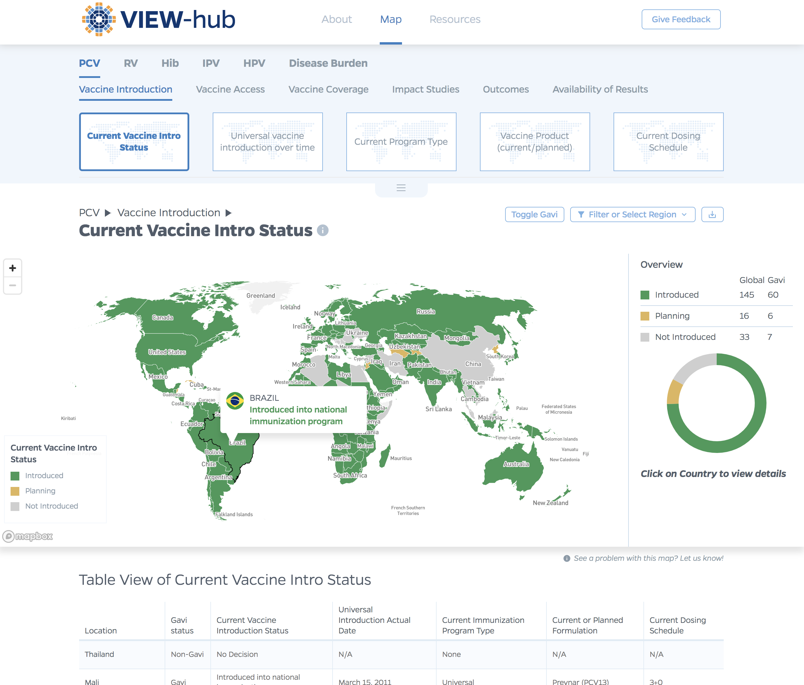
VIEW-hub website designUI/UX Design & Data Visualization
Transforming Food Systems Under Climate ChangeData Visualization & Report Design
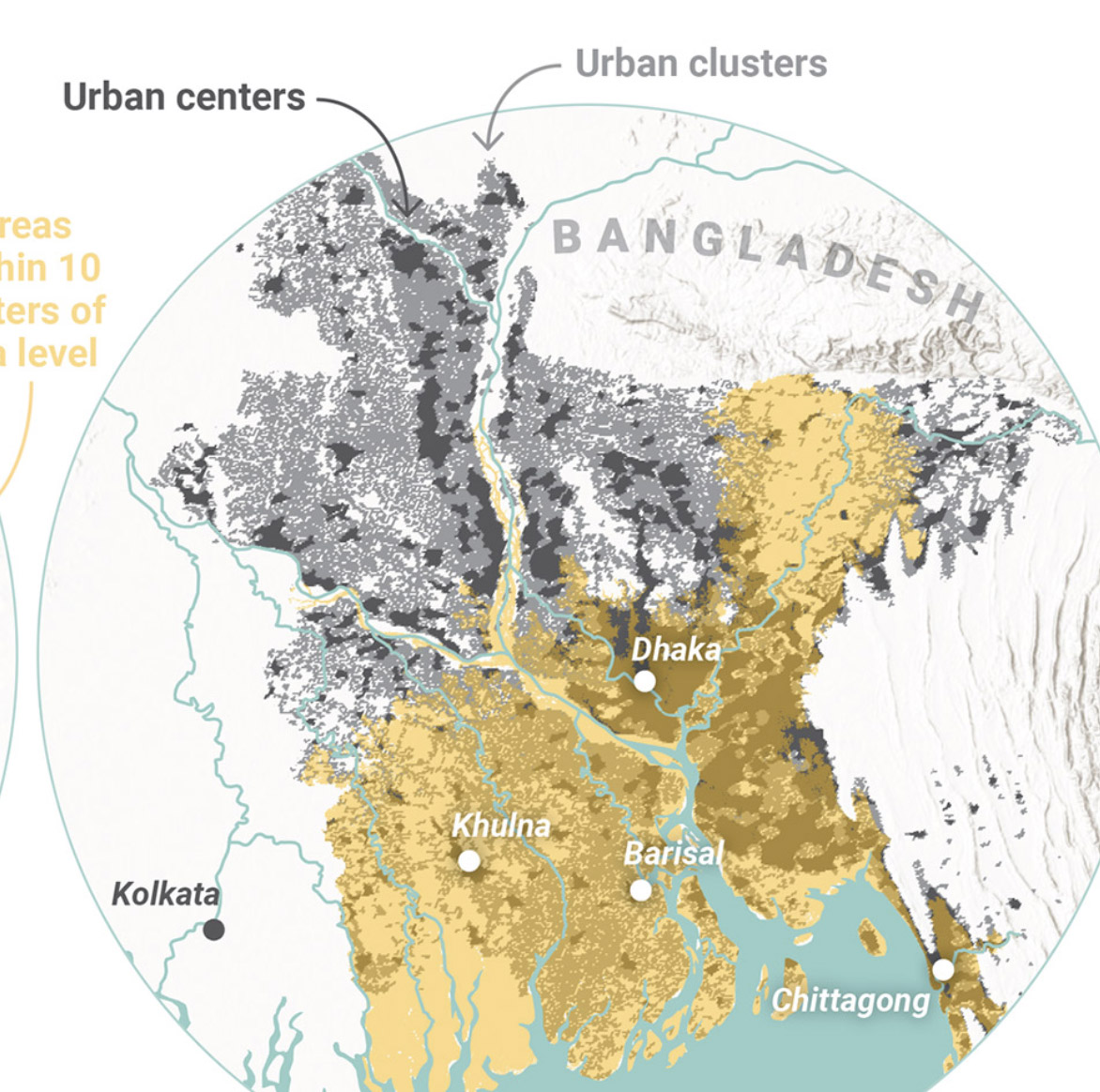
Towards a More Equal CityData Visualization
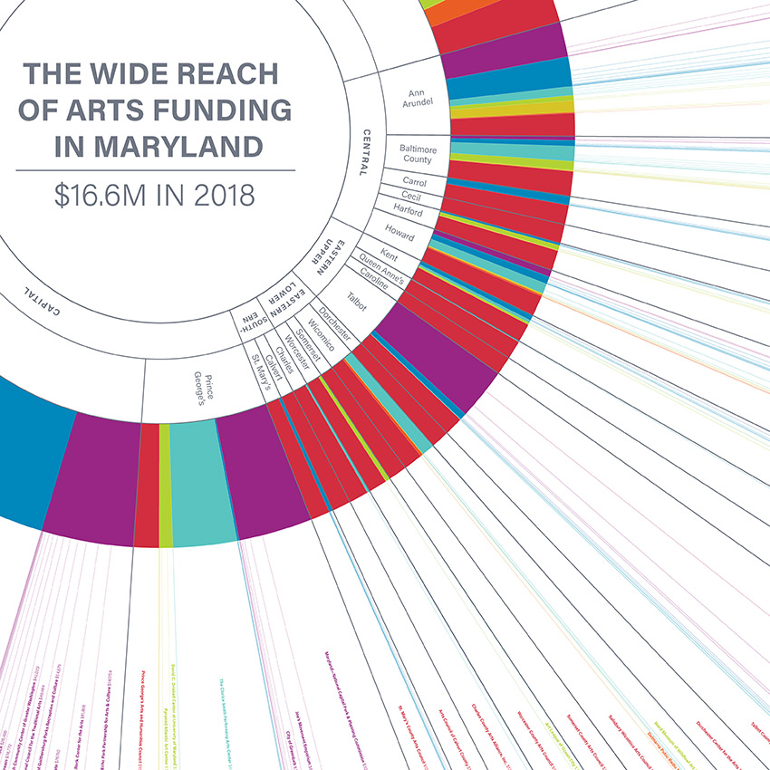
Wide Reach of Arts Funding in MarylandData Visualization
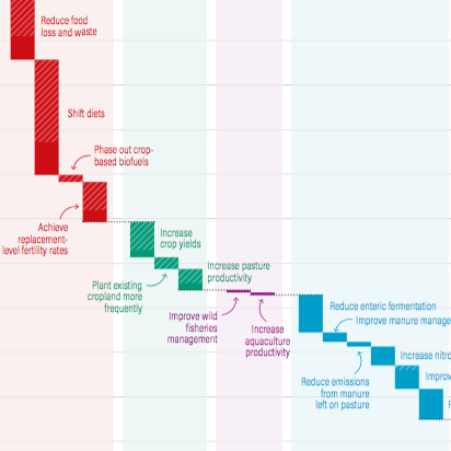
Creating a Sustainable Food FutureData Visualization & Report Design
Global Commission on AdaptationMap & Infographic Design
Logo & Branding projectsLogo design
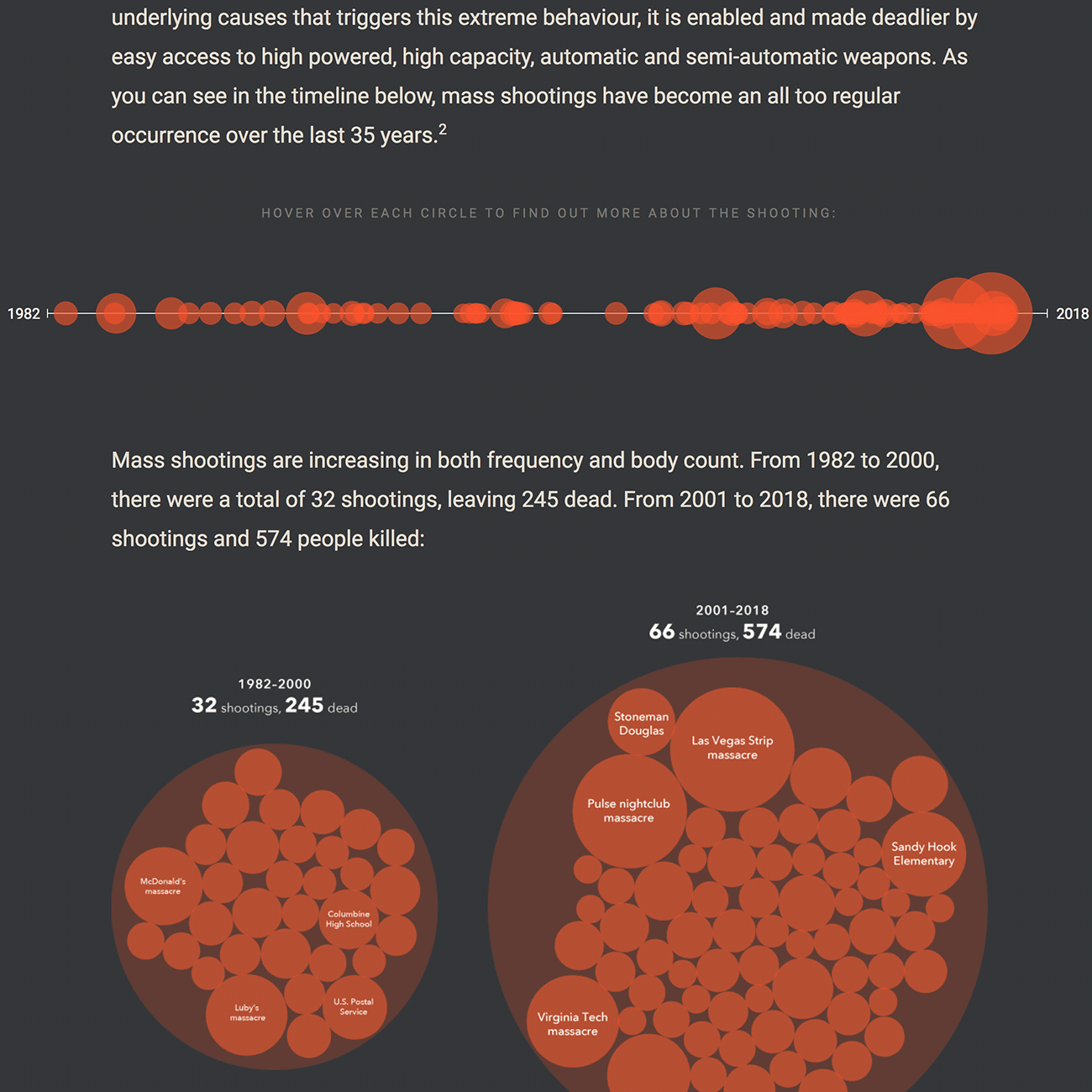
Sensible Gun Laws NowInteractive
Stories to WatchPresentation Design
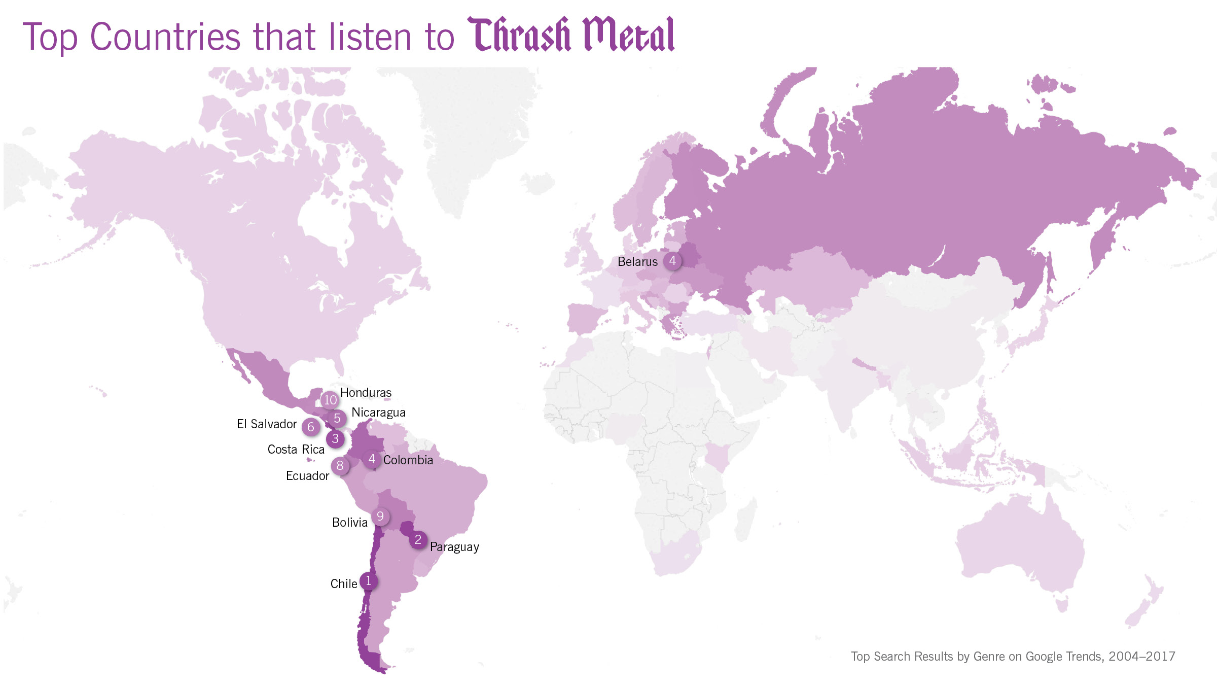
Globetrotting History of MetalData Visualization
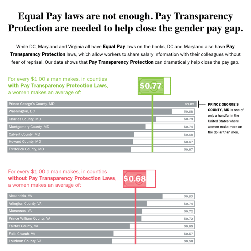
Equal Pay Laws are Not EnoughData Visualization

How to Record Your BandInfographic
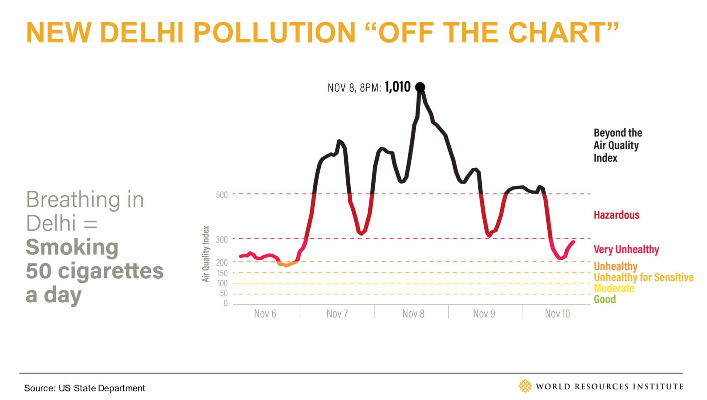
WRI Blog graphicsCharts & graphs
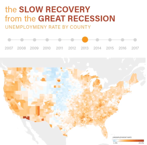
The Slow Recovery from the Great RecessionInteractive
The Race to the MoonInfographic
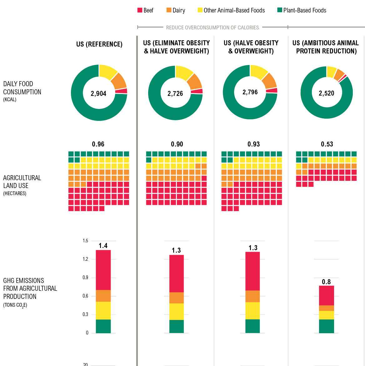
Shifting DietsData visualization
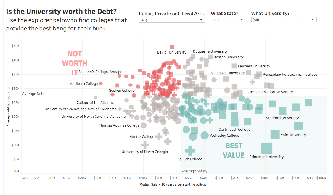
Is the University Worth the Debt?Interactive
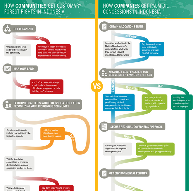
Scramble for Land RightsInfographic

Show FlyersConcert posters
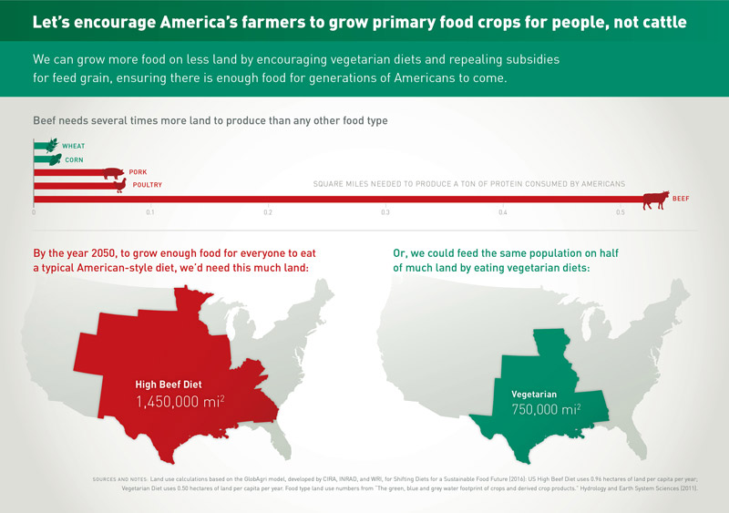
Land for Plants, not CattleInfographic
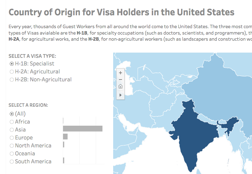
Visa Holders DashboardsInteractive

Positive Youth FestConcert Poster
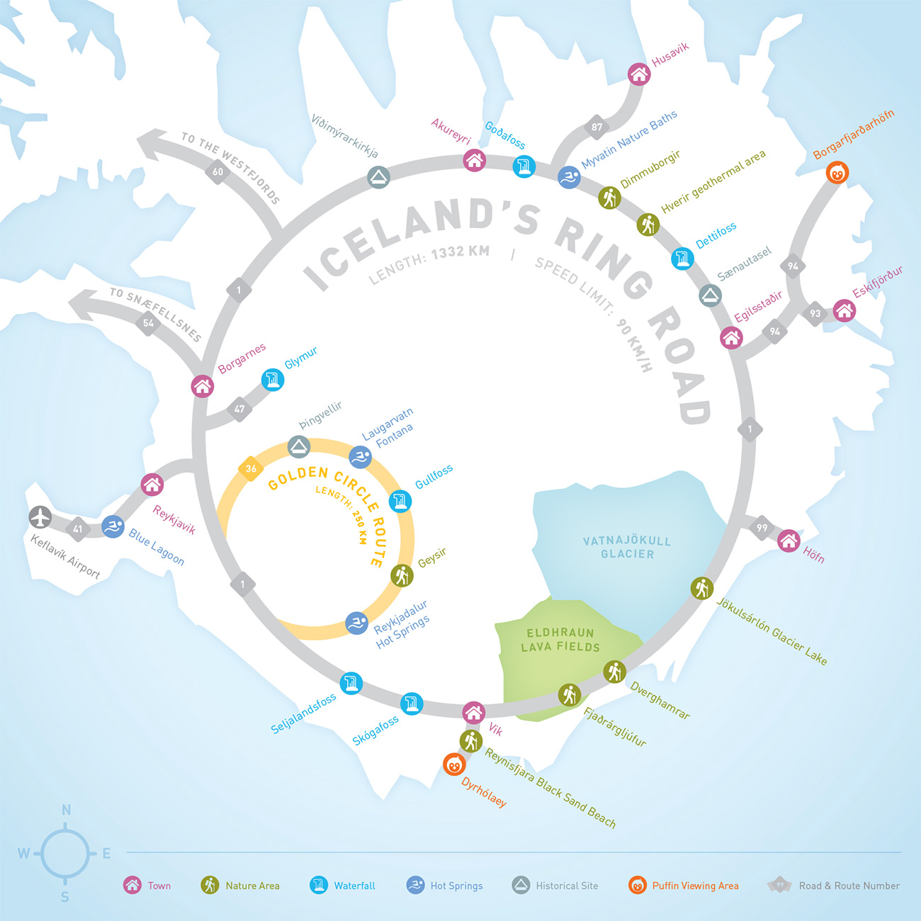
Iceland Ring Road MapInfographic
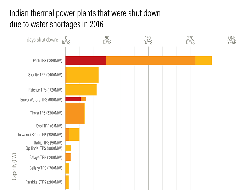
Droughts & BlackoutsData Visualization
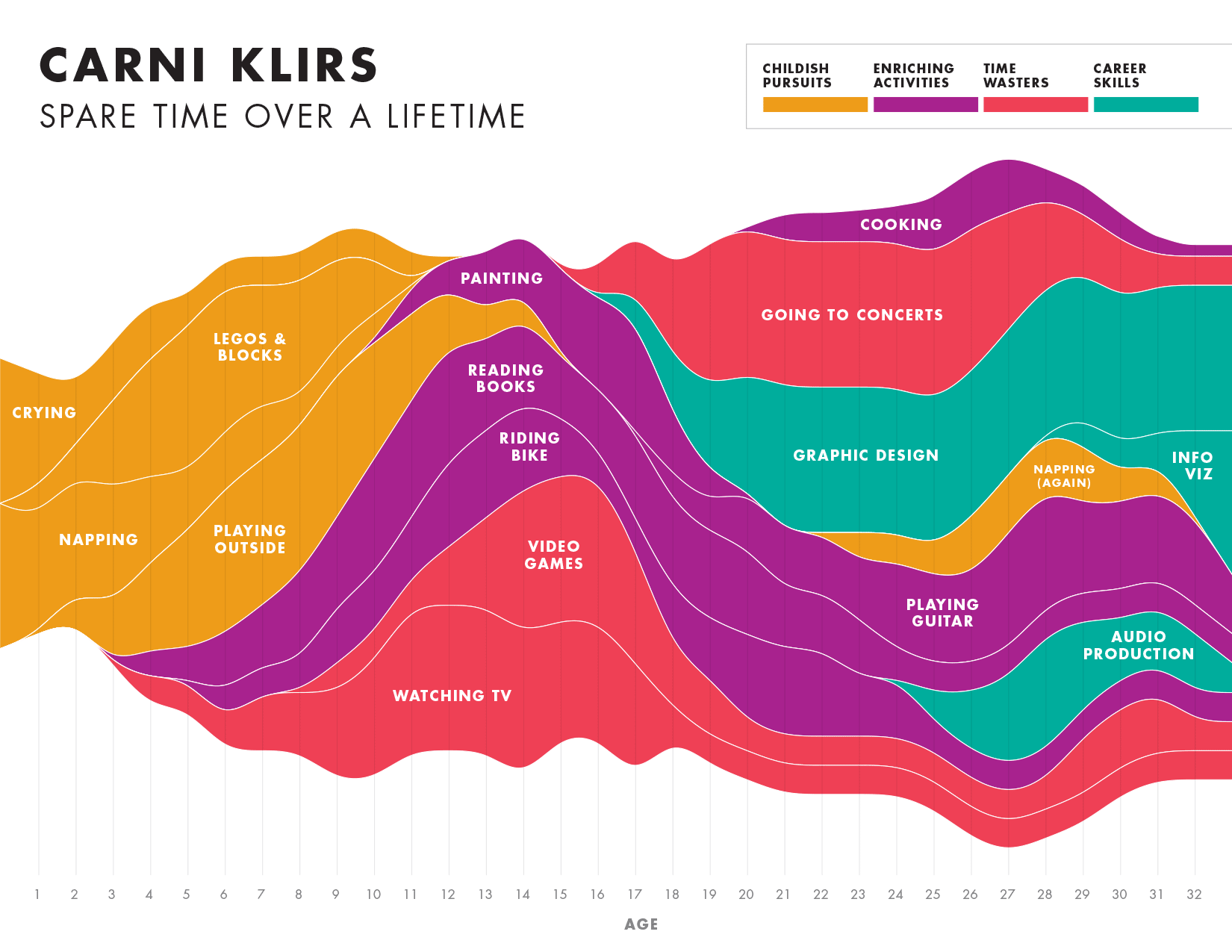
Spare Time over a LifetimeInfographic

Pinkwash posterConcert Poster
Please be in touch: carni.klirs@gmail.com. Follow me on instagram or twitter.