Timeline of COVID Policies in the U.S.
INTERACTIVE / DATA VISUALIZATION
Designed at Graphicacy for Johns Hopkins University's Coronavirus Resource Center.
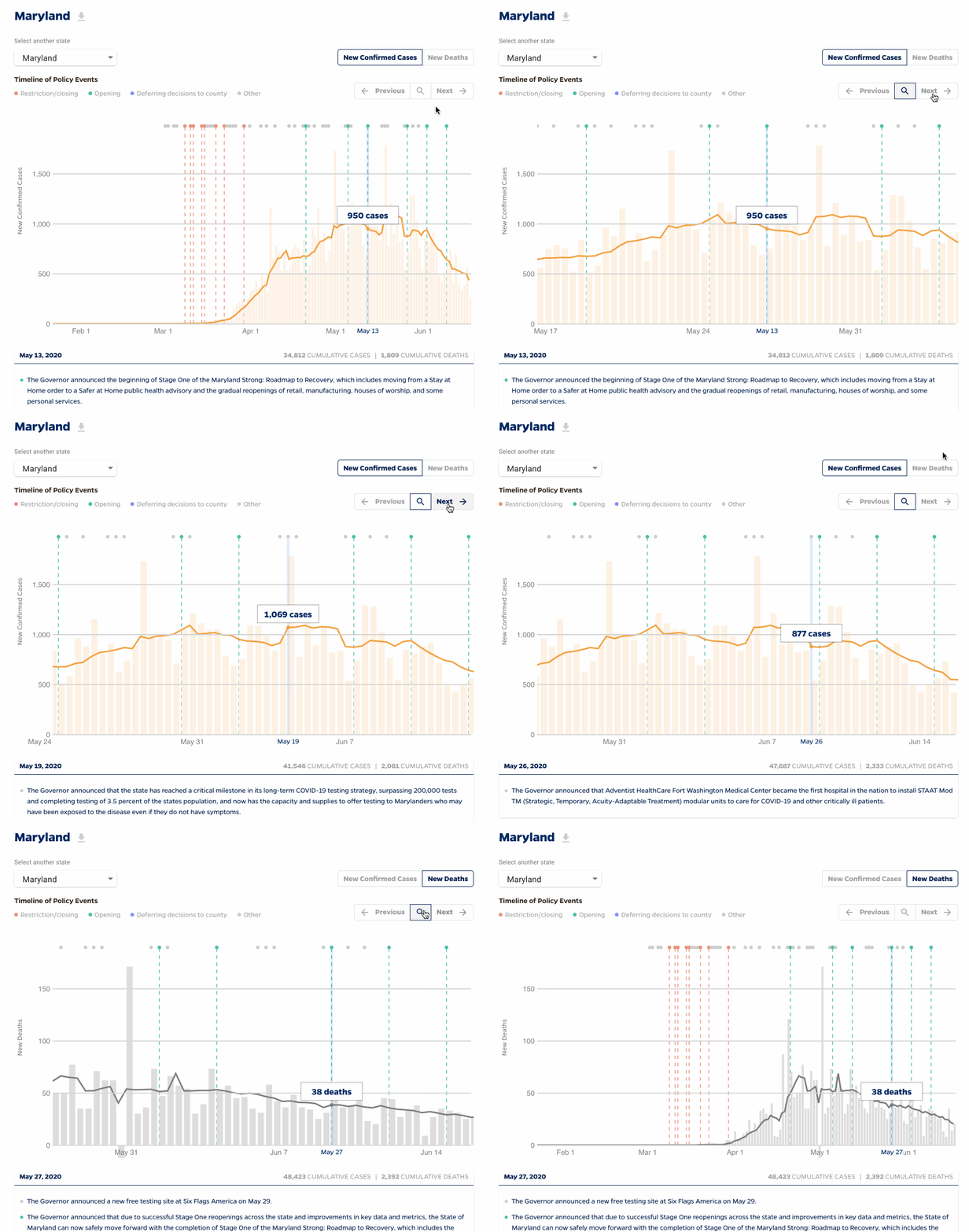
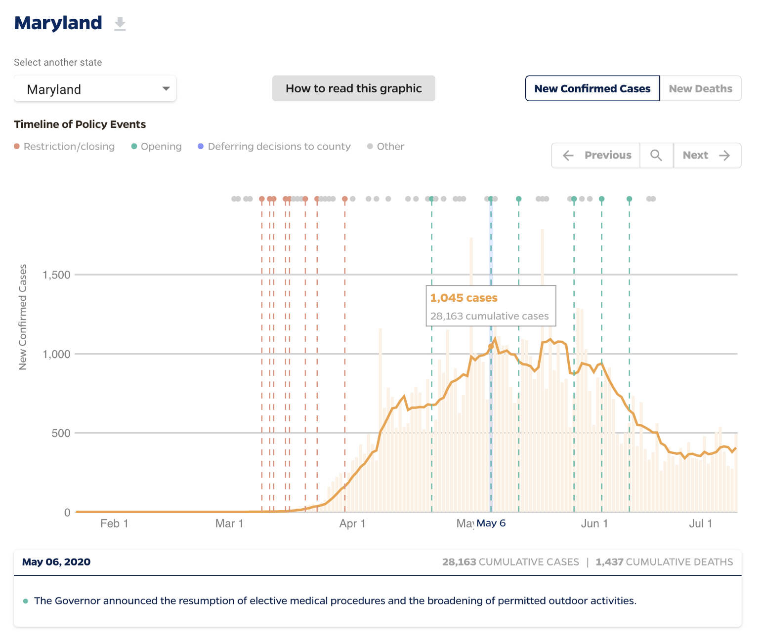
As part of Graphicacy's ongoing partnership with the Johns Hopkins University Coronavirus Resource Center, I designed a timeline of policy events for each of the 50 United States and the District of Columbia. The goal of this data visualization is to allow readers to display any actions taken by the Governor of a state alongside a chart showing either Daily New Cases or Daily New Deaths. Restrictions/closings, openings, deferring decisions to counties, and other actions are represented by markers so the reader can see if that policy action had any impact on the outbreak.
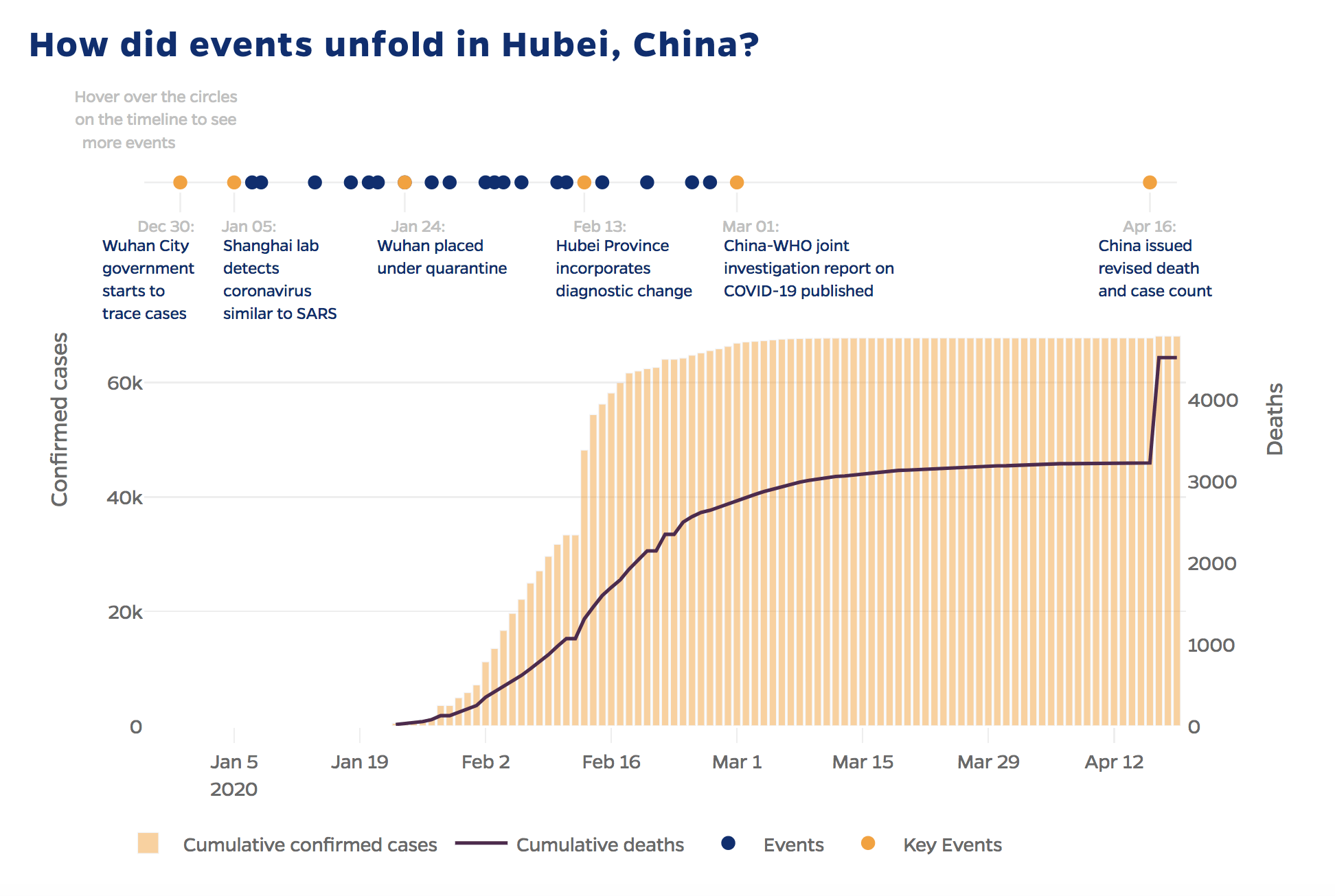
Johns Hopkins University (JHU) previously developed a timeline visualization of policy events in the Hubei province of China, which served as the model for our new visualization for the U.S. JHU was interested in partnering with us to make the charts easier to digest and intuitive for a wide audience of users.
A look into my design process
The first change I recommended was moving away from using a dual-Y axis. While there are many reasons why a dual Y axis can be confusing for readers, it’s also not needed for the primary purpose of this chart. Knowing that goal of this visualization is to let the reader see if specific policy events had any impact on the state of the outbreak, this can be done using either a chart of confirmed cases or deaths. Presenting a single metric at a time cleans up the chart without impacting the core narrative. So I recommended a simple toggle switch to let the user display either confirmed cases or deaths.
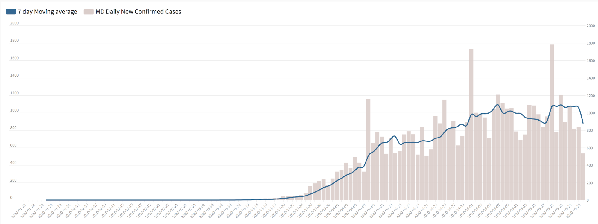
To make a changes in the slope of the outbreak easier to spot, I recommended displaying new daily data rather than cumulative data. In the original chart built for Hubei province, the lockdown was strict enough that the number of new daily cases dramatically decreased during the month of February, so much so that the shape of the curve visibly bends, even when looking at cumulative cases. By March, the outbreak was mostly contained, and there were very few new daily cases. This allows the user to see how policy actions affected the shape of the outbreak. However, for the U.S., where the outbreak was never fully contained, charting the data in a cumulative view looks more like a straight line, rather than a squashed curve. Here is Maryland, for example:

Months into an outbreak, when there are a large number of total cases, a cumulative chart makes it much harder to spot the difference between adding 500 new cases versus 1,000 new cases. Alternatively, charting new daily cases, the difference between 500 and 1,000 new cases is immediately apparent.
This is a good example of why it’s important to have a data exploration phase as part of the design process, where I can work with real data and test out different charting options. For this project, I did this exploratory work in Flourish.
Switching to daily data, however, introduces a second problem: the daily COVID-19 data are quite noisy and involve some weekly variance, when there is a lull in reporting over weekends, and a catch-up on Mondays and Tuesdays. So I introduced a moving average line, to smooth out the variability and make it easier to see the overall trend:
Live data and user interactions
After the Graphicacy team agreed to a chart direction with the JHU team, I turned to the events timeline. We thought the timeline of dots used on the Hubei visualization worked nicely, as it was compact, and allowed discrete events to share the same X axis as the chart. To aid in spotting the interaction between events and the shape of the outbreak, I added vertical lines for restrictions/closings, openings, and deferring decisions to counties actions.
The policy event content for any individual state turned out to be quite extensive–a list of 50 to 100 events–with any given event description being as long as a full paragraph of text. To keep the tool compact and readable, I added a box below the chart to display a single day of events at a time. To add context, the box also displays a cumulative count of cases and deaths up through that day.
The final layer to consider when building a visualization are the user interactions. How should the user navigate through this tool? What would they expect to be able to do, and does our tool easily allow them to do that?
Above the chart, I added previous and next buttons, which let the user move from event to event in a sequential manner. Alternatively, users can click directly on the chart itself to jump directly to that event. I also introduced a “focused” mode, which zooms in to show an eight-week time span centered around the active event, which can be toggled on at any time.
While each of these choices in our design process might seem minor, they all add up to a cleaner, more informative chart and a more intuitive user experience. Explore this tool yourself and see what is happening in your state.
Other Projects:
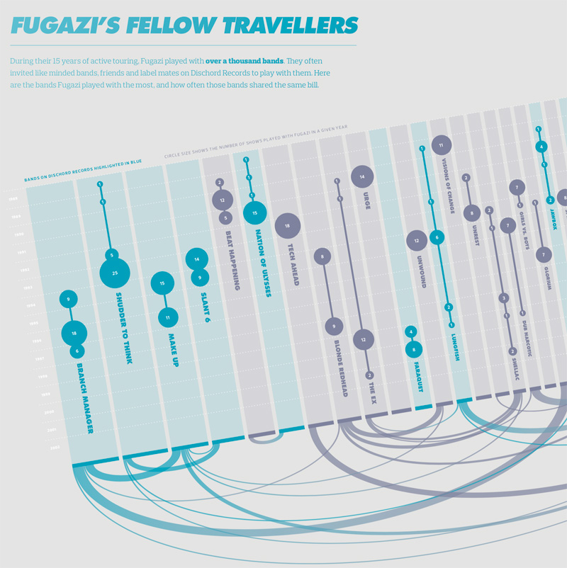
Visualizing the History of FugaziData Visualization
COVID-19 Testing Trends TrackerData Visualization
Timeline of COVID Policies in the U.S.Data Visualization
VIEW-hub website designUI/UX Design & Data Visualization
Transforming Food Systems Under Climate ChangeData Visualization & Report Design
Towards a More Equal CityData Visualization
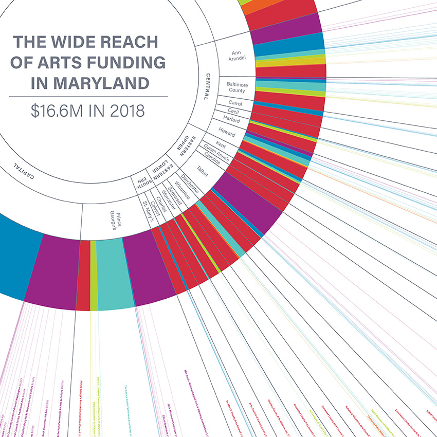
Wide Reach of Arts Funding in MarylandData Visualization
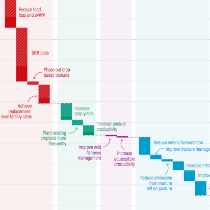
Creating a Sustainable Food FutureData Visualization & Report Design
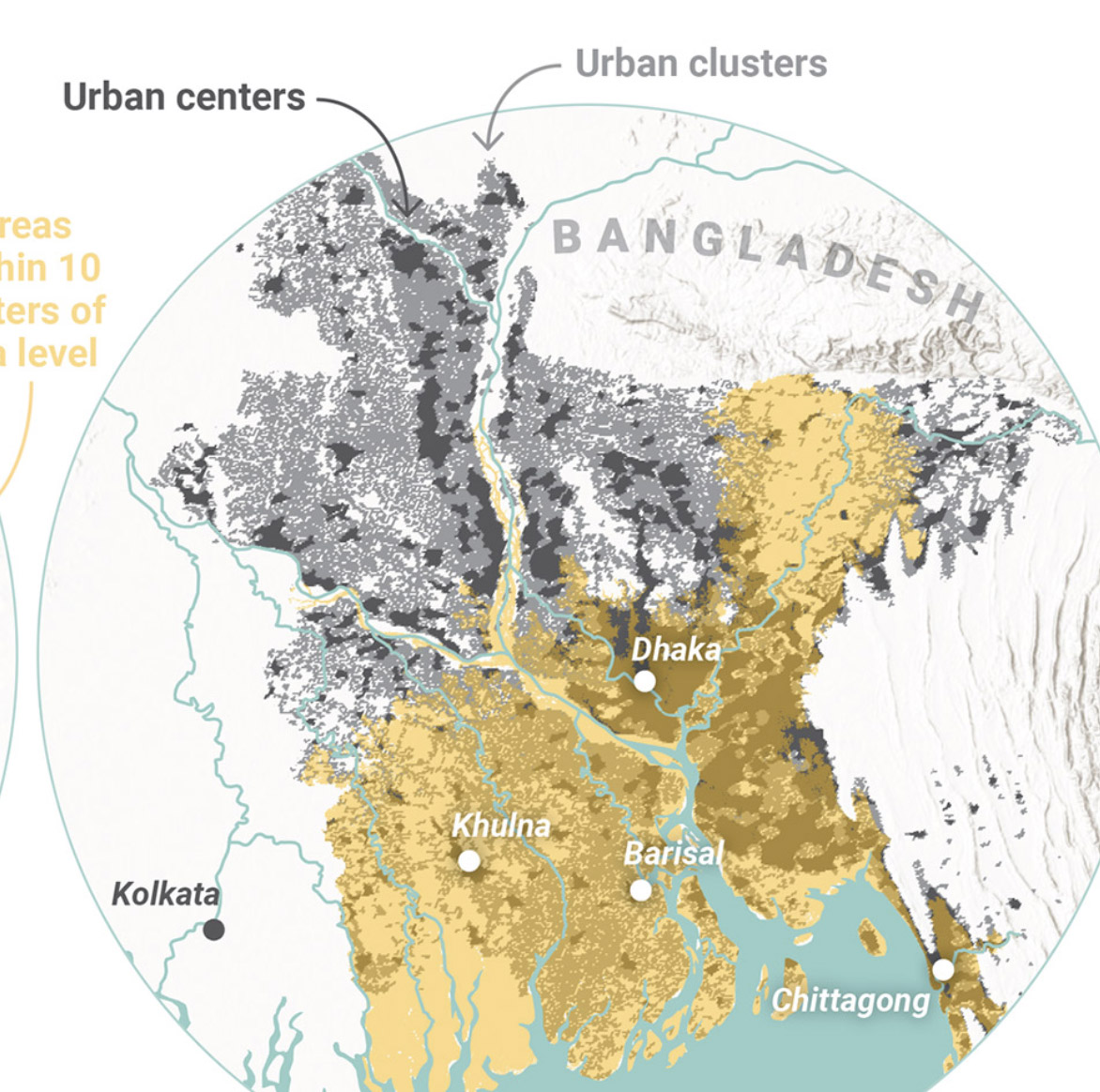
Global Commission on AdaptationMap & Infographic Design
Logo & Branding projectsLogo design
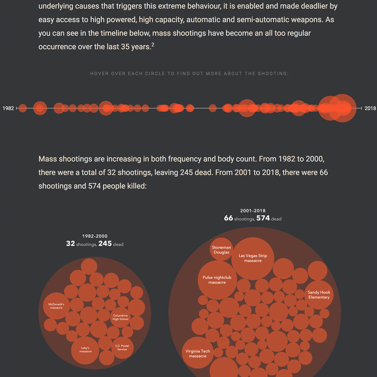
Sensible Gun Laws NowInteractive
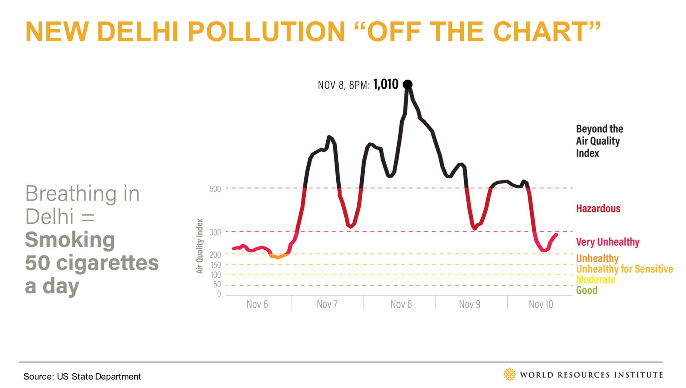
Stories to WatchPresentation Design
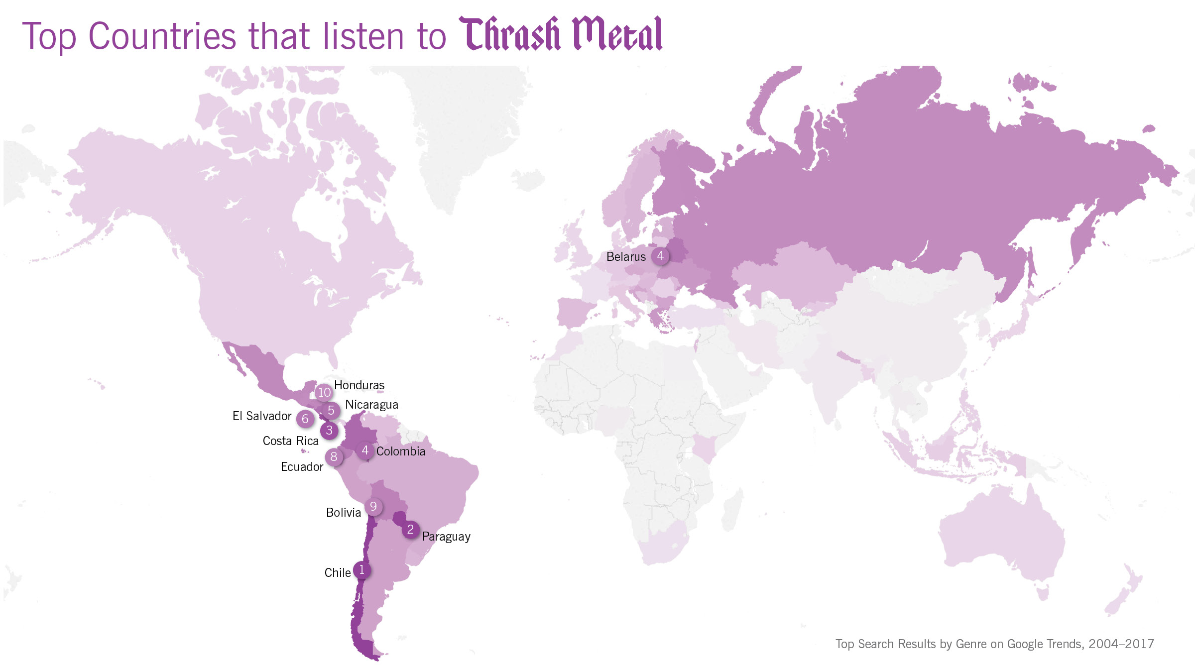
Globetrotting History of MetalData Visualization
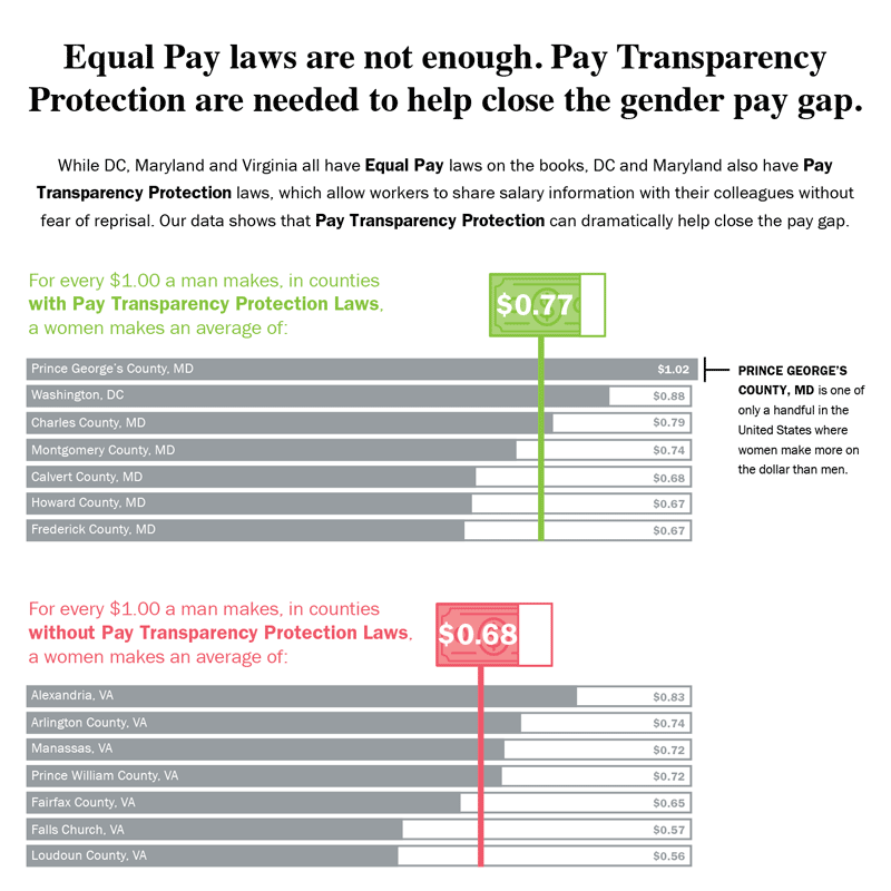
Equal Pay Laws are Not EnoughData Visualization

How to Record Your BandInfographic
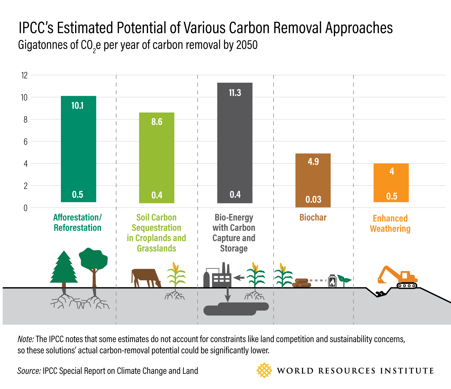
WRI Blog graphicsCharts & graphs
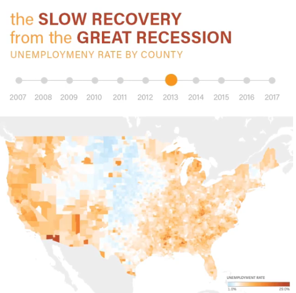
The Slow Recovery from the Great RecessionInteractive
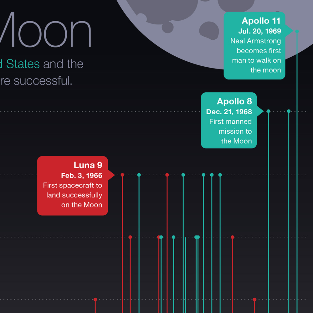
The Race to the MoonInfographic
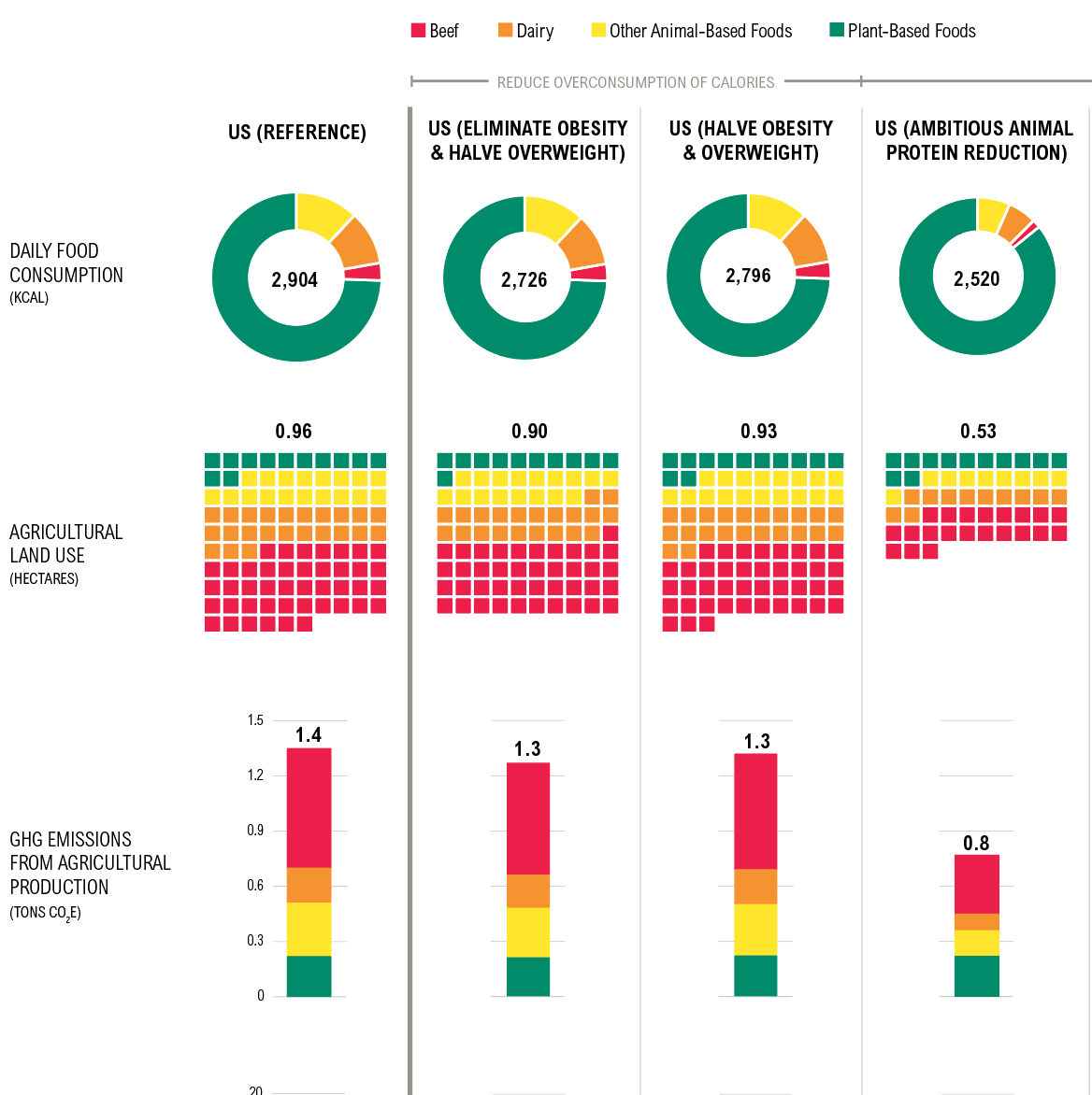
Shifting DietsData visualization
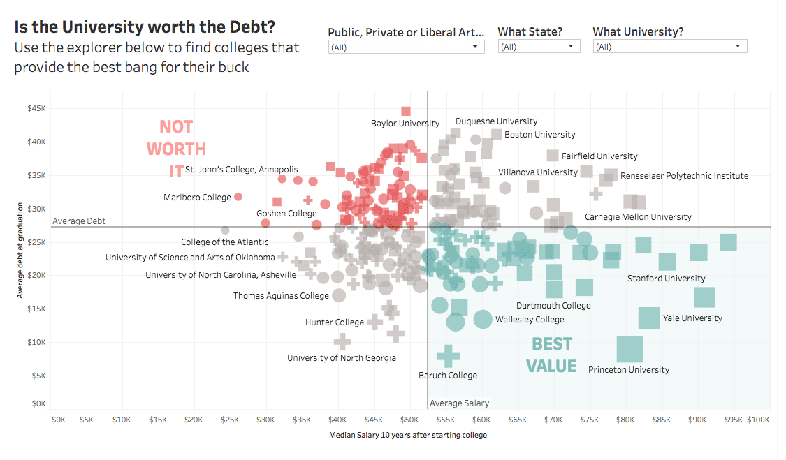
Is the University Worth the Debt?Interactive
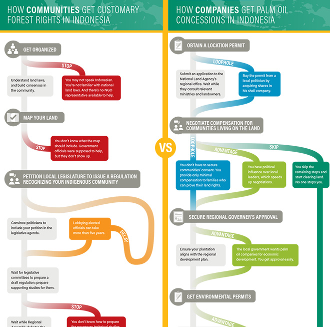
Scramble for Land RightsInfographic

Show FlyersConcert posters
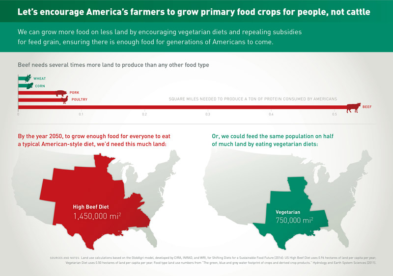
Land for Plants, not CattleInfographic
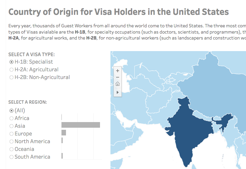
Visa Holders DashboardsInteractive
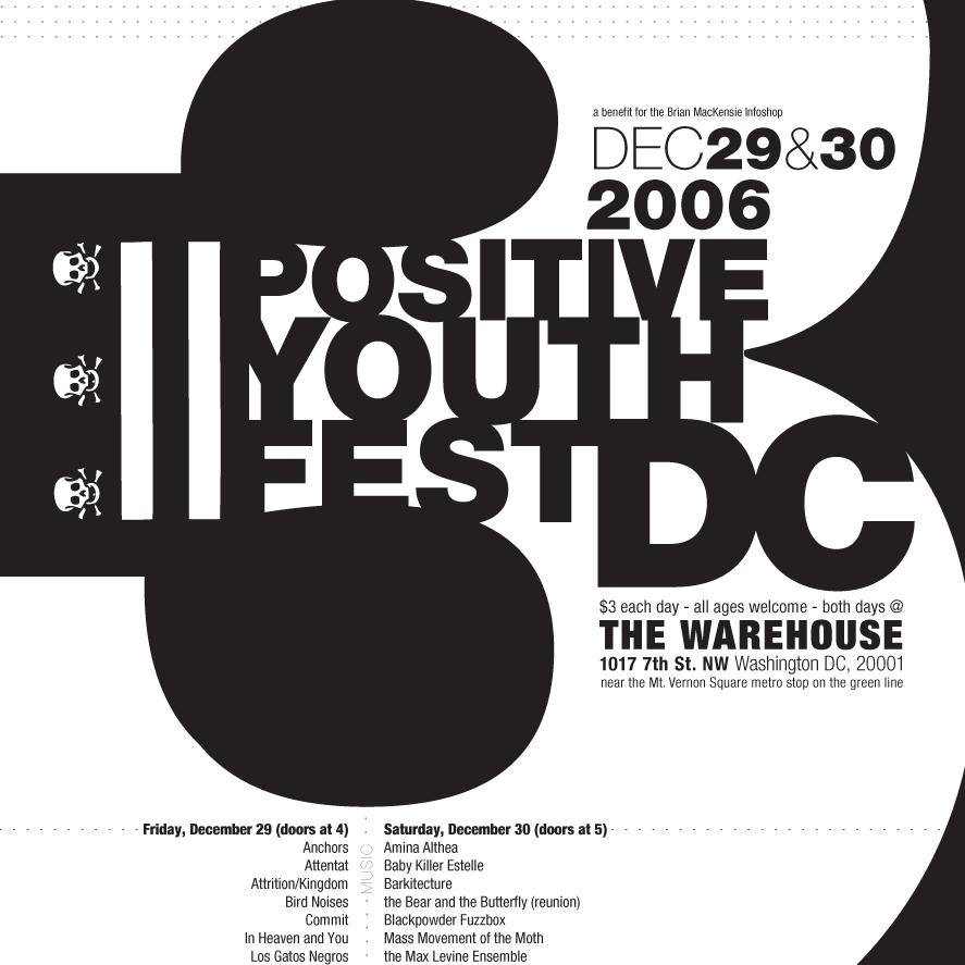
Positive Youth FestConcert Poster
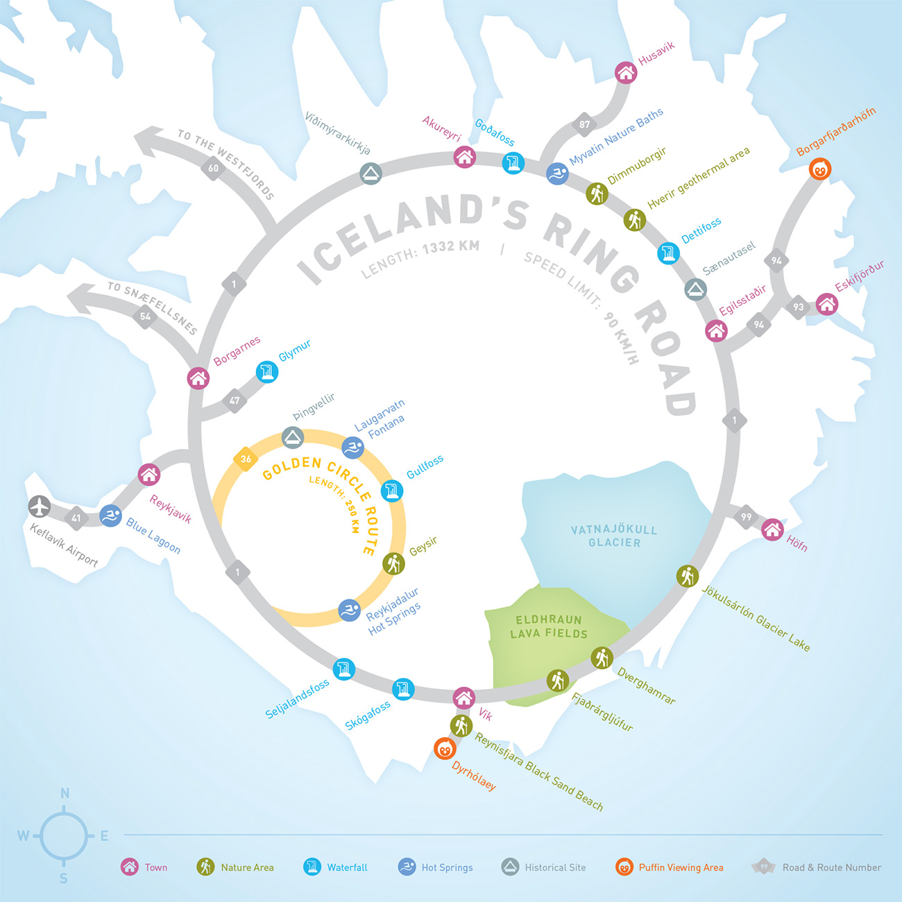
Iceland Ring Road MapInfographic
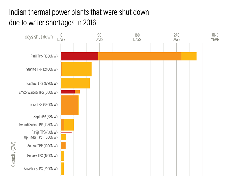
Droughts & BlackoutsData Visualization
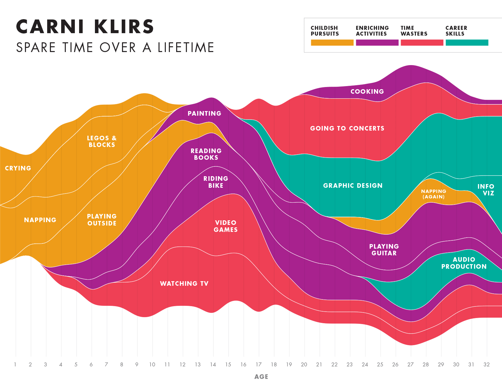
Spare Time over a LifetimeInfographic
Pinkwash posterConcert Poster
Please be in touch: carni.klirs@gmail.com. Follow me on instagram or twitter.